
A Closer Look: The Latest Mortgage Trends

Under the Home Mortgage Disclosure Act, lending institutions are required to report refinancing activity, home purchase loans, and government-insured loans. PolicyMap recently rolled HMDA data for 2009 into our online collection of socioeconomic indicators, helping users understand significant new trends. Interested in knowing more?
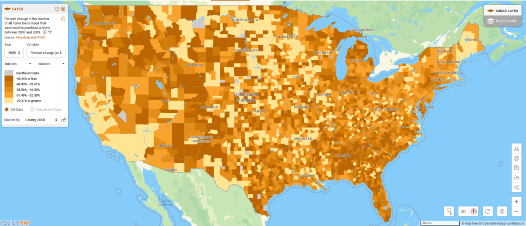
- The main trend of the last few years is evident, as fewer people took out a mortgage to buy a home. In 2007, 3.5 million households bought a home and took out a mortgage; in 2009, only 2.4 million did.
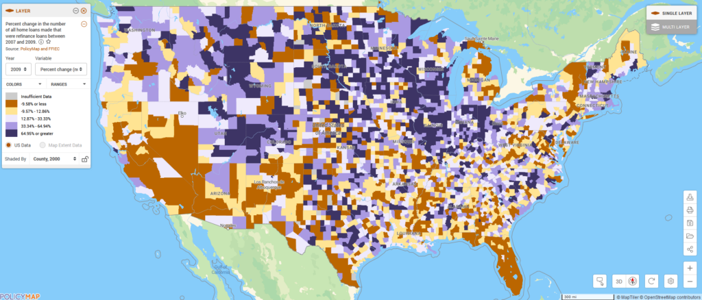
- The number of homeowners refinancing, however, has increased. Over 1 million more households refinanced in 2009 than 2007 – 5.3 million versus 4.2 million households.
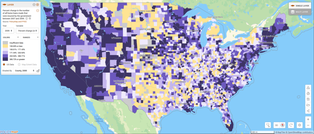
- Most strikingly, the number of government originated loans rose by 297% in the last two years. Over 50% of all home purchase loans in 2009 were insured by the government.
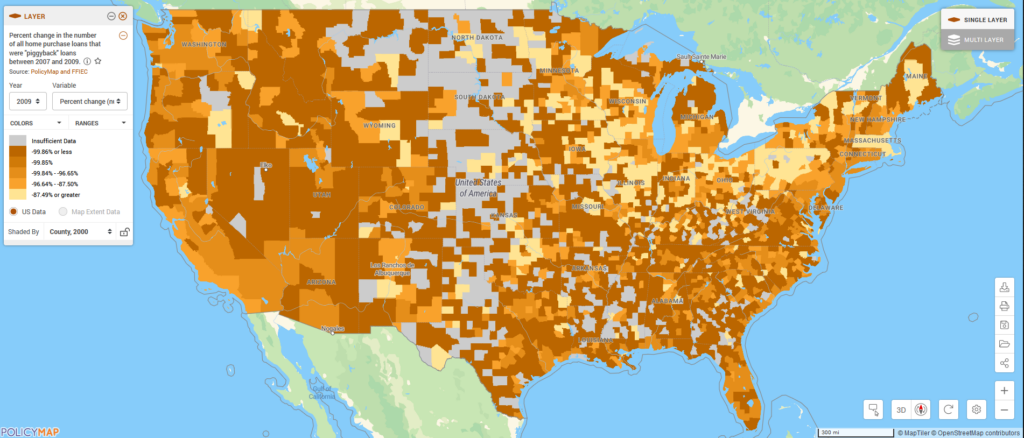
- We saw a sharp decline in the number of homebuyers using two loans to buy a home (piggyback loans). While an astounding 350,000 home purchases were financed using two mortgages in 2007, only about 14,000 home purchases included piggyback loans in 2009.
The nature of these trends varies significantly in communities across the nation. For example, while refinancing looks to have taken off in parts of Illinois, Indiana, and Wisconsin, not much of this activity has taken place along the West Coast or in the South, particularly Florida. This could be a result of homeowners owing more than their house is worth, making refinancing impossible. In other parts of the country, the majority of homebuyers are using a government-insured product to make a home purchase. This seems logical, given that subprime mortgage alternatives dried up in the crash of the housing market.
To get a clearer picture of these variances across the country, check out the interactive maps below or go to PolicyMap and explore data in the “Lending Activity” tab.
When reading these maps, note that orange areas represent places where a specific lending type has declined, while purple areas represent places where it has increased. And, the darker the purple, the greater the increase.
![]()