
Autumn Colors on PolicyMap
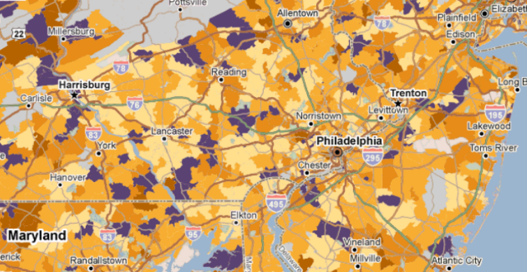
We here at PolicyMap are optimists by nature. We always accentuate the positive, and try to disregard the negative. That outlook served us well until it came time to look at our some of our maps, which, as it happens, often portray negative numbers. While our positive numbers were shown in vibrant shades of purple, our negative numbers were relegated to a dull yellowy-orange, and it was sometimes difficult to distinguish between their different shades. That has changed.

We’ve updated the negative color ramp on our maps to more lively and distinguishable shades of orange. Maps with negative numbers now look distinctly autumnal, which is perhaps appropriate, displaying the foliage of falling values. With this new aesthetically pleasing and more usable map, we’ve found that we can remain optimistic while looking at data that happens to be numerically negative.