
New Obesity, Diabetes, and Physical Inactivity Data
Our diabetes and obesity data recently went through an overhaul. Thanks to a new source at the CDC (the National Diabetes Surveillance System), our county-level obesity and diabetes data now covers six years, from 2004 to 2009, includes age-adjusted percentages, and offers new-to-PolicyMap data on physical inactivity. All these are available in the Health menu. Here’s a detailed look at what’s new:
- Previously, you could only access the most recent year of data provided by the CDC. Now, we have historical data going back to 2004, so you can look at trends across time. And as an added benefit, the latest year of data is one year newer, as recent as 2009.
- People of different ages generally don’t weigh the same, or have the same incidence of diabetes, or exercise the same amount. So in some cases, your obesity map may be a glorified age map. So if you want to see variations in these health indicators, without them being affected by age differences, check out the age-adjusted percents, marked “Adj%” in the Change Variable section of the legend.
- What if you’re not interested in who is obese, but who might be at risk? Then look at the new Physical Inactivity indicator, in the health menu.
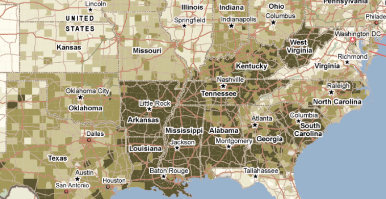
As obesity continues to plague parts of the country, and healthcare costs continue to rise, it’s important to recognize that different areas are affected differently. Anti-obesity efforts that may be necessary for the South or Midwest might not be as important in the Mountain West. Take a look at the map, and see how people in your region are doing.