
Just in time for Halloween: Here comes the Tax Man
Goblins! Witches! Zombies! Werewolves! This time of year we hear a lot about scary things, so here at PolicyMap we thought we’d celebrate with something truly bone-chilling. Yep, you guessed it. Here comes the Tax Man.
Just in time for Halloween, we have added IRS tax data to our platform. While we all fear the reaper as tax returns come due, it turns out our tax data provides some very interesting data and maps. Now on PolicyMap you can find information on tax returns, exemptions, adjusted gross income, and tax liability in communities across the country. This dataset also includes details about tax credits and deductions. Some examples of what you can now map include: student loans, mortgage interest, sales and real estate taxes, child credits, dependent care expenses, unemployment compensation, retirement contributions, and how much people are withdrawing from retirement accounts. We’ll quickly highlight two of these indicators here, and leave it to you to login to PolicyMap to check out the rest under the Incomes & Spending data tab.
Capital Gains: A capital gain is the difference between the price of an asset when you bought it and when you sold it. So, a capital loss is bad; it means the asset sold for less than you paid for it. The map below shows the average net capital gain or loss reported on income tax returns in 2013. The darkest oranges are the areas with the highest capital gains, or said another way, the luckiest among those who held and sold assets. You can see the greatest gains across North and South Dakota, Colorado and Wyoming, as well as in Texas and in much of New England.
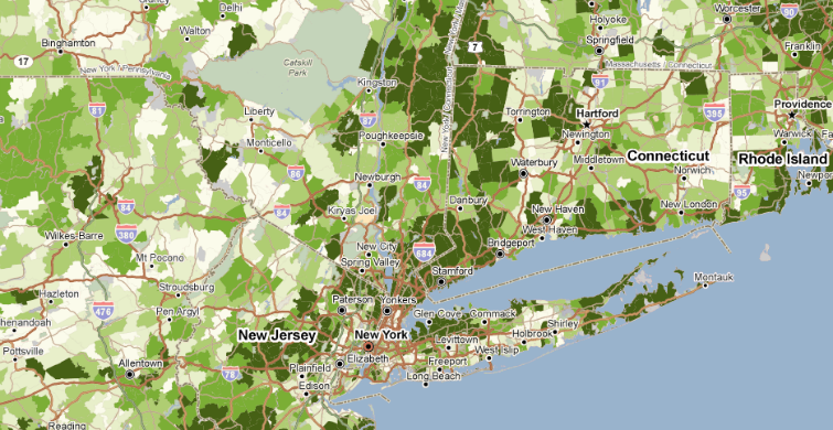
Charitable Contributions: This second map shows the percent of tax returns that included gifts to charity. Here the darkest orange areas are those where the greatest proportion of the population gives to charity (or at least where they report doing so on their taxes!) Different parts of the country certainly stick out in this map than in the capital gains map. According to the IRS, the people most often giving away their money are in the Midwest, in Utah and Western Colorado, and along both coasts.
So take heart. You may already be filled with dread thinking about April 15th, but think of all the great data we get to have as a result of it! And besides, there’s always a chance you won’t wait until April 14th to start your taxes this time.
IRS tax data comes from Powerlytics, a big data provider of financial insights and analytics.