
Where People Are Moving
Economists say that one of the advantages the United States has over Europe is the ease of labor mobility. If you live in an area of high unemployment, you don’t need to get a visa or learn a new language to move to another state.
Interstate migration is an interesting way to gauge the comparative economic health of areas within the United States. PolicyMap has county-to-county migration data from the IRS, which compares tax returns from one year to the next to count the number of people (and their aggregate income) that leave or move to a county in a given year. We just updated this to include the migration from 2010 to 2011.
The first map I looked at was the number of new individuals in a given county in 2011:
My immediate reaction was, wow, a lot of people are moving to the northeastern I-95 corridor! Also, it looks like there’s a lot of in-migration in California, Arizona, and Florida.
So where are people leaving?
Looks pretty similar! What this shows is that there are no obvious mass-migration patterns in the US right now. Where lots of people live (places like the northeast, California, Arizona, and Florida), lots of people move. They’re not necessarily moving to a different state or region; it may just be a reshuffling of where people live in an area. If you look at net-migration (showing the number of people a county gained or lost), it’s “speckled”, meaning, there aren’t many clear regional patterns (except that people keep moving to Florida):
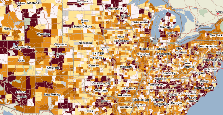
What if instead of looking at the number of people moving to or from a county, we look at the percent of people in a county who are new or have left? By looking at percent, we don’t get to see nationwide migration trends, but we get to see what areas are affected by heavy migration. In other words, if 40% of the population of Podunk County moved away, and 60% of the population of Backwater County just moved in, it might not really be a whole lot of people (nothing compared to the thousands moving in and out of a major city), so it doesn’t really count as a mass-migration. But it matters quite a lot to the people of Podunk and Backwater! These are small places that may or may not be equipped to deal with rapidly changing communities.
So let’s look at the percent of the population that’s just moved in:
The trend here is clear: Lots of western counties experience higher levels of in-migration. So where are counties with heavy out-migration?
Surprise! It’s a very similar map. The lesson: People in the west are more likely to move to another county than people in the east.
Let’s take a look at one last map, the net-migration, as a percentage of total population:
Again, it’s a fairly speckled map, suggesting no major national trends, except one: The North Dakota oil bonanza continues to attract people from elsewhere in the country.
The IRS Migration data is available in the Demographics menu, and is available to all users. Check it out, because there’s one major piece of this data I didn’t look into here: the migration of money. When people move, how much income are they taking with them? Income migration data can be accessed by toggling the variable within the legend to “Aggregate dollars”.