
Predominant Language: A Colorful Map
Data
Predominant Language Spoken at Home
Source
Census: Decennial Census and American Community Survey (ACS)
Find on PolicyMap
- Demographics
- Language
Last week, we featured the new language spoken at home data on PolicyMap, which lets you see concentrations of speakers of over 40 languages. They’re great indicators if you want to find concentrations of a specific language. But what if you wanted to find concentrations of any language?
For that, we have new predominant language indicators, inspired by our own predominant race and ethnicity indicator, and Jill Hubley’s maps of the languages of New York.
There are three new indicators. The first is straightforward: predominant language spoken at home. Looking at a map of the whole country, you can see it’s mainly English, with notable areas of Spanish and Navajo.
But zoom in beyond the county level, and you’ll see some of the local ethnic enclaves discussed in our previous post:
Since English does generally dominate the map, the second indicator is the predominant language, not including English-speakers:
As you’d expect, there’s a lot of Spanish, but plenty of other languages, like French in Maine and Louisiana. (“Cajun” is derived from “Acadia”, donchaknow.)
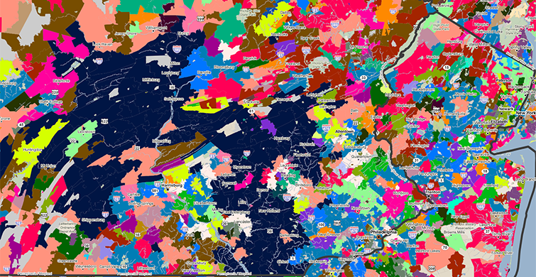
And if Spanish is also too mainstream for you, we have a third indicator of predominant language, not including English or Spanish. A quick warning: this map is really really colorful.
See the dark navy area west of Philadelphia? The predominant (non-English non-Spanish) language there is “Other West Germanic Languages”. Check out what happens when we overlay the points of private schools with an Amish religious orientation:
See any other interesting patterns? Let us know!