
Digging Deeper into Racial Disparities
Data
Predominant Race
Source
Find on PolicyMap
- Demographics
- Race, Ethnicity, Diversity
- Predominant Race
- Race, Ethnicity, Diversity
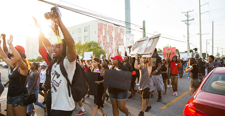
Communities across the United States are reckoning with deeply entrenched structural racism as protests continue over the killings of George Floyd, Ahmaud Arbery, Breonna Taylor and many other Black and Brown people. Maps and data can provide quantitative confirmation of stories of racism that many already know, and can guide policymakers when reforming public policy to serve all residents.
Louisville, Kentucky has been the site of major uprisings after the police killed 26 year old EMT Breonna Taylor in her home on March 13th. Mapping race, income, incarceration, lending practices, and more can help shed light on some of the underpinnings of racial inequities in the city. Louisville is just one example, however. Maps of the data in any of the cities experiencing unrest across the US tell similar stories.
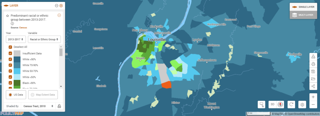
Let’s first consider the geography of race in Louisville. In the map below, race predominance is shown as follows: green indicates Black populations, blue indicates White populations, orange shows Latinx populations, and purple indicates Asian populations. (Note: this layer contains additional race categories that don’t have predominance in these two cities.)
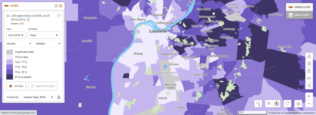
Keeping the map of predominant races in mind, let’s examine the ultimate indicator of health, life expectancy. Lower life expectancy rates indicate limited opportunities to live safe, healthy lives. The areas in the lightest lavender, below, show where life expectancy is nearly 5 years lower than the national average. Those lighter areas track closely with predominance of Black and Latinx communities in Louisville.
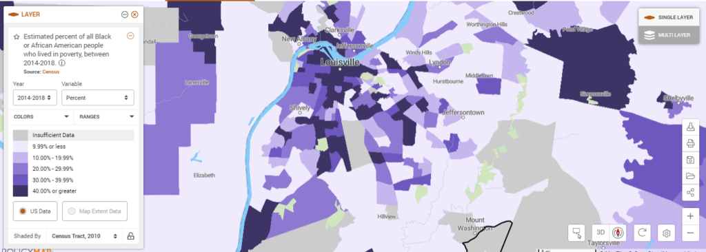
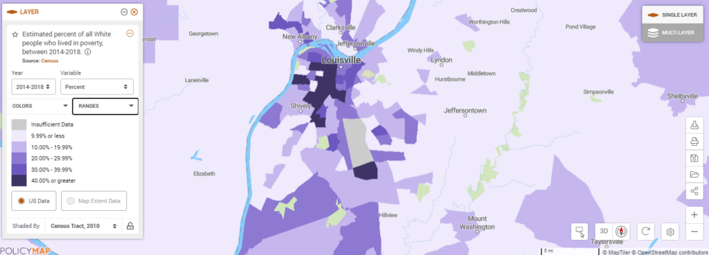
Life expectancy is related to poverty, and looking at poverty through the lens of race tells a story of economic inequality in cities across the US. (See more about our work on the racial wealth gap.) In our example of Louisville, the areas in dark purple in the following maps show more pronounced poverty among Black populations compared to White populations:
Black people living in poverty:
White people living in poverty:
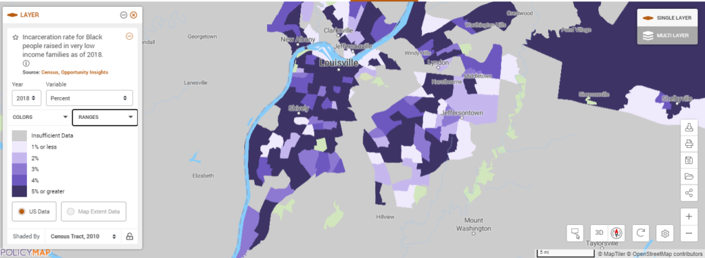
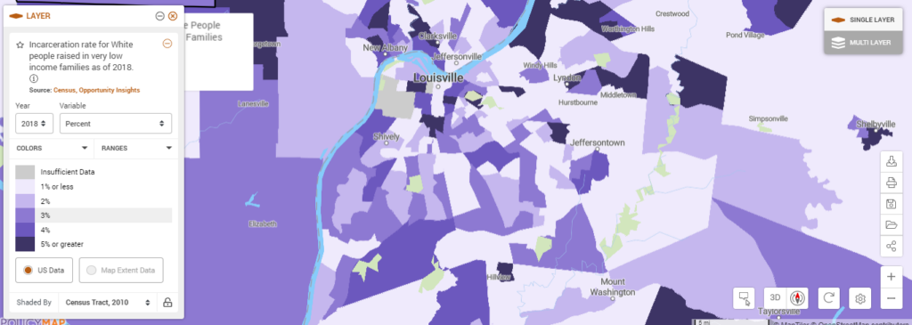
And incarceration rates show deep racial disparities, as well. The darkest purple areas on the maps below show incarceration rates of >5% of very low income residents.
Consider Black incarceration rates:
Compared to White incarceration rates:
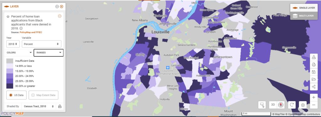
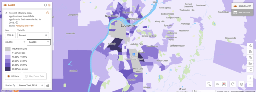
Beyond overall health, poverty and involvement in the criminal justice system, disparities in access to economic opportunity paint a sobering picture of racial inequities. Using mortgage denial rates, we can see how Black borrowers are disproportionately denied mortgage loans, thus missing out on this traditional means of wealth generation. (See more about our work on racial inequality and mortgage denials.)
Mortgage loan denials to Black applicants:
Compared to Mortgage Loan Denials to White applicants:
PolicyMap offers numerous indicators to understand racial disparities, and we’re always looking for more research partners to explore this topic and others germane to our users. Contact us if you’re interested in collaborating with us.