
Data Updates! Predominant Race/Ethnicity and Diversity Index
Data
Predominant Race/Ethnicity
Source
Find on PolicyMap
- Demographics
- Population
- Diversity
- Predominant Race/Ethnicity
- Diversity Index
We’re excited to announce that two indicators have been updated to include the 2013 ACS 5-year estimates: Predominant Race/Ethnicity and the Diversity Index. You’ll find both of these indicators by going to the “Demographics” header above the map, and then scrolling down to the “Diversity” sub-header.
Just to review, the Diversity Index reflects the probability that if two people were chosen at random in a given area, they would be of different races and ethnicities. In calculating the index, we used 8 mutually-exclusive racial and ethnic categories reported by the American Community Survey. The index is calculated at the level of the county, tract and block group. Higher index values suggest more heterogeneity (i.e., diversity).
The Predominant Race and Ethnicity indicator conveys two pieces of information for the price of one: first, it shows which racial or ethnic group is the predominant group in terms of population and second, it shows what fraction of the population the predominant group represents.
Using these two indicators in tandem can give a more nuanced sense of the residential patterns of a neighborhood, town or city. In areas where the predominant racial or ethnic group is “predominant” by a smaller margin, you would expect to see higher diversity index values.
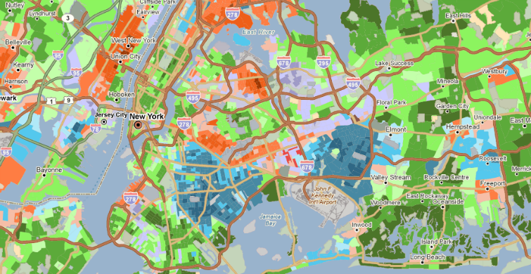
For example, let’s look at Queens, New York City. Queens County recently adopted the title as “The World’s Borough”, in celebration of the county’s diversity. Looking at the Diversity Index map, there are areas in Queens that would suggest that the motto is well-deserved, with higher values in Astoria, Flushing and Jamaica, for example.
The Predominant Race and Ethnicity map reveals additional insight into the composition of Queens – southern areas largely consist of African-American communities and in the north, Asian communities are interspersed with White and Hispanic enclaves.
What do you learn about your neighborhood with these two datasets? Write to us and let us know!