
Affordability Series, Part 1: A New Way to Explore Income Distribution Data
A new PolicyMap indicator that transforms income distribution data into a single, clear view of any community’s income makeup.
Key Takeaways
- PolicyMap’s new Income Distribution Index shows which income tier (lower, moderate, or higher) predominates in a community, filling a gap left by averages, medians, and HUD Low Mod calculations.
- The index sorts areas into six categories based on national income cutoffs, and is meant to complement existing measures like Gini or Theil, helping surface areas where income concentration and inequality overlap.
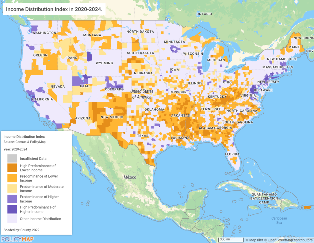
PolicyMap has created a new index, called the Income Distribution Index, that characterizes the overall income makeup of an area by identifying which income tier – lower, moderate, or higher – accounts for the largest share of households. The index is designed to help users quickly understand whether an area skews toward one end of the income spectrum or reflects a more mixed economic profile.
Why Income Distribution Data Needs a Better Metric
Even with numerous income calculations available, understanding a neighborhood’s overall income distribution still means examining each individual income bracket and comparing population percentages in those brackets. Averages skew upwards with even a few high-income earners and medians only show where the middle population’s income lies. Moreover, most calculations around income focus on identifying poverty and low-income groups, primarily to help direct federal funds and programs. These measures do not always tell a complete story of the overall income distribution in each geographic area.
Where Averages, Medians, and HUD Low Mod Income Data Fall Short
The most holistic metric for characterizing household income in an area is Low Mod from the Department of Housing and Urban Development. The HUD Low Mod calculation measures the share of local median household income as a share of metro or non-metro area’s median household income. For reference, very low income is categorized as ≤ 30% of the metro median income, low income is ≤ 50%, moderate is ≤ 80%, middle income is ≤120%, and upper income is > 120%. This calculation is nuanced in that it considers local variation in regional cost of living and economic opportunities. A census tract with low income in a poorer rural area could still be considered moderate income, while a census tract with relatively high income in an expensive city might be considered low income, relative to the region. In a very poor region, people might be considered middle income but still have a relatively small income with limited purchasing power or opportunities. However, this only presents those percentages of median family income and is thus abstracted away from the fundamental income distribution in an area. Again, you are left looking at the percentage of households in particular income bands.
Introducing PolicyMap’s Income Distribution Index
PolicyMap’s new income distribution index was designed to fit into the gaps of existing income measures. In doing so, it helps describe the overall economic strength of the entire population. The income distribution index uses cutoff measures based on the median national standard but does not just look at poverty. And unlike HUD Low Mod, which only uses medians relative to a region, this index focuses on the composition of the entire income distribution.
It is uniquely challenging to try to create a single numeric value to represent the entire economic makeup of a neighborhood. We decided to focus on creating a metric that showed which income group makes up the majority of the population. This helps identify which income group is the predominant group within a location. The index allows you to quickly identify which neighborhoods are most characterized by high-, middle-, or low-income. We also included specific income-bracket calculations within the hover tool on PolicyMap for more details.
The Six Income Distribution Categories, Explained
In order to characterize the income distribution of a county, we needed to make judgments about what number and type of buckets to employ. In order to create a reasonable number of coherent groupings, we based our analysis on the national median household income estimate of $83,000. This formed the basis of the “Moderate” income category, and from there we built the “Lower” and “Higher” income groupings based on evenly splitting the remaining income bands.
Not every type of income distribution characteristic is widely distributed across a county. For instance, while there are very few small geographies that have both large numbers of people with low and high incomes, most fall into the following distribution categories:
- High Predominance of Lower Income – More than 60% of households in this area earn below $60,000, indicating a strongly lower-income community.
- Predominance of Lower Income – Between 50% and 60% of households earn below $60,000, meaning lower-income households are the clear majority but less concentrated than the tier above.
- Predominance of Moderate Income – Middle-income households, those earning between $60,000 and $99,999, are the standout group in this area, typically where no income extreme dominates. This also corresponds nicely with the latest average US median household income of $83,700 in 2024, according to the Census Bureau.
- Predominance of Higher Income – Between 50% and 60% of households earn above $100,000, reflecting a community where higher-income residents are the majority.
- High Predominance of Higher Income – More than 60% of households earn above $100,000, indicating a strongly affluent community.
- Other Income Distribution – No single income tier clearly dominates, reflecting a more economically diverse area or a categorization that does not fit a clear predominance.
How to Use Income Distribution Data in Your Analysis
This dataset can enrich analyses of the income dynamics in an area by allowing a single view of the distribution in an area. It offers a quick characterization that’s easy to put in a report or use to create a multi-layer map. We see the Income Distribution Index not as superior to any of the existing poverty, income, or income inequality metrics currently in use, but as a complement. If you identify a county with a high median household income and are curious what income levels are driving it, you can dig deeper with the index. It can be combined with other metrics to show how areas with High Predominance of Lower Income correlate with other poverty measures and associated challenges.
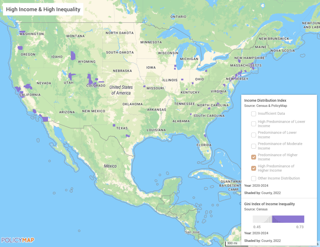
It also pairs nicely with measures of inequality and segregation using either the Gini or Theil indexes. For instance, you could look for areas in the country that have a high rate of inequality but also have a predominantly high-income distribution. These may be economic areas that are struggling but would be otherwise overlooked.
Request More Information
Want to see this data in action? Contact us to learn more about the Income Distribution Index and how it can strengthen your analysis of community economic conditions. Our team is happy to walk you through the methodology, show you sample maps, or discuss how it fits into your current work.