
Social Drivers of Health in Oncology: What Place-Based Data Reveals About Cancer Care Access

Key Takeaways
- In inner Detroit, the communities with the greatest transportation barriers are the ones farthest from where chemotherapy is delivered.
- In Appalachian Kentucky and West Virginia, the counties where poverty and Medicaid enrollment peak are the same ones where cancer death rates and lung cancer incidence are highest.
- Along the Texas-Mexico border, high uninsurance rates and limited English proficiency compound in counties where colorectal cancer incidence in Hispanic populations is elevated and infusion centers are nearly absent.
- In Louisiana’s Cancer Alley, the physical environment is itself a risk factor, with extreme environmental burdens coinciding with elevated rates of cancer and other health conditions that impact cancer outcomes.
- Across these communities, the same pattern holds: concentrated barriers often converge in places farthest from the care infrastructure built to address them. Transportation gaps, financial strain, language access, and environmental burden don’t just shape who gets diagnosed — they determine who can follow through with treatment. Adherence challenges that look individual are often structural, rooted in where a patient lives as much as in the treatment itself. PolicyMap’s Social Determinants of Health data collection provides the geographic context to identify where those barriers exist, understand why patients fall out of care, and target the communities where support programs are most needed.
Introduction
Advances in precision medicine have transformed what’s possible in cancer treatment. But where a person lives still plays a big role in their risk for getting cancer, their likelihood of getting screened and being able to follow through with treatment, and their cancer outcomes.
The oncology field has increasingly recognized social drivers of health — transportation, financial insecurity, housing instability, language access, etc. — as powerful predictors of patient outcomes. Clinical screening tools have been developed to identify these barriers at the individual level, and they are a meaningful step forward. But screening tells you about one patient at a time.
Place-based data tells you about the community conditions that shaped that patient’s situation long before they walked through your door. It tells you which neighborhoods, counties, and corridors face the highest concentration of compounding barriers — and which ones are also farthest from the care infrastructure designed to address them.
Below, we examine four communities where that convergence is most visible and most consequential — and where place-based data gives pharmaceutical companies, providers, and support organizations the geographic intelligence to screen, support and treat patients more effectively.
Transportation Access: Detroit and the Care Facility Gap
Transportation is a commonly identified barrier to cancer care — not because patients don’t want to show up, but because the geography of transportation access and the geography of cancer care facilities are not the same map.
The first map shows the prevalence of transportation barriers among adults in Detroit’s neighborhoods, with infusion centers and hospitals plotted as points. This is not a proxy measure — it is a direct estimate of the share of residents who lack reliable transportation. In inner Detroit, Hamtramck, Highland Park, and parts of Dearborn Heights, that share exceeds 22%. These are the darkest tracts on the map, and are also the tracts with the fewest infusion center points. The communities reporting the highest rates of transportation barriers are the same ones farthest from the facilities where chemotherapy is delivered.
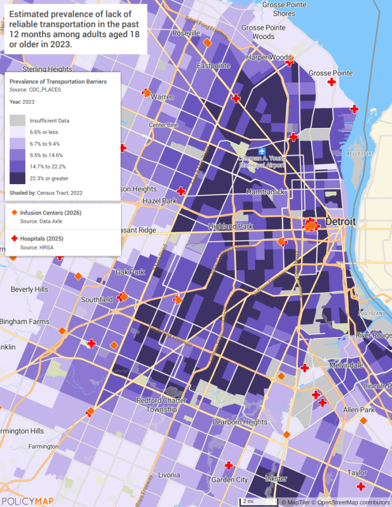
The second map reinforces the structural dimension. In showing the share of housing units with zero vehicles available, it illuminates that more than a quarter of housing units in inner Detroit have no vehicle. The car-free households and the infusion centers are in different parts of the map, and no amount of individual problem-solving closes that distance without systemic intervention.
Programs serving Detroit and cities like it should be building transportation assistance — ride programs, gas reimbursement, transit pass coordination — into their standard-of-care workflow, not treating it as an individual accommodation when a patient mentions it. Chicago’s South and West Side neighborhoods face the same structural mismatch: high car-free rates and transit access in communities where the major cancer centers are located on the North Side or in the suburbs. Baltimore’s West Side presents a near-identical pattern. The mismatch is not a Detroit problem. It is a design problem.
Some organizations are working to close that gap. The American Cancer Society’s Road to Recovery program has provided nearly 10 million free rides to treatment since 2005, and many health systems have built their own transportation assistance funds and volunteer driver networks. The opportunity is to move these efforts upstream — from reactive referral to routine screening, so that transportation is addressed before a missed appointment signals the problem rather than after.
Financial Hardship: Appalachian Kentucky, West Virginia, and the Cancer Burden
Kentucky and West Virginia both expanded Medicaid under the ACA. That means the standard measure — uninsurance rate — understates the financial reality. High Medicaid enrollment in these states is not just a coverage indicator. It is a poverty indicator, a signal that residents are at or near 138% of the federal poverty level and dependent on public insurance with its own constraints on what treatments are accessible and authorized. The financial stakes of treatment reach directly into that reality: 42.4% of cancer patients exhaust their entire life savings within two years of diagnosis, and in communities where income is already at or near the poverty line, the economic shock of cancer is not a temporary setback — it is often permanent.
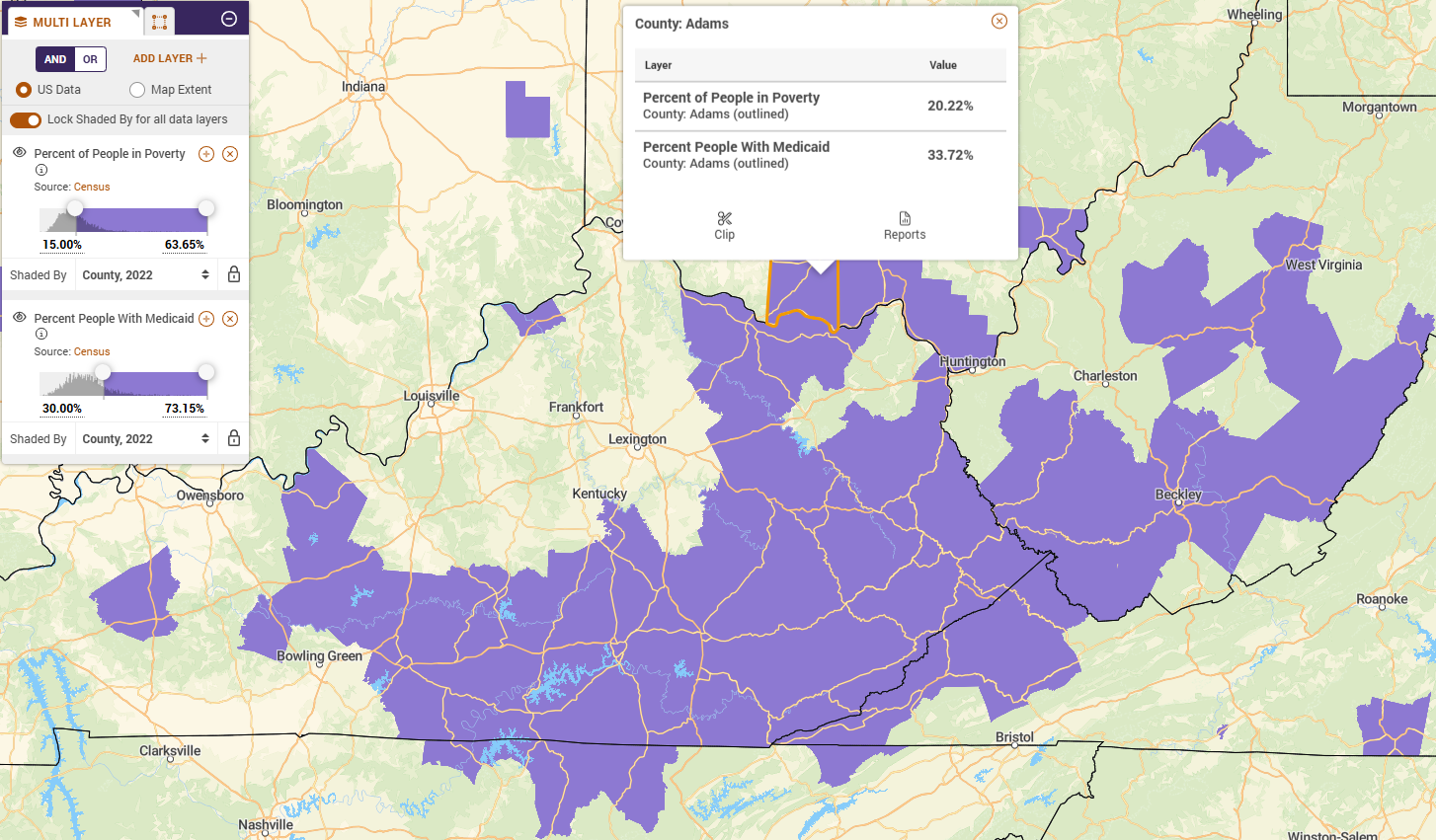
The first map shows poverty rate and Medicaid enrollment layered together across Appalachian Kentucky and West Virginia. Eastern Kentucky and southern West Virginia — the core of the Appalachian coalfields — are among the most rural, most isolated counties in the eastern United States. By some estimates, many counties lack a hospital within 30 miles. Nationally, rural patients undergo 25% fewer preventive screenings, are 1.5 times more likely to present with advanced-stage cancer, and experience 10-20% higher mortality rates than their urban counterparts. In Appalachian Kentucky and West Virginia, those odds compound with healthcare infrastructure so sparse that accessing an oncologist can require hours of travel each way. The counties in this region carry poverty rates of 15% or higher and Medicaid enrollment of 20% or higher — figures that reflect not just economic hardship, but structural isolation that has persisted for generations. That is the baseline these communities are starting from.
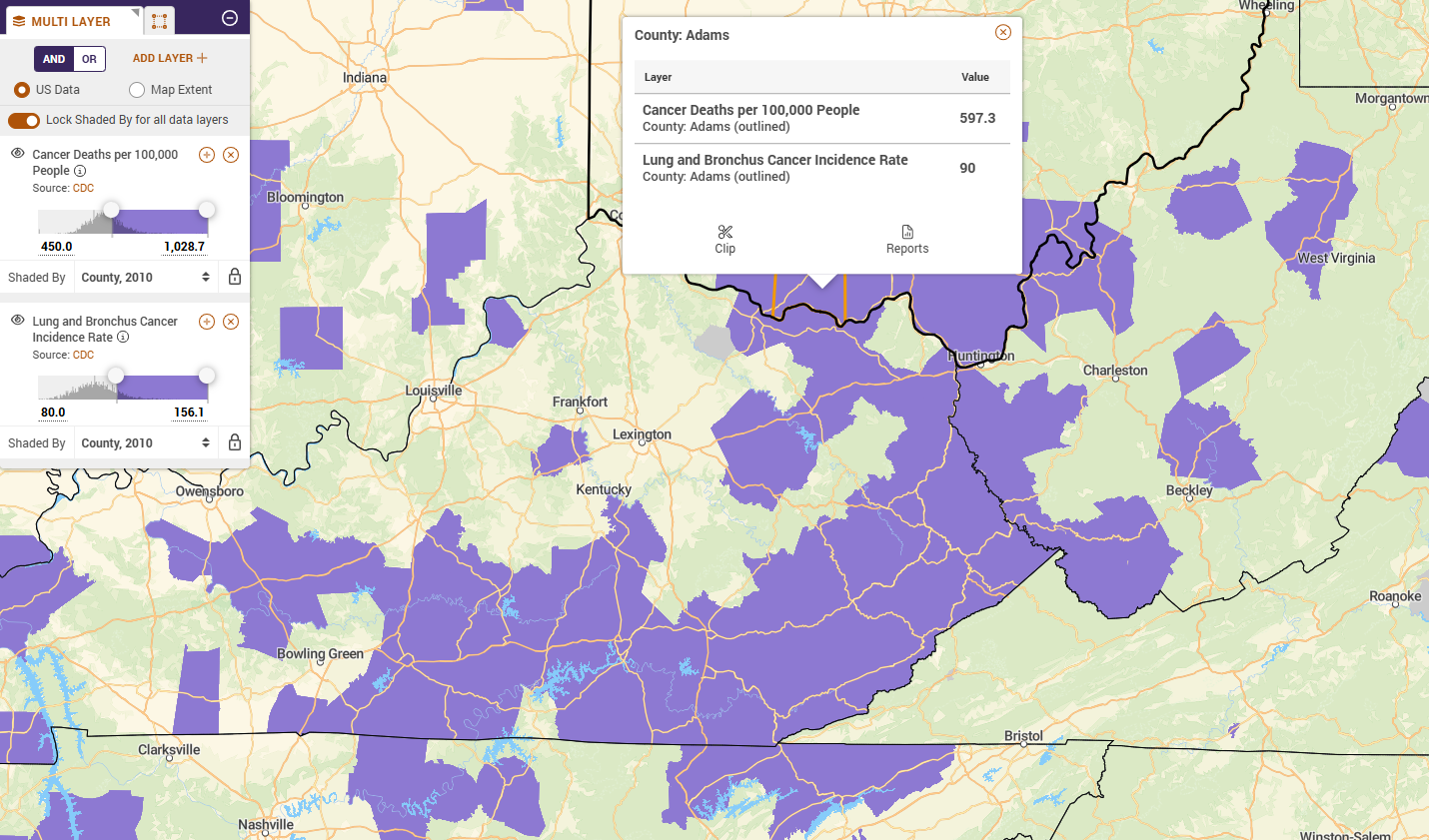
The second map shows what that baseline produces over time. By layering overall cancer death rates and lung and bronchus cancer incidence across the same geography, the footprint is nearly identical to the first map. The counties with the deepest financial hardship are the ones with the highest cancer mortality and the most elevated lung cancer rates. The data does not establish causation — delayed diagnosis, limited treatment access, high smoking rates, and environmental exposures from decades of extractive industry all contribute — but the overlap is too consistent and too geographically precise to dismiss.
Mississippi’s Delta region presents the same compounding dynamic: high Medicaid dependence, concentrated poverty, and cancer death rates that rank among the highest in the country. Alabama’s Black Belt counties mirror the Appalachian pattern almost exactly. The geography changes, but the math does not.
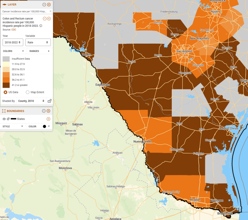
Language and Insurance: South Texas and the Border Access Gap
Texas has the highest uninsurance rate in the country and has not expanded Medicaid. That fact alone concentrates financial risk in the state’s most vulnerable communities. Along the Texas-Mexico border, those communities are also predominantly rural. The colonias of Webb, Starr, Hidalgo, and Cameron counties are unincorporated communities — many lacking basic infrastructure — where residents live hours from the nearest oncologist and face barriers that compound across income, language, coverage, and immigration status simultaneously. Hispanic individuals nationally have the lowest health insurance rates of any racial or ethnic group: 19% uninsured, compared to 7% of non-Hispanic White patients. In South Texas, without Medicaid expansion and with the added suppressive effect of immigration-related fear on healthcare utilization, actual rates in border communities run higher.
The financial barrier compounds with a language barrier that clinical SDOH research has shown to be particularly consequential: Spanish-speaking patients are less likely to disclose financial concerns to care teams even when those concerns are present. The trust gap suppresses exactly the information providers need to help.
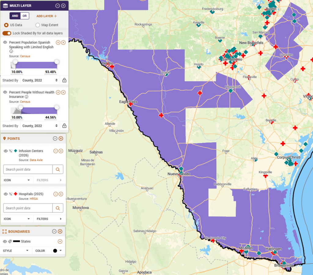
The first map layers the share of Spanish-speaking residents with limited English and the share of residents without health insurance, county level, with infusion centers and hospitals shown as points. In Webb, Starr, Hidalgo, and Cameron counties — the Rio Grande Valley and border corridor — Spanish-speaking populations face uninsurance rates of 20% or higher. However, infusion centers and hospitals cluster in San Antonio and Corpus Christi and are nearly absent in the border counties.
The second map shows colon and rectum cancer incidence per 100,000 Hispanic residents, county level. Colorectal cancer is highly preventable with routine screening — and highly dependent on a care relationship where patients trust their providers enough to follow through. In communities where language barriers suppress disclosure and uninsurance suppresses access, that screening rarely happens on time. The incidence rates visible in this map are a downstream consequence of upstream barriers that no individual clinical encounter fully resolves.
California’s Central Valley — where farmworker communities face nearly identical concentrations of limited English proficiency and uninsurance — shows the same cancer access gaps. New Mexico’s border counties share the South Texas profile almost exactly. This is not a Texas story. It is a border community story, and it repeats wherever the same conditions converge.
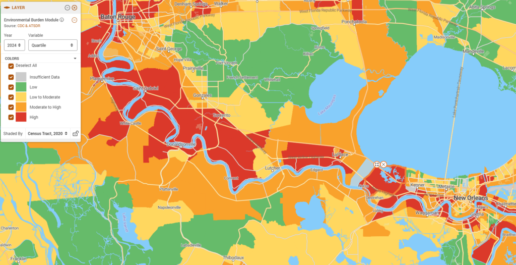
Deprivation and Environment: Cancer Alley and What the Air Costs
Cancer Alley is an 85-mile stretch of the Mississippi River between Baton Rouge and New Orleans home to more than 150 petrochemical facilities — the largest concentration of fossil fuel and chemical plants in the Western Hemisphere. The communities that sit alongside them are small, rural river parishes: Reserve, Convent, Geismar, St. Gabriel — communities with populations in the thousands, on land that was, not long ago, agricultural. Majority Black, historically under-resourced, and carrying some of the highest environmental burden scores in Louisiana, these communities have been documenting the health consequences for decades. The data now maps those consequences precisely.
The first map shows the Environmental Burden Module, a composite measure of environmental exposure and hazard burden, at the census tract level across the Cancer Alley corridor. The pattern is unmistakable: communities in the highest burden quartile (red) line the Mississippi River almost continuously from Baton Rouge to New Orleans — Saint Gabriel, Donaldsonville, White Castle, Convent, Lutcher, Edgard, LaPlace, Norco. As the river curves, the red follows. Move a few miles inland and the burden score drops to green. The industrial siting history of this corridor is visible in the data, and the communities bearing the highest environmental burden are the same small, rural parishes that have been documented for decades as carrying disproportionate cancer risk.
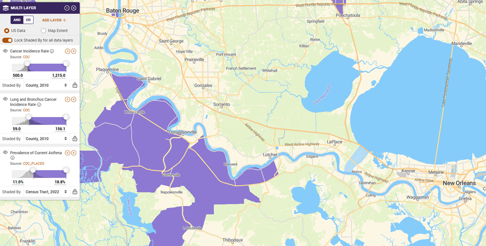
The second map layers three health outcomes across the same geography: overall cancer incidence rate, lung and bronchus cancer incidence rate, and current asthma prevalence. The asthma layer is not incidental. It is the most immediate respiratory signal of chronic petrochemical exposure — the same exposure that, over years and decades, produces elevated lung cancer rates. Where environmental burden is highest on the first map, all three outcomes are elevated on the second. The geography matches because the causes are the same.
Each section of this piece highlights a different barrier — transportation in Detroit, financial hardship in Appalachia, language and insurance in South Texas, environmental exposure in Cancer Alley. But that framing understates the reality. These communities are not facing one problem each. They are facing many, simultaneously. Detroit’s car-free households also contend with high poverty rates, decades of municipal disinvestment, and some of the highest rates of chronic disease in the Midwest. Appalachian Kentucky and West Virginia carry the weight of a collapsed extractive economy, a behavioral health crisis, and among the worst workforce shortages in the country. South Texas border communities navigate immigration status as an additional layer on top of language and coverage barriers — one that suppresses healthcare utilization far beyond what uninsurance rates alone can measure. And Cancer Alley is not just an environmental story. It is a racial justice story: industrial facilities sited in predominantly Black communities over generations, compounding environmental risk with every other dimension of structural disadvantage.
What these maps show is a fraction of what these communities are managing. No single dataset, no single screening tool, and no single policy intervention captures the full picture. The value of place-based data is not that it solves the problem — it is that it makes the convergence visible, and forces a more honest accounting of what equitable care actually requires. No clinical screening tool asks what is being released into the air from the plant a mile away. Houston’s Manchester neighborhood — a predominantly Hispanic community adjacent to oil refineries on the city’s east side — shows cancer and respiratory rates that mirror the Cancer Alley profile almost exactly. Richmond, California, home to a major Chevron refinery, has documented the same pattern for years. The industry moves. The health burden stays. And the communities left behind are almost never facing just one barrier.
What Equitable Cancer Care Requires
The barriers documented in this piece are severe — but they are not random, and they are not invisible. They are mappable. And programs that understand their community’s geography can act on that knowledge in concrete ways: allocating navigator resources before patients present at a crisis stage, designing transportation assistance around where car-free households actually live, identifying which zip codes face the sharpest coverage cliffs, and making the evidence-based case to funders for community-specific investments that individual screening data alone cannot support.
Individual SDOH screening is a necessary first step. But the most effective cancer programs will pair that patient-level data with community-level intelligence. The goal is not just identifying which patient needs a ride to their next appointment — it is understanding which neighborhoods have been structurally cut off from the care infrastructure, and building programs that reach those communities before the missed appointments start.
The four communities examined here — Detroit, Appalachian Kentucky and West Virginia, South Texas, and Cancer Alley — are not outliers. They are illustrations of patterns that repeat across every region of the country. The geographic data to find every convergence point exists. Programs that use it will be better positioned to intervene early, allocate resources efficiently, and demonstrate to funders and leadership that equity investments are targeted, measurable, and working.
PolicyMap’s Social Determinants of Health data — transportation access, financial stability, limited English proficiency, environmental burden, cancer incidence and mortality, chronic conditions, and more — gives cancer programs, health systems, and their partners the geographic foundation to move from observation to action. Whether the goal is placing a patient navigator where the need is sharpest, identifying communities with the deepest coverage gaps, or understanding why treatment adherence breaks down in a specific region, the analysis starts in the same place: knowing where the barriers are, and who is already being left behind.
Request More Information
The communities farthest from cancer care infrastructure are often the easiest to overlook — until the data makes them visible. Ready to see where transportation, financial, language, and environmental barriers converge in your service area? Contact PolicyMap to request a demo and data walk-through.