
Assess Hospital Quality of Care with the Hospital Compare Dataset

Data
Hospital Compare: Quality of Care
Source
Centers for Medicare and Medicaid Services (CMS) & Health Resources Services Administration (HRSA)
Find on PolicyMap
- Health
- COVID-19
The ability to assess key quality of care measures across different hospitals can help researchers, policymakers, insurance providers, and even individuals begin to assess trends in health care in a given area. To understand how those trends relate to the communities they serve, one could map the Hospital Compare dataset with other indicators on PolicyMap such as insurance status, predominant race/ethnicity, poverty, or transportation data. This comparison data is vital when considering Americans are spending an ever-increasing amount of money on health care. According to the American Medical Association, healthcare costs have increased almost 5% from 2018 to 2019, and this trend has continued and even increased throughout the pandemic. These rising costs have even more of an impact on uninsured families and households who must pay out of pocket for health care. Knowing which hospitals have the best quality of care measures can help make the most out of the money spent on healthcare. In order to make those comparisons more meaningful, the PolicyMap team has updated this dataset with the latest key hospital measures and ratings from the Centers for Medicare & Medicaid Services.
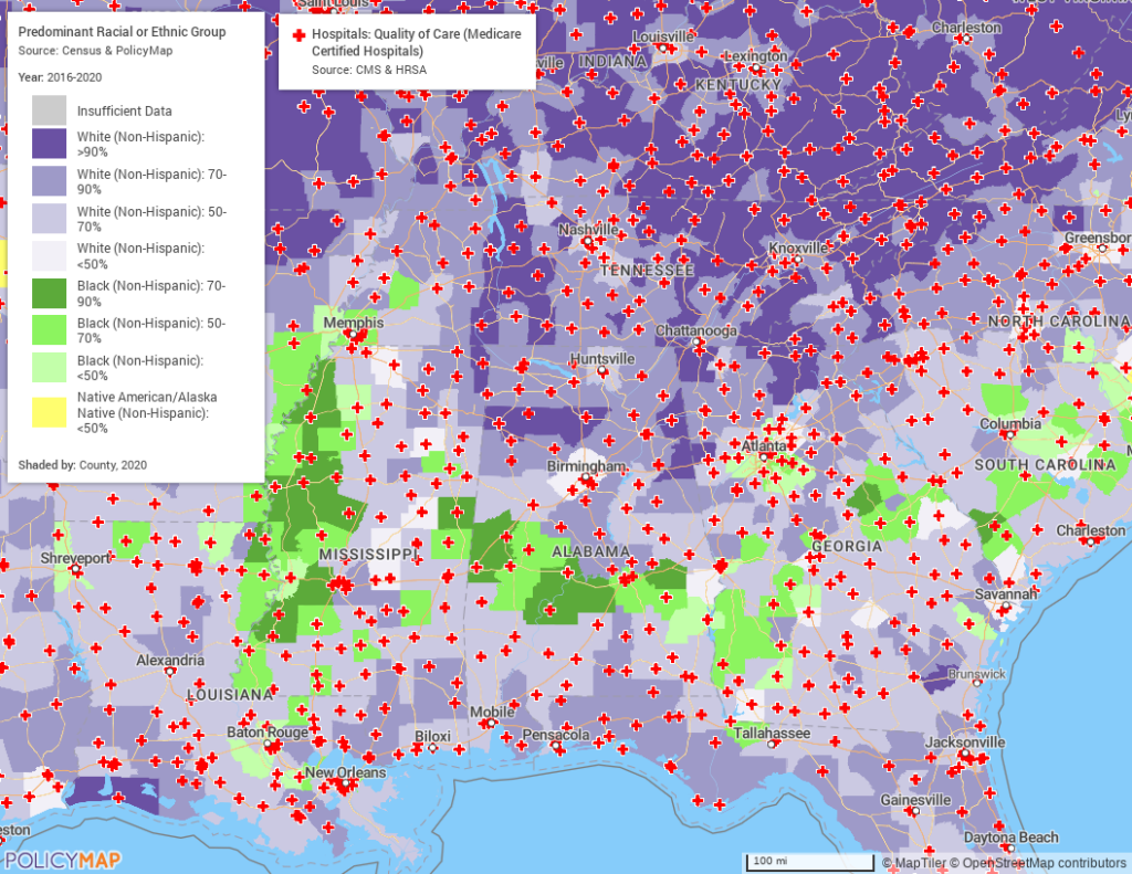
Hospital quality of care and predominant race
We know that social determinants of health can have a major impact on a person’s health outcomes and overall quality of life. Having access to high quality health care can help improve those outcomes and minimize disparities. With that in mind, we’ve displayed predominant race/ethnicity and the overall Hospital Compare dataset showing all Medicare certified hospitals across the southern portion of the US. In looking at that map we see a fairly even geographic distribution of hospitals across the region with clusters in urban population centers as one might expect to see.
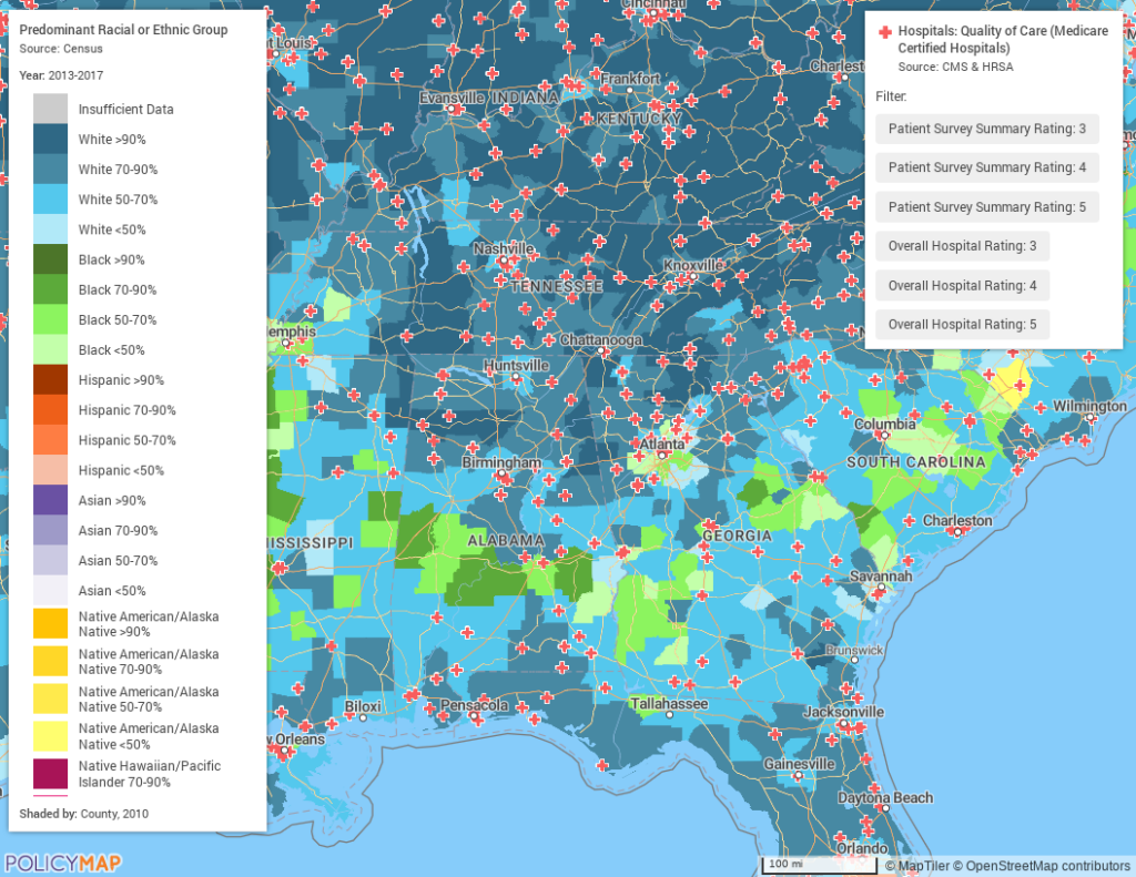
Taking this a step further, we now have used the filter option to look only at hospitals with the highest patient survey and overall ratings. These ratings are on a scale of 1-5, one being the lowest, 5 being the best. We selected only hospitals with a ranking of 3 or higher in these two categories. We now see in areas that are predominantly Black, there are fewer highly rated hospitals, especially outside of urban areas.
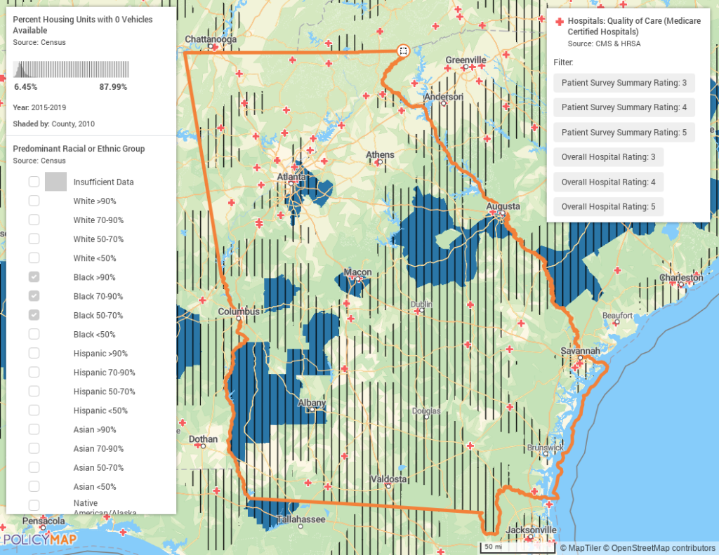
Lack of transportation in rural areas
Further narrowing out view to focus on the state of Georgia, we can use a multi-layer map to show counties that are predominantly Black and have higher than the state average rates of housing units for which no vehicles are available. Quite a few hospitals fall within the areas with fewer cars per housing unit, but almost none of the highly ranked hospitals fall in the areas that are predominantly Black and have limited access to vehicles.
Knowing hospitals’ quality of care in a given area is important as this helps shape the overall health outcomes and quality of life for residents in that area. Areas with lower ranked hospitals may be able to use these types of analyses to begin formulating plans to increase their rankings, while higher ranked hospitals can investigate ways to further solidify their rankings and address some of the disparities.
These maps only show a few of the different filters and options offered by the Hospitals Quality of Care Dataset. Interested in digging deeper? Contact us.