
HMDA Data for 2009 is Now Available on PolicyMap!
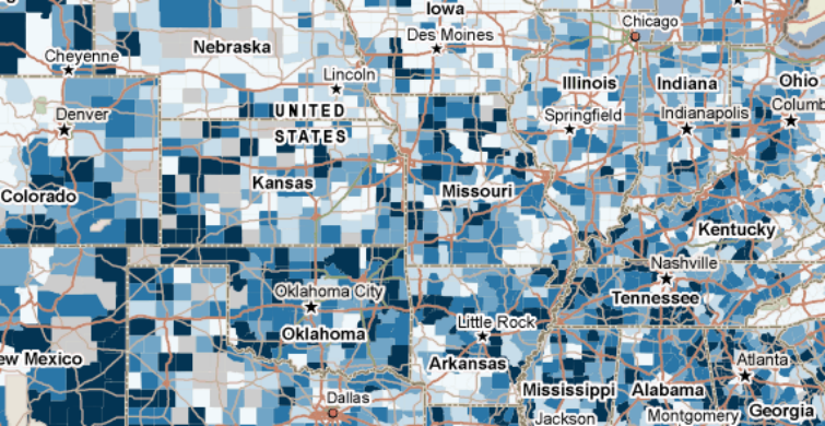
The 2009 HMDA data reflect the ongoing difficulties in the housing and mortgage markets that began appearing in 2007. As a user, you will find sharp decreases in originations, regardless of race, ethnicity or income. One of the more notable trends in this data is the growing percentage of government-insured loans in communities across the nation. Check out the county-level time-series map below to see how the rate of government-insured loans has changed from 2004 through 2009. The darkest purple counties on the map represent those counties where more than 41% of the mortgages originated in each year were insured by the government.
Click to open the animated map and see the growth of government insured loans.

![]()