
Map Racial and Ethnic Inequality in Your Community
Though much progress has been made, there are still vast racial and ethnic disparities that exist in our communities today. Having an understanding of these disparities and their ongoing impact on different racial and ethnic groups is a vital first step in working toward equity.
SEE POLICYMAP IN ACTION
Mapping inequality is difficult, and even more so without the right data.
That’s why PolicyMap has compiled these resources and solutions to help you get started on mapping and analyzing disparities. How might you use our data to examine inequality in your community?
Real World Solutions


Access to Homeownership
It has been shown that homeownership is one of the primary ways to build wealth in the United States today. However, the lasting impacts of redlining and discrimination make the possibility of homeownership very difficult for Black and Latino Americans.
The following series of maps shows the percentage of home loan denials, predominant racial or ethnic group, and bank branch locations.
The first map displays areas where more than 25% of home loan applications have been denied (dark purple areas). You can look at these areas in comparison to a map of areas that have higher percentages of minority populations in Orlando (orange and green shading on the map) and see that they align.
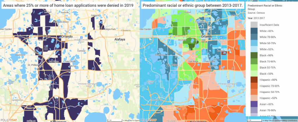
Based on these previous maps, you may want to understand if proximity to a bank branch increases the likelihood of accessing a home loan. By layering on bank branch locations, you can see that physical bank branch locations within Orlando’s city limits are plentiful. We can see that, although minority populations are served by banks in Orlando, albeit far less than neighboring predominantly white neighborhoods, we can conclude that close proximity to bank branches does not guarantee access to fair lending for Black and Hispanic applicants.

Achievement Gap
Another way to look into racial and ethnic disparities is through access to the internet. Now, more than ever, internet access is a vital part of everyday life. Some even argue that it should be treated as a public utility or a human right. We’ve seen the proliferation of telecommuting and distance learning during the COVID-19 pandemic, and those without internet access are being left out.

ON THE BLOG
Racial Inequities in Education Exacerbated by COVID-19
Identifying which students are at higher risk of falling behind and needing support is key to addressing inequality exacerbated by the pandemic.
CUSTOMER STORY
First Book
First Book, a nonprofit social enterprise that provides new books and resources to educators serving kids in need, uses PolicyMap to identify “resource deserts” and ensure resources get distributed to those who need them most.

CASE STUDY VIDEO
Computer & Internet Access
University of Delaware sociology professor Dr. Victor Perez uses PolicyMap to educate students about the geography of environmental injustice.
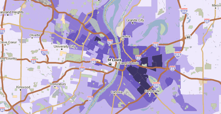
What patterns do we see in internet access in New Orleans? The two maps in this section show the relationship between households without any type of computer and predominant race in New Orleans.
In the first map we see that the areas in darkest purple are those where nearly a quarter of all households have no internet access.
We are then able to compare that map to a map of predominant race. In this map the green shading represents areas with > 50% Black residents, while the blue shading represents areas with >50% White residents. We are able to see that the areas with the least internet access are areas with the highest percentage of Black residents.
Environmental Justice
Environmental justice issues are one of the many ways to look at racial and ethnic disparities. If we were to ask the question, which communities in Philadelphia are the most likely to live near polluted areas, mapping could illuminate the answer.
VIDEO
Using PolicyMap to Teach Environmental (In)Justice
University of Delaware sociology professor Dr. Victor Perez uses PolicyMap to educate students about the geography of environmental injustice.
The following map provides one way to go about finding this answer. The data available on PolicyMap allows one to look further into disparities by layering Census data (like race, income, education, etc.) with environmental hazards.
In this instance, we see predominant racial or ethnic group Census data layered with EPA brownfield sites in Philadelphia. According to the EPA, Brownfield sites are locations that may be deemed hazardous due to either contamination and/or pollution. These sites then undergo testing to determine the severity of the contamination and how to move forward with cleanup if necessary.
Taking a look at the map, it is clear that the vast majority of these sites are located in neighborhoods that are either predominantly Black or predominantly Hispanic (darker green or orange on the map). This is only one of the many types of spatial analyses that are possible with PolicyMap.
Disproportionate Impact of COVID-19
The COVID-19 pandemic has made it clear that racial and ethnic disparities in health care and access to medicine are still prevalent today. We know that these disparities exist, but we can dig deeper to find out which populations are at highest risk for COVID-19 and also more likely to be uninsured.

ON THE BLOG
New Study Can Help Target COVID-19 Vaccines
A new study shows two tools that help people understand their risk of dying from COVID-19 based on where they live, along with their socioeconomic information and certain health conditions.

ON THE BLOG
The Risk of COVID-19 Spread in Intergenerational Households
The spread of COVID-19 has put intergenerational households at high risk, making it critical for health officials to be able to identify them.
For this question, we will be looking at the city of Columbia, SC. In the first map we see the intersection of populations that are at risk of developing severe COVID-19 symptoms layered with areas where more than 10% of the population is uninsured. The residents in these areas are at a higher risk of developing severe COVID-19 symptoms while also being less likely to have insurance to cover the costs of medical bills associated with the treatment of their symptoms.
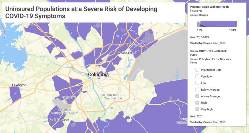
We are then able to compare that risk map to a map of predominant race. In this map, the green shading represents areas with >50% Black residents, while the blue shading represents areas with >50% White residents. Comparing the shading on the two maps reveals a pattern of vulnerability to severe COVID-19 challenges among predominantly Black communities in the Columbia, SC area.
Data on Racial and Ethnic Disparity
These datasets can help jump start your analysis on racial and ethnic disparities.
Census Data
U.S. demographic information including race
Social Vulnerability Index
Populations most vulnerable to human-made disasters and extreme weather events
Segregation Index
Racial and ethnic segregation across communities in the U.S.
Historic Redlining
Systematic and discriminatory lending practices based on race or ethnicity
Mortgage Lending
Home loan denials by race and ethnicity
School Performance
Performance of schools serving minority and low-income students
Economic Mobility
Social and economic conditions of adults based on place of childhood
Contact Us
Interested in to learning more about PolicyMap, exploring our data warehouse, scheduling a personalized demonstration, or getting a quote?
Share a bit about yourself and your work, and we’ll be in touch in short order.
Blog Posts on Racial and Ethnic Disparities

Using PolicyMap Data to Find Equity at the Intersection of Housing and Opportunity in the US
PolicyMap is a one-stop shop for visualizing nationally available data that can facilitate the open conversations needed to guide the implementation of fair housing practices in neighborhoods across the United States.

Using Historical Data to Inform Future Fair Housing Policy
While federal fair housing protections have been recently reintroduced, fair housing advocates suggest more is needed to ameliorate the numerous effects of historic unfair lending practices on today’s Americans.

Digging Deeper into Racial Disparities
Mapping race, income, incarceration, lending practices, and more can help shed light on some of the underpinnings of racial inequities.

Racial Disparities Magnified by COVID-19 Cases and Deaths
Mapping data on race alongside health and occupation data shows which neighborhoods may be hardest hit by the COVID-19 outbreak.

Addressing Racial Inequality by Investigating Mortgage Denials
New mortgage denial data shows how certain racial groups face greater challenges getting home loans, denying them a crucial tool in generating wealth.
Internet Access Disparities Highlighted in All-New Maps from PolicyMap
According to recent Census data, some city neighborhoods are severely lacking in internet access. See how the digital divide affects your city.
Explore factors driving the racial wealth gap, such as disparities in homeownership, educational attainment and income, using PolicyMap.
Customer Stories
See firsthand examples of how PolicyMap subscribers have used data to study disparities in their communities.

By using PolicyMap, the students were able to identify areas in Waco where families were living in poverty. Using the data uploader, the students located the supermarkets in these communities so that the Diaper Bank could reach an agreement with stores to donate one pack of diapers to the Diaper Bank for every pack sold.

To identify gaps in child care access in Philadelphia, the William Penn Foundation supported an analysis of existing child care services and childcare demand using locally available data. The results of the analysis were put on a PolicyMap Integrated Mapping Tool, along with other helpful indicators showing the number of young children and existing childcare resources, like certified and uncertified child care centers, and Head Start centers.
The tool also uses other data to show potential locations for new or expanded child care facilities, like previously certified centers and for-sale school district buildings. This gave providers a tool for siting new child care centers, gave investors and policy makers a tool for targeting resources to increase high-quality child care access, and gave parents a tool for finding high-quality child care centers near where they live and work.