
Racial Disparities Magnified by COVID-19 Cases and Deaths

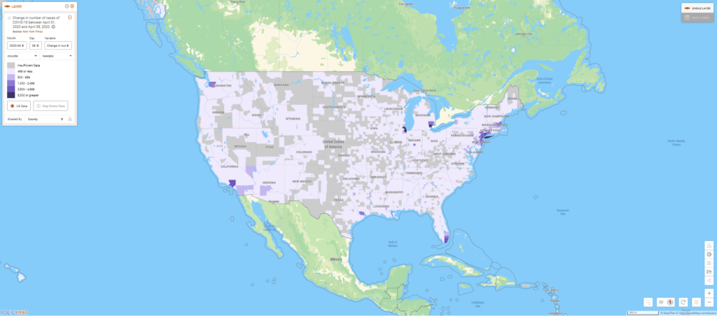
As the United States becomes the world’s largest hot spot for COVID-19 cases and deaths, tracking the disease is essential for mitigating loss of life and identifying trends. Tracking, paired with demographic, health and jobs data, reveals that in some places, specific groups may be disproportionately affected by the virus. With new data from the New York Times, along with community level indicators on PolicyMap, we can now track changes and understand trends in confirmed cases and deaths due to COVID-19 daily.
The new daily data shows us that Detroit (Wayne County), Chicago (Cook County), and New York City (New York, Kings, Queens, Bronx, Richmond, and surrounding counties) have faced the highest increases in new cases of COVID-19 over the past week.
In Chicago, the exponential growth in cases is clear:
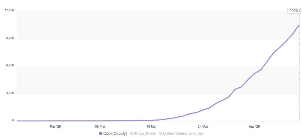
Taking a closer look at Chicago, some trends in COVID-19 cases and deaths there have emerged, revealing racial disparities that have attracted national attention. An analysis of COVID-19 patient demographics in Chicago shows that the illness is disproportionately killing African Americans. Nearly three quarters of those who have died of severe COVID-19 were African American, while only 30% of the population in Chicago is African American.
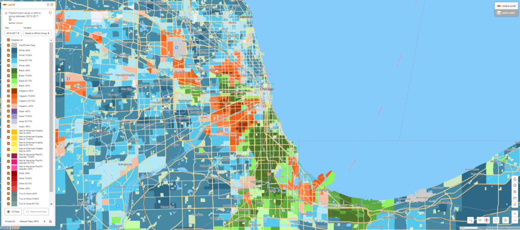
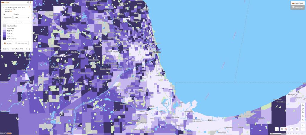
Comparing a map of race and ethnicity in Chicago to life expectancy shows that even before this pandemic, African Americans (shown in green in the first map, below) tended to live shorter lives (shown in light purple in the second map, below), partly because these populations tended to have higher rates of chronic diseases.
Some chronic conditions identified by the CDC, such as hypertension, can exacerbate COVID-19 respiratory symptoms to become life-threatening. Mapping hypertension at the neighborhood level in Chicago shows that African American communities tend to be harder hit by these health conditions that carry higher risks of severe COVID-19, as well.
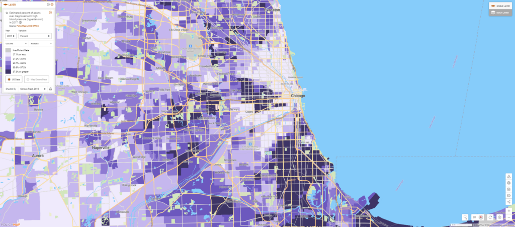
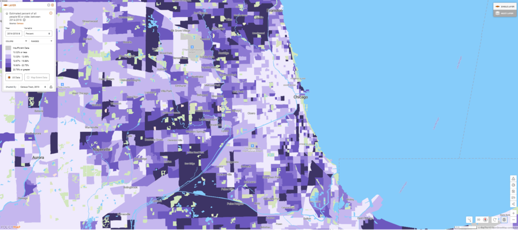
These neighborhoods also have a higher concentration of older adults—another group that is more likely to die from severe COVID-19.
Until a vaccine is developed for this virus, the best way to prevent these deaths is to stop transmission of the virus in the first place. Chicago has a stay-at-home order in place already, but many Chicagoans still need to leave the house for work, bringing them into contact with potentially infected people along their commutes and in their workplaces.
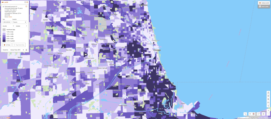
Mapping occupational data reveals that in many African American neighborhoods, a high proportion of residents work in healthcare support, which includes jobs such as orderlies, phlebotomists, and nursing assistants. As hospitals fill with COVID-19 patients, these workers may be more likely to become exposed to the virus or to bring the virus home to their families. Ensuring that all hospital support workers have access to appropriate Personal Protective Equipment and that their workplaces follow best practices to reduce “occupational transmission” could help limit infections in some of these neighborhoods.