
The New PolicyMap Is Coming Soon
Get ready to dig deeper. The New PolicyMap is loaded with features designed to make it simpler for you to interpret data, integrate powerful insights into your organization’s workflow and make impactful decisions.
A host of new and improved features are coming your way, but we thought it important to highlight a few which will have the greatest impact on your work.
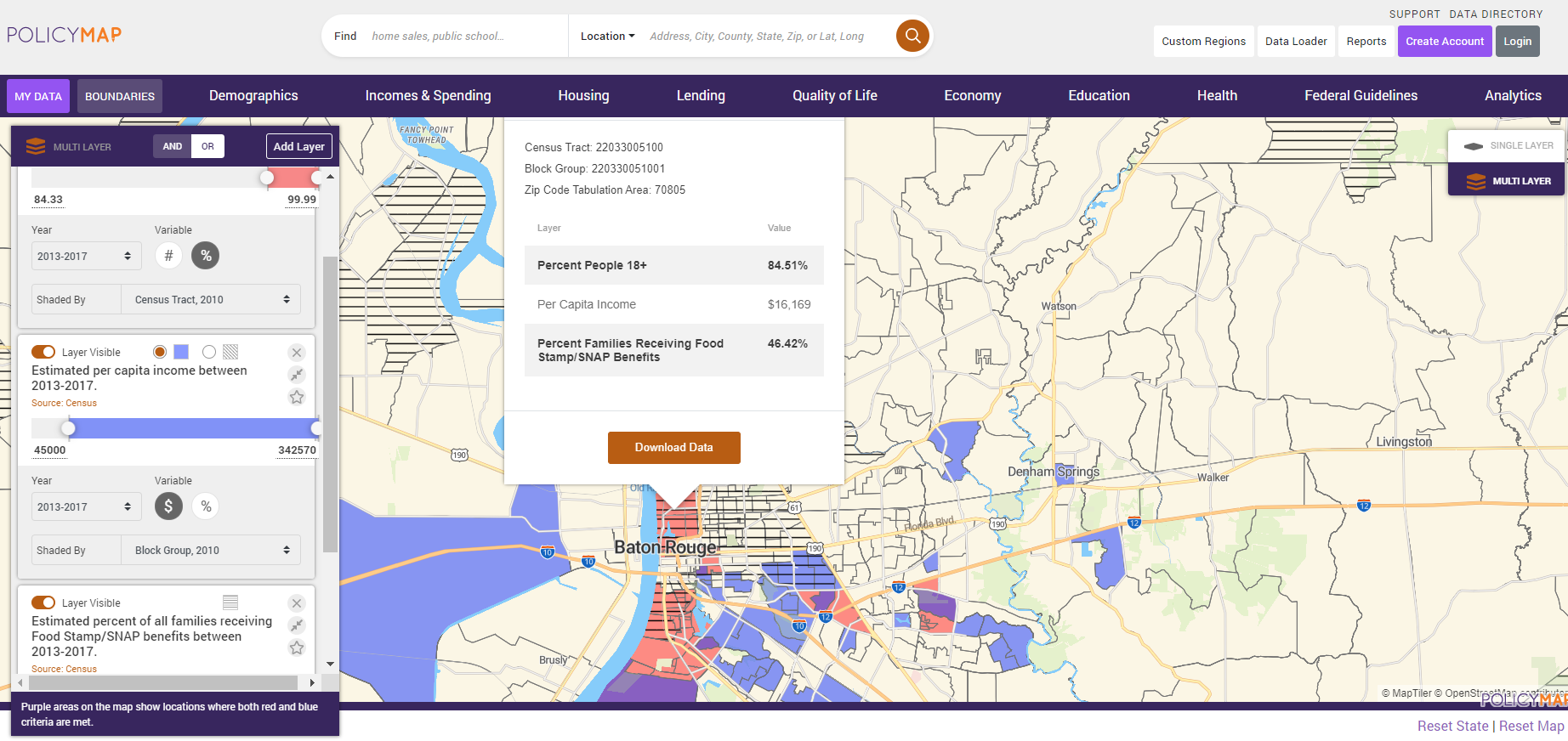
Multi-Layer Maps: Multi-Layer Maps gives you the ability to filter areas on a map that meet all of the criteria in which you are interested or layer data that will enable you to show areas that meet any combination of criteria you want. With Multi-Layer Maps you can filter or layer up to 5 indicators on the map using both colors and hatch marks. Equally as important, you can combine any data, regardless of the geography at which the data is available. This means you can look at census tract level data, with zip code level data, with county level data and so on. Why is this so important? Because as much as we all want data to be available at all geographies, it simply isn’t. If, for example, you work in the health care field and need to find neighborhoods most in need of pediatric doctors who accept Medicaid, you may want to identify those neighborhoods where:
- a high percentage of children who are under the age of 18 live,
- a high percentage of households claimed the Earned Income Tax Credit on their income tax return,
- chronic illnesses are prevalent,
- the population tends to be socially vulnerable, and
- sit in medically underserved areas.
This data is all available but it comes at varying geographies from multiple sources, making analysis complicated. With the New PolicyMap, you can easily combine this data in Multi-Layer Maps to pinpoint the specific areas where you need to focus your attention. You won’t find this in any other mapping application on the web.
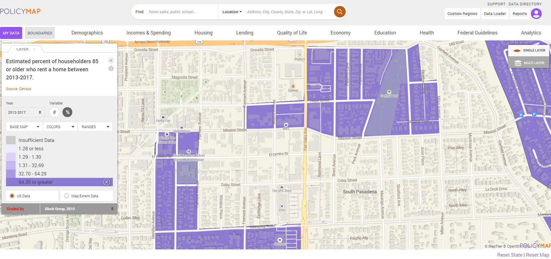
Twenty Two Zoom Levels: Get ready to view and analyze everything from state level data all the way down to parcels. Whether you are tracking vacancy in your city, identifying parcels for development in select Opportunity Zones, or finding buildings to target your initiatives for the elderly, you need these additional zoom levels.
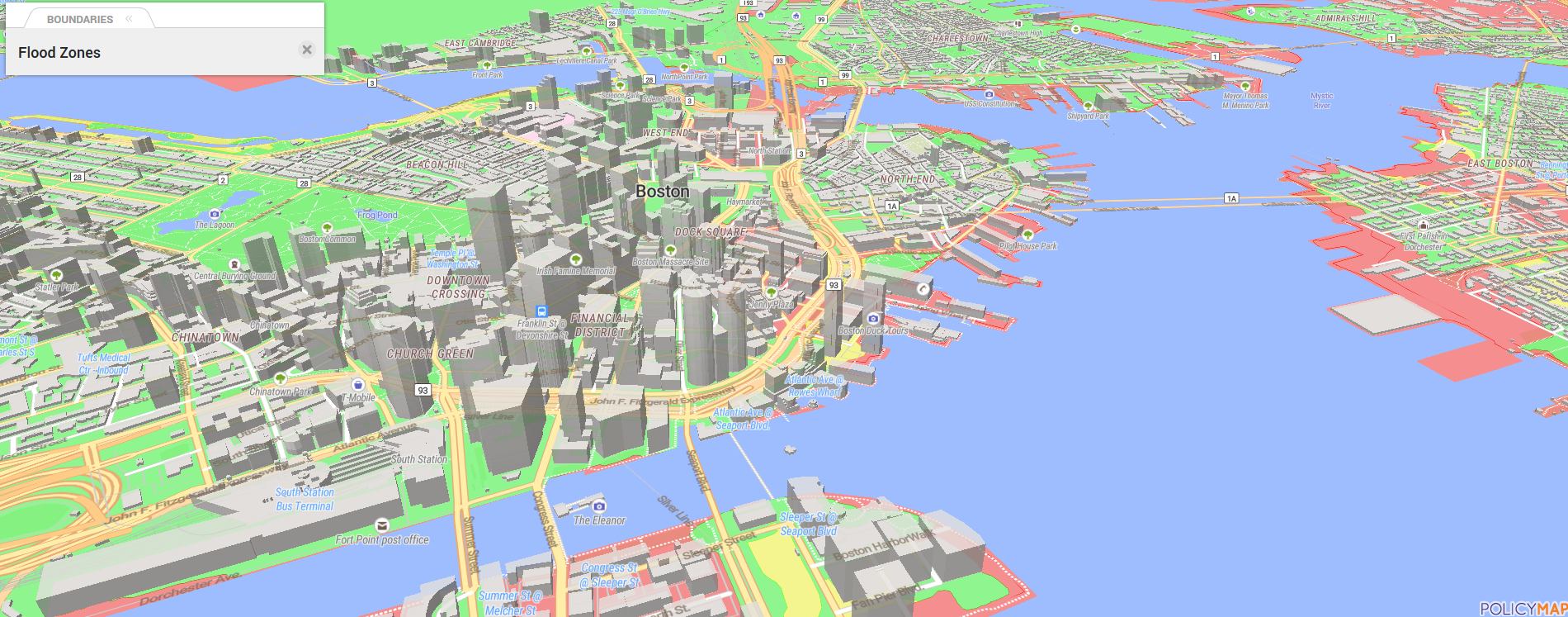
3D Mapping: Visualize data while seeing the renderings of actual buildings in most cities. Imagine seeing the actual buildings that sit within a flood zone – all with a few clicks of the mouse.
Ever wish you could:
- Change the basemap?
- See trends on the map?
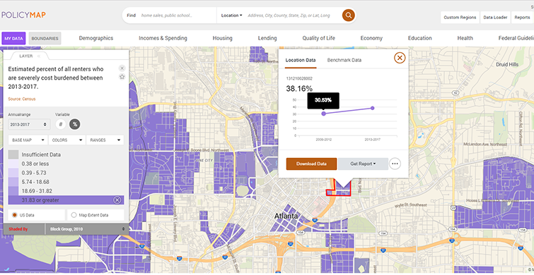
- Edit your custom region after you build it?
- Edit the color and line styles/weights of boundaries on your map?
- See indicator value frequencies being displayed on your map?
- Use the maps on a tablet or other mobile device?
Coming in January 2020, all of this will be at your fingertips, but we are ready to start showing it off now! Want a sneak peek? Just contact us for a demo. We can’t wait to show you what’s in store.