
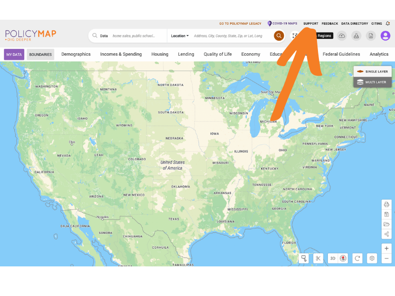
PolicyMap Support
Our mapping application, analytics platform, and data licensing services are built for non-GIS professionals, data-literate researchers, and everyone in between. We’ve created helpful tutorials, videos, guides and other resources to help you get started or find answers. Need additional assistance? Use the form below to connect with our support team.
Jump Into Making Maps
We have created a Quick Start video for those who wish to jump right into PolicyMap. The Quick Start video will walk users through how to make a map and also customizing data layers and points. You’ll learn how to search for specific addresses, locations or census tracts, find and add data to your map, use the identify tool to see the data behind the map and use the features loaded into the legend.
Subscriber Knowledge Base
Discover curated resources to support your learning journey.
ACCESS POLICYMAP’S KNOWLEDGE BASE
Guides, Tutorials & Videos
Whether you’re new to PolicyMap or a data-literate researcher, we’ve created guides to help you dig deeper into our maps and data.
Our Knowledge Base is only accessible to subscribers.
Contact Support
Didn’t find the answer you were looking for in our Knowledge Base? Found a bug? Please submit your question or comment to our support team in the form on the right.
We’re available to assist you Monday through Friday between 9AM – 5:30PM EST. We are a small but mighty team, please be patient.
Join Open PolicyMap Training Sessions
There are over 60,000 predefined maps and many unique features, so we invite anyone to join a free online training session to learn more about PolicyMap. Sign up for a session here: PolicyMap Training Calendar.
Sessions are open to both subscribers and non-subscribers. Course times rotate weekly. Can’t find a time that works for you? Contact us.

Level 1: Learning the basics of PolicyMap
This overview will cover: basic user interface (searching for locations, loading datasets, saving & printing), unique custom functionality (creating custom boundaries, editing ranges, customizing colors, etc), and highlighting specific datasets. We will have plenty of time for questions and answers.
Level 2: Learn the Data Loader, Multi-Layer Maps, and other Advanced Features
In this session, we will cover the more advanced features of PolicyMap including the Data Loader, Data Download, and Multi-Layer Maps. The Data Loader allows subscribers to quickly upload a point (address) dataset. Downloading Data is as simple as a few clicks. The Multi-Maps feature is the ability to overlay up to 5 layers of data. This session will also offer plenty of time for questions and answer, and time permitting, a chance to go through a user case study.
Contact PolicyMap

Phone
1-866-923-MAPS (6277)
We’re available to assist you between 9AM & 5:30PM EST.
