
Analyzing Housing Supply and Affordability in Chicago Neighborhoods

With PolicyMap and Moody’s Analytics’ new Housing Gap Analysis, the scope of Chicago’s housing challenges is clear–nearly every neighborhood from Logan Square to Pilsen, Albany Park to Bridgeport shows some degree of undersupply. Yellow marks modest shortage, orange signals substantial shortage, and together they paint nearly every corner of the city. This isn’t a story of isolated shortages in a few hot markets; it’s a citywide imbalance with profound implications for who can afford to live in Chicago.
By layering Moody’s Housing Gap Estimates with Census home values, we can see exactly where scarcity drives up costs, where oversupply masks deeper problems, and why solving Chicago’s housing shortfall requires both citywide reforms and neighborhood-specific strategies.
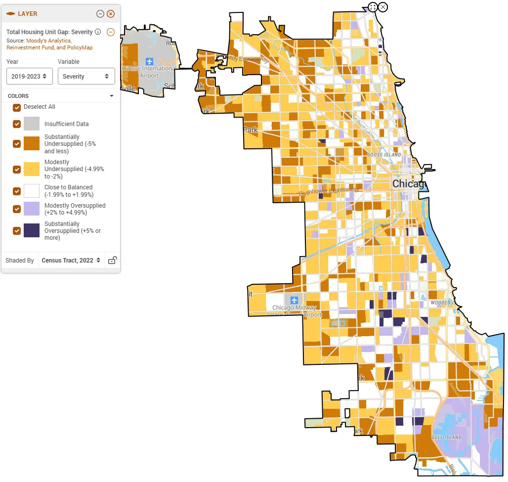
The map above reveals the extent of the problem. Yellow and orange (undersupply) dominate nearly every census tract across the city. Only scattered pockets of beige (balanced) and purple (oversupplied) break the pattern.
Understanding the Data
Moody’s Analytics Housing Gap Estimates measure housing shortage and surplus at the census tract level by comparing current vacancy rates to each city’s historical equilibriumdefined as the average vacancy rate when the market was most stable between 2012 and 2018. This represents a period after the housing market crash and before the COVID-19 Pandemic. When vacancies fall below this equilibrium, the study suggests that a shortage exists; when they exceed it, a surplus exists. This methodology, detailed in our white paper with Moody’s, provides a more nuanced view than simple inventory counts by accounting for what constitutes a balanced market in each specific city.
The data categorizes every tract by severity:
- Substantially Undersupplied (-5% or less): dark orange
- Modestly Undersupplied (-4.99% to -2%): yellow
- Close to Balanced (-1.99% to +1.99%): beige
- Modestly Oversupplied (+2% to +4.99%): light purple
- Substantially Oversupplied (+5% or more): dark purple
U.S. Census ACS data (2019-2023) provides estimated median values of owner-occupied homes at the census tract level, allowing us to observe how shortage conditions correlate with property values.
Together, these datasets reveal precisely where Chicago’s housing shortage drives up costs, and where oversupply signals something other than market health.
Chicago’s Housing Challenge: Near-Universal Undersupply
Chicago’s map reveals systemic undersupply across the entire city, in wealthy neighborhoods and working-class communities, in established areas and transitioning ones. Yellow and orange dominate from the North Side through the Northwest and West Sides into the Southwest Side. Beige (Close to Balanced) appears scattered between neighborhoods but represents only a small fraction of the city. Purple (oversupplied) concentrations remain rare, limited to downtown pockets, the far southeast, and specific South Side neighborhoods.
The few oversupplied areas tell two distinct stories. Downtown shows modest oversupply alongside high values–suggesting perhaps that luxury construction exceeded immediate absorption. South Side neighborhoods show substantial oversupply alongside low values–implying either a surplus created perhaps by a history of population loss or recent gentrification, where new units have not yet been absorbed into the market.
Logan Square: Balanced Core, Undersupplied Surroundings
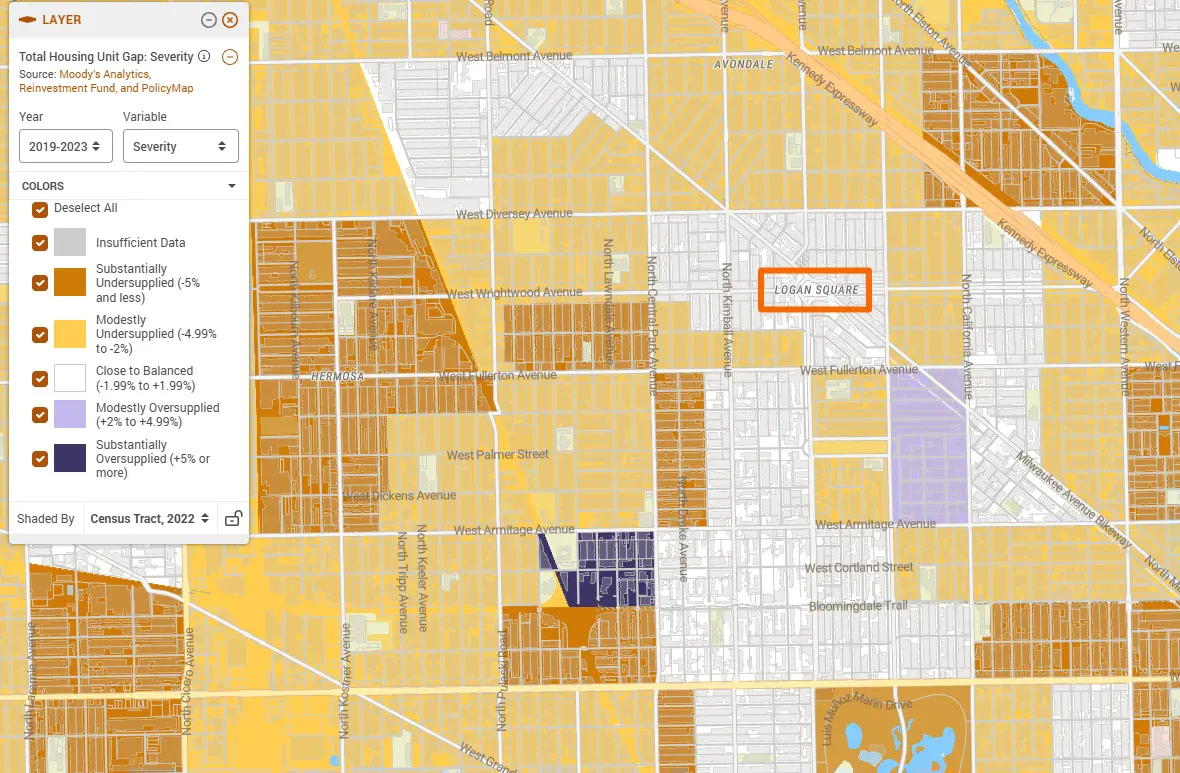
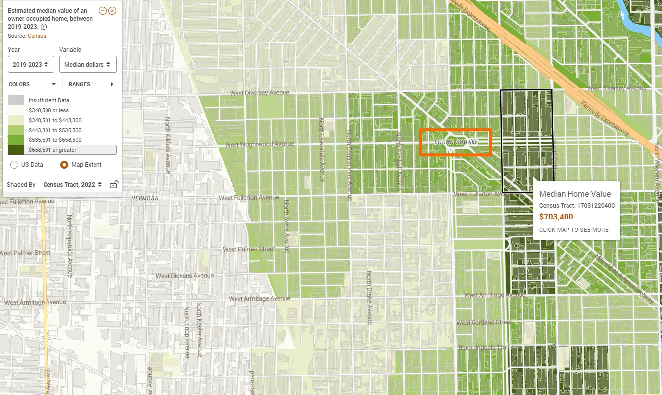
Logan Square’s center shows Close to Balanced supply, yet it’s surrounded by Substantially Undersupplied neighborhoods to the north, west, and south. The highlighted census tract shows a median home value of $703,400, with the broader area ranging from $535,000 to over $700,000.
A household earning $75,000, roughly a Chicago teacher’s salary, can afford approximately $300,000. To afford Logan Square’s median home, households need an income exceeding $175,000. The neighborhood that once housed working families now serves primarily high earners, with prices reflecting citywide scarcity rather than local supply alone.
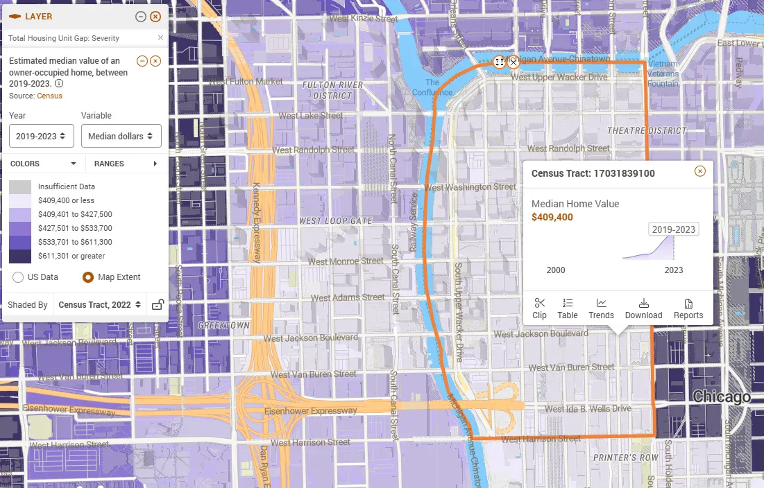
Pacific Junction: Oversupply Without Affordability
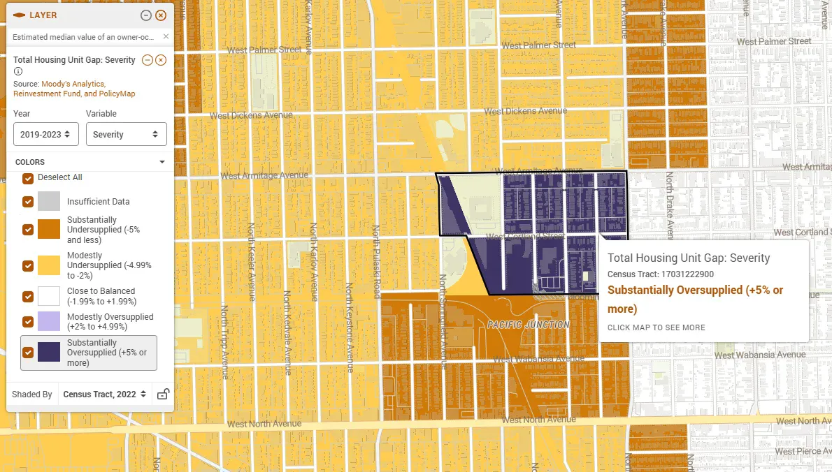
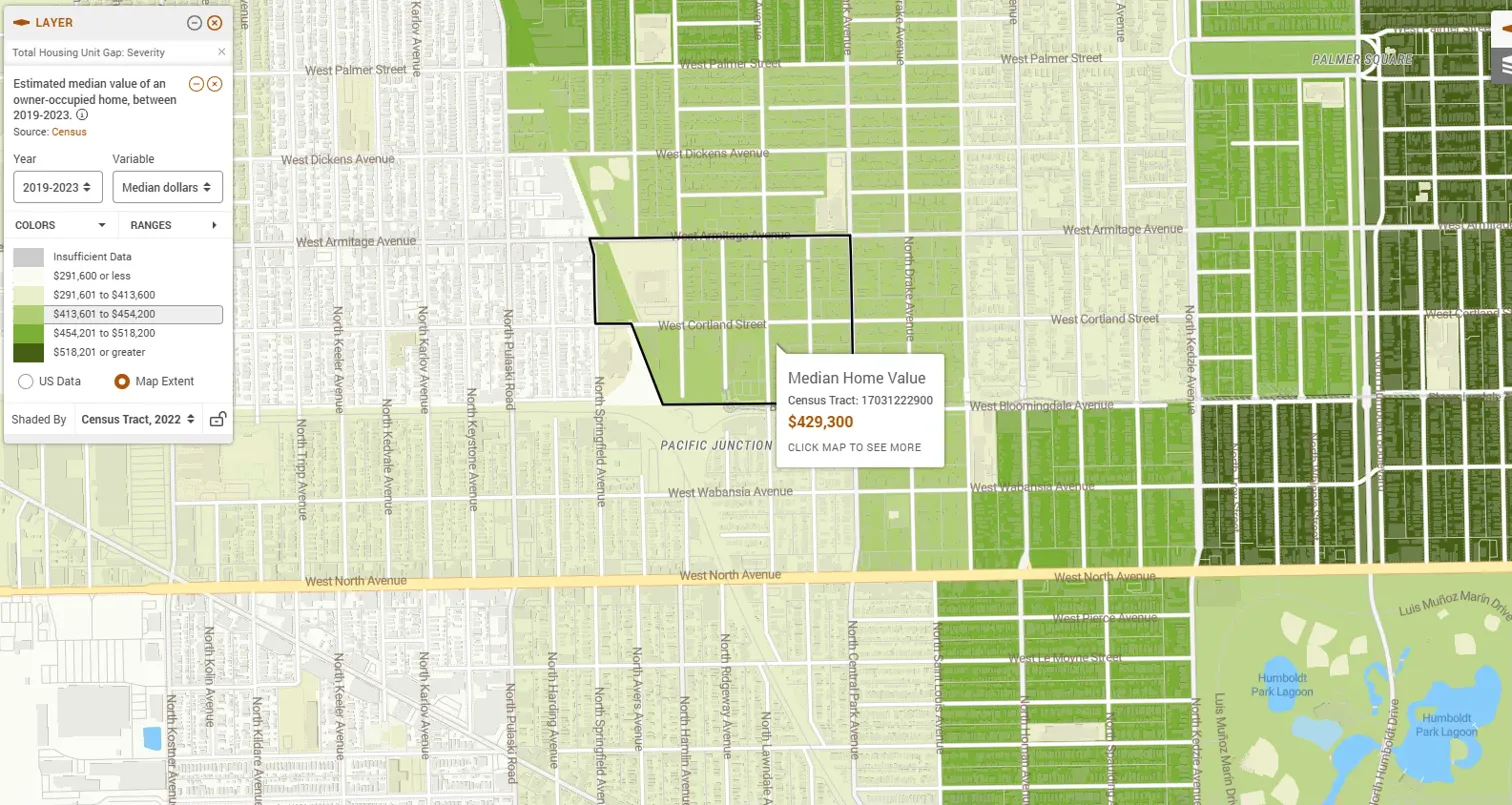
Just blocks from Logan Square, this corner of Pacific Junction shows Substantial Oversupply (+5% or more), perhaps from new condo construction that outpaced demand. Yet Census Tract 17031222900’s median value of $429,300 remains unaffordable for middle-income households needing $300,000 price points. Even one of Chicago’s most oversupplied census tracts sits above workforce affordability.
Market-rate construction alone won’t deliver middle-income housing. Oversupply brought values down $274,100 in neighboring census tracts, compared to Logan Square’s $700,000+, but couldn’t reach the price points working families need without policy intervention.
Lincoln Park: When Desirability Overrides Supply
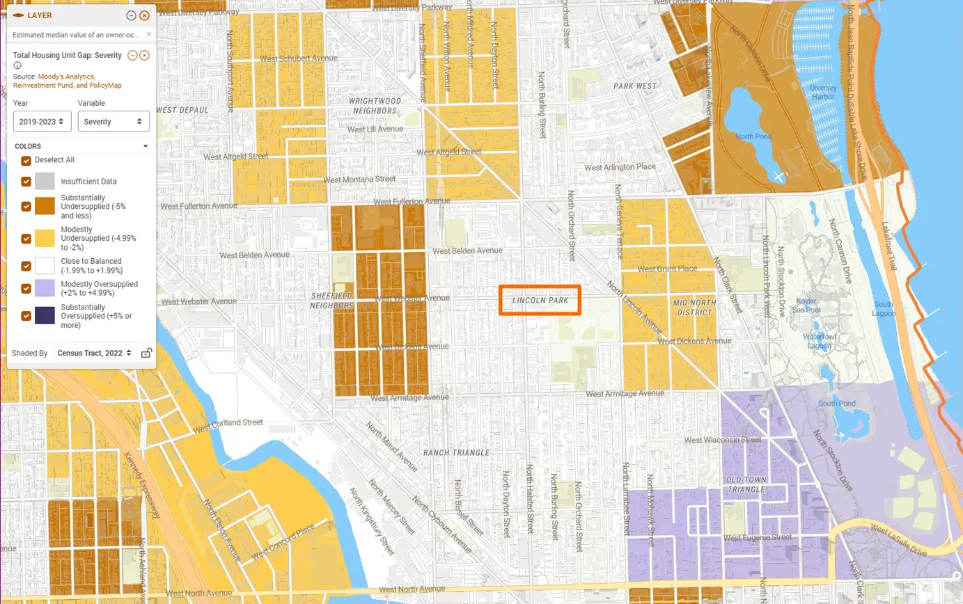
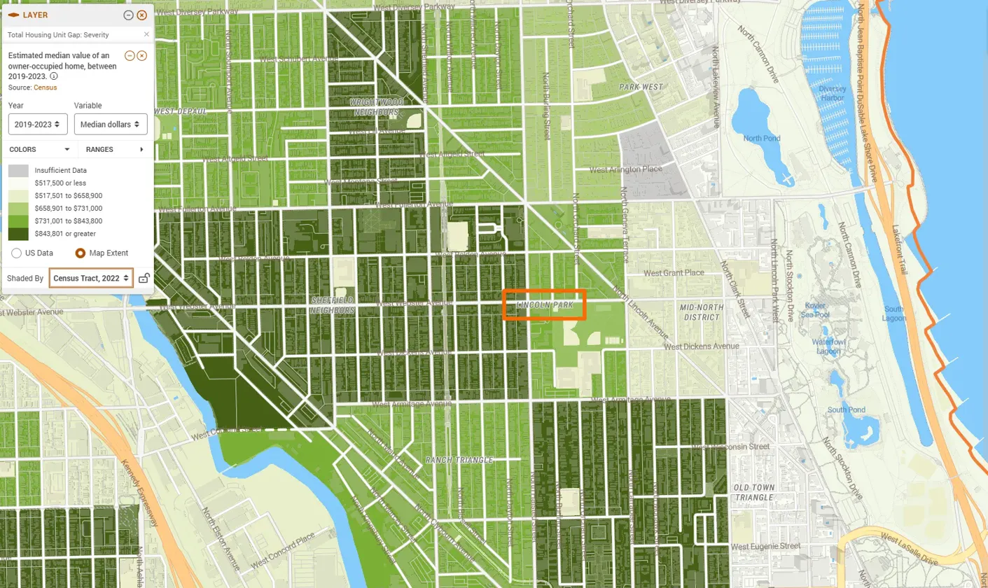
Lincoln Park shows Close to Balanced supply yet commands median values of $700,000 to over $800,000—matching or exceeding substantially undersupplied areas elsewhere. High values don’t require shortage when other factors strongly influence the market: lakefront location, top schools, high-income owners, and decades of desirability.
Lincoln Park’s home values likely won’t change if supply were to increase because shortage isn’t the primary driver. The market here operates differently from most of Chicago, suggesting that while shortage drives prices in most areas, desirable neighborhoods may maintain premiums regardless of supply conditions.
The Loop: Luxury Oversupply, High Values
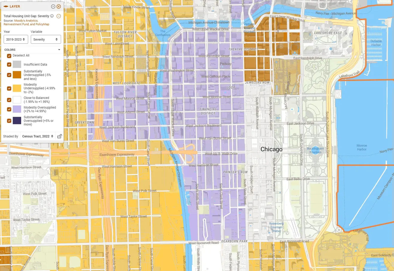
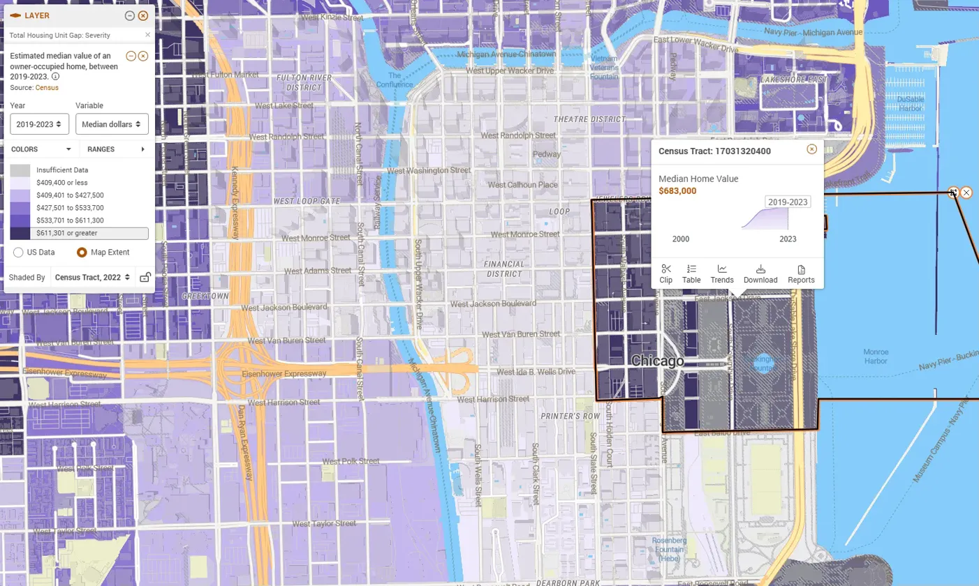
Downtown shows predominantly Modest Oversupply with Close to Balanced areas and even a pocket of Substantial Undersupply mixed in. The Financial District (Census Tract 17031320400) shows median values of $683,000 despite oversupply. West Loop Gate shows $409,400.
Luxury high-rise construction likely created a measurable surplus, yet values remain elevated–units take longer to sell or rent, but prices stay high. In this area, developers may have overshot demand within the luxury tier.
Englewood: Oversupply as Disinvestment
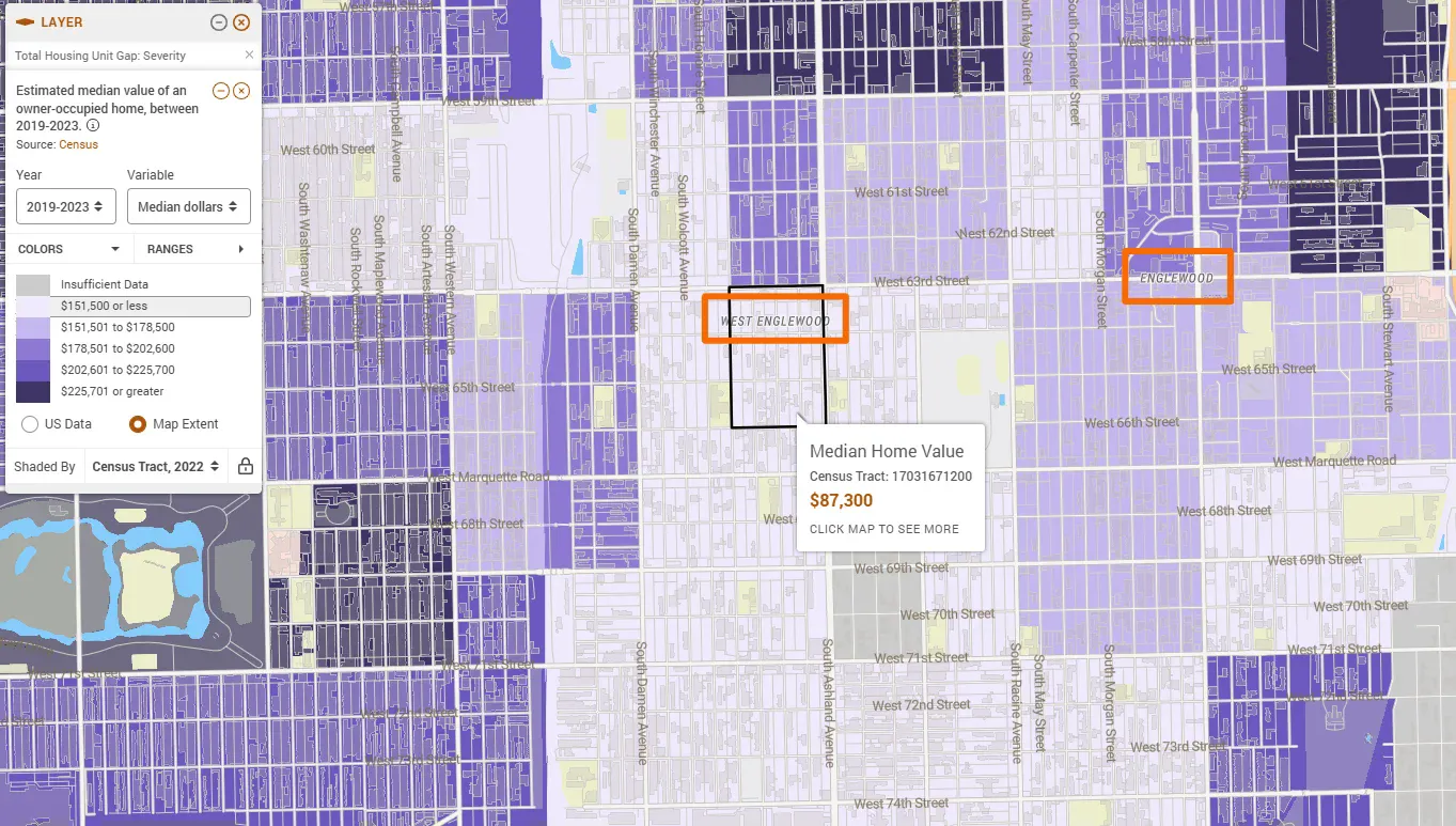
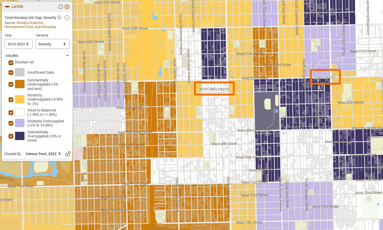
Englewood and West Englewood show Substantial Oversupply, the same severity as Pacific Junction, yet tell an entirely different story. Census Tract 17031671200 shows $87,300 median values alongside +5% oversupply. This could be surplus from population loss and abandonment, or new units from recent gentrification that the market has not yet absorbed. It could be that these surplus units are not affordable to existing lower-income residents. As we update the data with the next release of American Community Survey data, it will be interesting to see how these places have changed.
At $87,300 (just 12% of Pacific Junction’s median), it may be the case that these neighborhoods don’t need more housing. Perhaps they need comprehensive investment, such as economic development, access to employment, quality schools, public safety, and lending access to restart functional housing markets.
What the Data Reveals
Mapping Chicago tract by tract reveals a market imbalance with multiple faces. The city faces:
- Widespread undersupply affecting most neighborhoods, driving values beyond middle-income reach
- Balanced neighborhoods under pressure from surrounding shortage (Logan Square, Lincoln Park)
- Luxury oversupply that doesn’t address workforce needs (Pacific Junction, The Loop)
- Disinvestment oversupply requiring comprehensive intervention or recent gentrification (Englewood)
For a $75,000 household, teachers, nurses, service workers, affordable homeownership ($300,000) exists almost nowhere. Logan Square requires $175,000+ income. Even oversupplied Pacific Junction needs $125,000+. Lincoln Park demands $200,000+.
Moving Forward
Chicago needs both citywide reforms and neighborhood-specific strategies. Citywide reforms could streamline permitting, reduce barriers to multifamily construction, preserve existing affordable units, and dramatically increase production targets. Neighborhood-specific strategies could include targeted development in undersupplied areas, capital access and lending reform in disinvested communities, and recognition that luxury oversupply downtown doesn’t solve citywide shortage.
PolicyMap and Moody’s Analytics’ Housing Gap Estimates data with Census home values enables exactly this kind of precision. Understanding where shortage meets value, at the census tract level, transforms housing policy from broad generalizations into targeted, effective interventions. Whether you’re a municipal planner, housing authority director, nonprofit developer, or policy advocate, these neighborhood-level insights provide the foundation for data-driven decision-making.
Request More Information
Request more information about using PolicyMap to analyze housing conditions in any city or region. Fill in the form below.