
Targeting Resources in Areas With Growing COVID-19 Cases

Data
Covid-19
Source
New York Times
Find on PolicyMap
- Health
- COVID-19
- Cases of COVID-19
- COVID-19
As states face rising COVID-19 cases, government leaders are re-imposing limitations on businesses, beaches and outdoor gatherings to minimize the spread in their communities. Health officials are gearing up to make sure those who are most vulnerable to severe COVID-19 are protected and hospitals do not become overwhelmed. There is debate about whether we are seeing a “second wave” or a “second peak.” And health officials are providing varied explanations for recent increases in infection. Regardless of public debate, the data reveals that there are hotspots, particularly in the south and west, with accelerating rates of infection that government and health officials must address. Good data must help guide the conversation and support strategic solutions.
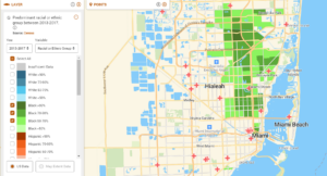
In April, we released a publicly available tool to help answer questions related to where COVID-19 was spreading, where vulnerable populations lived, where telemedicine was going to be problematic and more. That tool is even more relevant today than it was two months ago, given the trends that have emerged about the virus’ spread. It can help us to identify those counties with the highest 7-day rolling average cases, where vulnerable populations live within those counties, where hospital resources may be most strained and where the virus is disproportionally impacting communities of color.
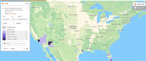
Using the daily-updated COVID-19 cases from the New York Times, specific counties within Florida, Texas, Arizona and California with very high rolling 7-day averages are evident on the map. (Looking at these 7-day rolling averages is important because they smooth random daily reporting spikes or drops and provide a more accurate picture of the spread of the virus).
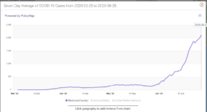
Disturbingly, these places are also seeing rates increase dramatically. In Maricopa county, for example, the 7-day average cases on the 28th of June was 2,118 – up from just 222 at the beginning of the month.
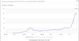
In Harris county, home to the City of Houston, the 7-day average cases on the 28th of June was 1,174 up from 249 on June 1st.
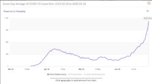
And in Miami-Dade county, where beaches have closed again, the 7-day average cases grew from 156 on June 1st to 1,132 on the 28th.
Drilling in, for example, to Miami-Dade county and layering on the Severe COVID-19 Health Risk Index we created for the New York Times (now available at the neighborhood level), we can pinpoint those neighborhoods where residents are most vulnerable to severe complications from COVID-19. Areas with very high or high risk are shown in dark purple on the map below and represent places where residents are more likely to have COPD, heart disease, high blood pressure, diabetes, and/or obesity. Understanding and visualizing this data at a local level is essential so that public officials can identify 1) which hospitals (shown as red icons on the map) may be most likely of becoming overwhelmed, 2) where distribution of PPE might be most impactful and 3) where additional testing sites could help identify the spread within these at-risk communities.
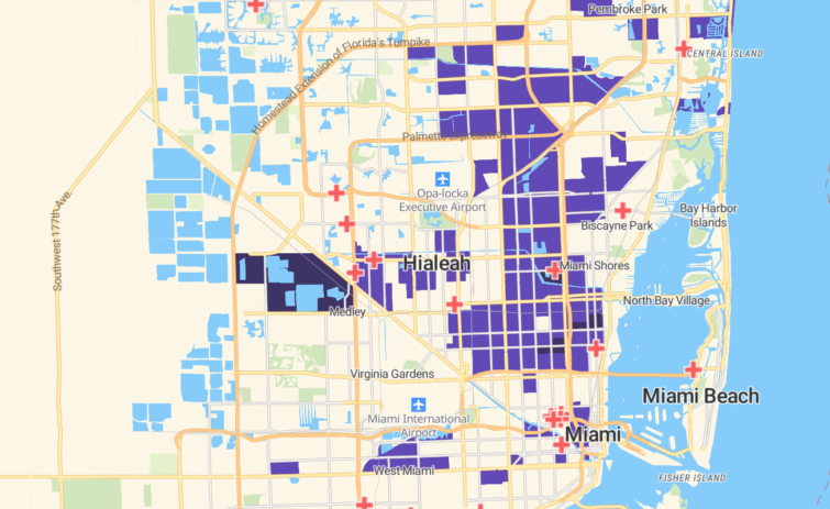
The vast majority of areas more vulnerable to the virus are also home to Miami-Dade’s Black residents as shown in the green areas on the map below, and the impact is disproportionate. While 18% of the county’s population is Black, more than 72% of the people living in these vulnerable areas are Black.
Digging deeper into the challenges facing each specific community dealing with this novel virus requires relevant, accurate and timely information. Some examples of institutions across the country that rely on PolicyMap’s data and maps for COVID-19-related work include:
- MD Anderson in Houston, TX, intends to use PolicyMap to understand the risk of COVID-19 to those dealing with cancer.
- Northwell Health in New York is using PolicyMap to identify underlying causes of health disparities at the neighborhood level.
- The City of Delray Beach and other partners in Florida relied on PolicyMap data to ensure COVID-19 testing was accessible to communities who needed it most.
- The City of Lancaster in Pennsylvania used PolicyMap to site public service announcement murals about COVID-19 safety.
To learn more about these efforts and how organizations across the country are using data from PolicyMap to address these problems, visit our COVID-19 Special Edition Resource page.