
Ancestry Data: Neat, But Not on PolicyMap
With the ACS 5-year data release coming up in December, we’ve been having discussions about what data we might want to add from the ACS on to PolicyMap. Some good ideas have been tossed around, like data on veterans, people with disabilities, children in poverty, and others. (Stay tuned to see what we add.) But one whole category of data caught my attention: Ethnic origin and ancestry.
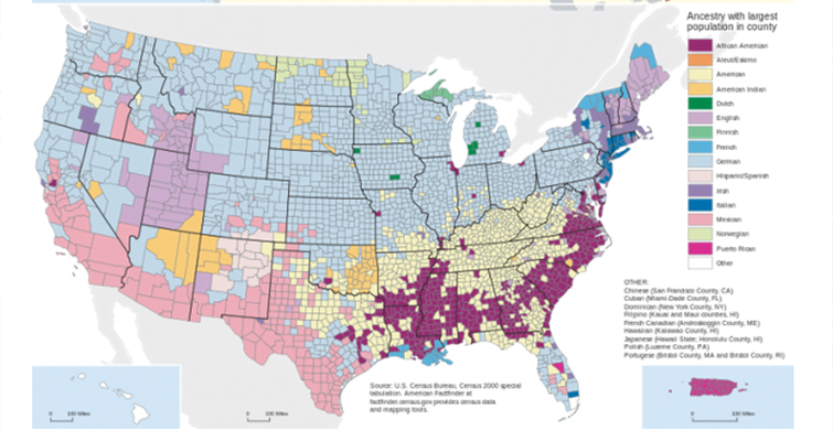
Data on ancestry can be fascinating. A quick peek at the Wikipedia page for “Race and ethnicity in the United States” shows a map of the predominant ethnic background in each county:

It’s interesting to see some of the patterns: Most prominent are the southern Black Belt, the Mexican ancestry in the southwest, Italians around New York, Irish, English, and French in New England, the Norwegians in Minnesota and North Dakota, and Germans almost everywhere else.
There’s also one other prominent group on this map: “American.” This category shows up on the map predominantly in the south. Technically speaking, this incorrectly addresses the question on the ACS form, “What is this person’s ancestry or ethnic origin?” It’s too simple to dismiss these respondents as flag-waving lovers of ‘Murica. Ethnic ancestry isn’t usually straightforward, and the ACS only gives you up to two answers. If you’re a little bit English, Irish, Dutch, Welsh, German, and, say, Alsatian, what are you supposed to write? This is a household survey, not a genetic test, so it’s difficult to say that any answer to the question is “wrong.”
I’m Jewish, and my family comes from the vague reaches of Eastern Europe. I wouldn’t identify as Ukrainian, even if that’s technically the country where a majority of my ancestors lived (and even that’s unclear, as the area they lived in changed hands repeatedly). If I wrote, simply, “Jewish”, the response would automatically be categorized by the Census as “Other”, because the Census strictly does not track religion. About 400,000 people identified as “Eastern European”, but that’s a different order of magnitude than the roughly 5.5-8 million American Jews as calculated elsewhere.
The problems pile up. Who identifies as “British” vs. “English”? “Scandinavian” vs. “Norwegian”? “French Canadian” vs. “French”? And what does it mean to be ethnically Canadian? No, really, that’s a serious question. “Americans” aren’t the only problematic aspect of the ancestry question. Troublingly, the response rate to this question hovers around 50%, generally lower than the rest of the survey. When someone is not comfortable providing any answer to the question, that response is simply left out.
Furthermore, for some people, it’s not clear. For African Americans whose ancestors were brought over during slavery, a specific ancestral nation is hard to identify. Census grouped together 2.7 million responses as “Subsaharan African”, but that’s far less than one would expect, given the 39 million people who identify their race (on a different question) as African American. Even though the Census suggests “African American” as a response, they categorize it as a race, and therefore don’t report it in the ancestry data. For many black Americans, the ancestry question comes with a set of assumptions that aren’t relevant to lived experience.
Often, people who are mixes of multiple ancestries will identify with a more culturally cohesive group—someone with English and Irish ancestry might be more likely to identify as Irish, for example. And is that wrong, if that’s the ancestry the respondent identifies with?
Despite its glaring flaws, this data is very interesting and could be useful for understanding neighborhoods, with possible policy and research implications. Here’s why the Census collects it, according to them:
“Ancestry is required to enforce provisions under the Civil Rights Act, which prohibits discrimination based upon race, sex, religion, and national origin. More generally, these data are needed to measure the social and economic characteristics of ethnic groups and to tailor services to accommodate cultural differences. The Department of Labor draws samples for surveys that provide employment statistics and other related information for ethnic groups using ancestry.”
One could use ancestry to identify ethnic enclaves (Little Italy, Little Armenia, Little Marrakesh, etc.), or to draw conclusions about how historical immigration patterns affected present day life. Is there a correlation between areas with Norwegian ancestry and Democratic voting?
These usability questions lead to one final question: which ancestries would we show on PolicyMap? There are over 100 ethnic groups represented. We could just choose the top 10, but then we dismiss the smaller communities whose ancestry might be more relevant to current policy questions. We could include them all alphabetically, and let the user do a lot of scrolling. It would be a lot of a scrolling.
Meanwhile, the Census Bureau is considering changes to its data on race and ethnicity, which would likely impact how ancestry is collected as well.
So what do we do? Do we show you the data and let you decide its worth? Do we hold it back because most PolicyMap readers will not have read this blog post, and will make unwarranted assumptions about the nature or accuracy of the data? For now, we’re going with the latter. We can’t make an alert say “Beware of this data”, and we think that alert is really necessary. What do you think? Would it be useful to you? Let us know, we’d love to hear what you think.