
Why Aren’t Trend Charts Available for Block Groups?
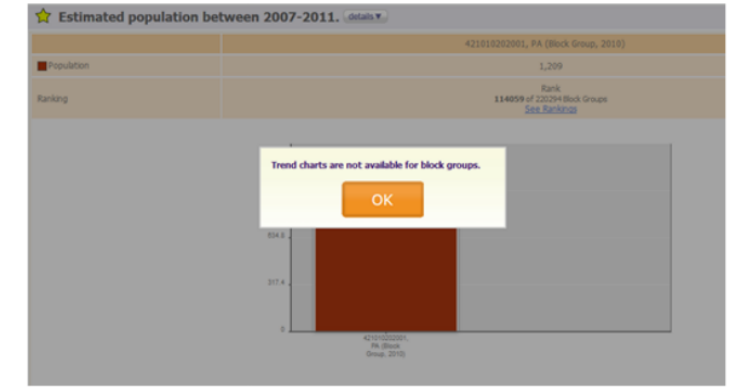
Have you ever received this message?

There’s a good explanation for why you did: the geographic shapes of 2010 block groups changed so much from 2000 that comparing one to the other would constantly provide misleading data. So we don’t show it.
Here at PolicyMap, we try to keep the complicated things about data display (like vintages and versions of boundaries) as uncomplicated and un-bothersome as possible for our users. But we like to keep our more curious users informed about the decisions we make regarding these inconvenient, but necessary, issues. Here I’ll explain why we’ve decided to avoid comparing block group values across years.
When we engineered PolicyMap to work with both the 2000 and the 2010 Census boundaries, we took our cues from the Census. For tracts and larger geographies like counties, the Census provided documentation and bridge tables for changes from 2000 to 2010. But for block groups, they didn’t include any explanation, presumably in part because of block groups’ inconsistent nature. Their names changed and their shapes moved with reckless abandon. So we decided that it wasn’t in our or our users’ best interest to produce that bridge for our maps. As such, we determined that 2000 block group values can’t be reliably compared to 2010 values.
However, you may notice that if you run a Report for a 2010 block group, we do provide an estimate of the percent change in population for that block group from 2000 to 2010. We created this estimate using a bridge table we crafted. However, because that bridge table didn’t come directly from the Census, we didn’t feel comfortable employing it in our Tables feature.
We’re always happy to discuss our data stewardship decisions with our users. If you’ve gotten this far in this blog post and have additional questions for us about our approach, please contact us at info@policymap.com!