
Change in voter turnout from 2004 to 2008
Now that PolicyMap has US election data, you can use it to see some of the voting patterns that were talked about after the last presidential election.
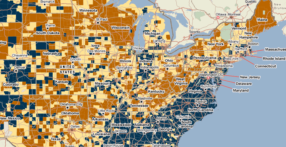
After the 2008 election, pundits noted that Barack Obama’s candidacy galvanized African Americans who had not previously voted to go to the polls. This trend can be clearly seen using PolicyMap. Below are two maps. The first is a map of the percent of the population that is African American. The second is a map of the change in turnout rate among eligible voters from 2004 to 2008. The dark purple indicates a large increase in the voter turnout data. As you can see, a clear pattern emerges.
Comparison of African American population to Change in Voter Turnout between 2004 and 2008
 |
County, State | Percentage Change |
|---|---|---|
| Williamsburg, VA | 21.70% | |
| Dillon, SC | 18.07% | |
| Chowan, NC | 17.69% | |
| Jefferson Davis, MS | 16.99% | |
| Vance, NC | 16.50% | |
| Carteret, NC | 16.45% | |
| Jefferson, MS | 16.03% | |
| Parmer, TX | 15.58% | |
| Sumter, FL | 15.41% |
Do you want to learn more about this dataset or other features on PolicyMap? Join our free weekly trainings (Click Here) or send your questions to pmap@policymap.com.
![]()