
Change in Unemployment, Now on PolicyMap
 PolicyMap has a new way of visualizing the geographic extent of the Great Recession. We’ve always had employment and unemployment data, but now you can view the change in unemployment across time.
It now has percent change data at 1 year, 3 year, and 5 year intervals. So, for example, if you want to see a map of the recent economic recession, go to Jobs & Economy, Unemployment (BLS), Annual, Employment.
 Change your variable to %Ch3Yr, and set the year to 2010.
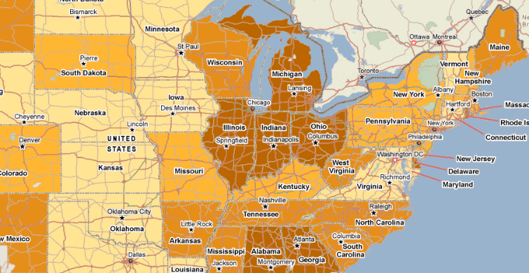
This gives you the percent change in people employed from 2007 to 2010:
The majority of the map is orange, showing a decrease in employment. The purple areas are the sections of the country where employment actually increased during the recession (mostly due to oil extraction in the center of the country).
You can also open a map of the change in the unemployment rate, but that will look the opposite; areas hurt the most will be purple, and areas doing okay will be orange.
Note that this data is only in the annual employment and unemployment data; we also have month-to-month employment and unemployment, but that does not show changes, due to regular seasonal changes in employment patterns.