
Changes to Boundary Behavior on PolicyMap
As you may have noticed, PolicyMap recently updated to include the Census’s 2010 boundaries. With this update, you may notice some differences in the way Maps, Tables, Reports, and Analytics treat our data.
Before our update, if you examined the population change of a Census Tract, you’d have gotten the same information, regardless of whether you’re in Maps, Tables, or Reports. But with the introduction of the 2010 boundaries, things got a lot more complex.
Tract 24003702204 (shown in ORANGE below) was introduced with the 2010 Census. It used to be part of the larger tract 24003702201 (shown in GREY below), which no longer exists in the new boundaries.
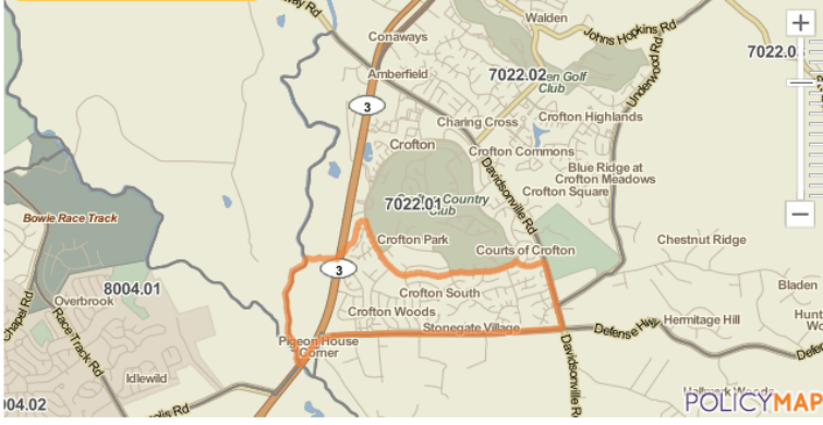
Here’s what tract 24003702204 looks like on the map with 2010 population (check out the orange boundary):
But here’s what the older 24003702201 looked like, with 2000 population:
As you can see, the older boundary is much larger, so comparing the two is tricky.
Because the definition of this area changed so much, we had to make some decisions about how to provide our users with the most accurate and useful information.
In tables and trend charts, we decided to play it safe and show “N/A” for 2000 data, since there isn’t really a comparable area in 2000.
Here’s what the table looks like with 2010 population:(left) and with 2000 population: (right)


No data displays, because that area didn’t exist in 2000.
And here’s what happens if you try to open the trend chart:
You can’t show a trend for a single year of data, so nothing appears on the chart.
But take a look at what happens in Reports with this same tract. We went out on a limb and decided to estimate what that population number would have been in 2000, in order to help our users understand how population changed in that area. Here’s a Community Profile Report:

In the tabular part of the Population Trends section, you’ll see that we’ve aggregated two block groups from 2000 to represent the equivalent area of the new tract that was introduced in 2010. We’re showing the population trend between the two summed block groups in 2000 and the tract in 2010. But in the text above the table, you’ll see that we’ve provided a different change value. We here at PolicyMap wanted to provide the most accurate estimate of change possible, which is what’s being shown here. The value in the sentence is different from the one in the table below it because, for the value in the sentence, we used the Census-provided equivalency tables, and we created some bridge tables of our own, too, described here (Census Geography Division).
This is some heady stuff that we know our power users will be interested in hearing about. But whether you’re an avid, intensive PolicyMap user or a casual visitor, we would love to hear from you with any questions about our process—and about any of the data you see on our site.