
How Data Is Made: School District Poverty
Otto von Bismarck said that laws are like sausages: it’s better not to see them being made. But by that logic, data is like ice cream, crayons, glass, and beer: One of the most popular factory tours around. One of the sausage-ier datasets we have on PolicyMap is our map of school-age poverty, measured by school district, which comes by way of the Census’s Small Area Income and Poverty Estimates (SAIPE). Last summer, I got to take the factory tour of SAIPE, at the National Center for Education Statistics’s STATS-DC Conference.
PolicyMap already has lots of poverty data straight from the Census and American Community Survey. That’s all sitting in plain view in the “Incomes & Spending” menu. But hidden away in the Education menu, under “Student Populations,” is “Students in Poverty.” How is this different, you might ask, from the Census’s “Percent of People in Poverty Under 18”?
Title I funding for school districts, as determined by the Elementary and Secondary Education Act of 1965, requires a count of children ages 5-17 in families living in poverty that reside in a school district. It requires annual counts, more precise than the ACS’s 5-year estimates.
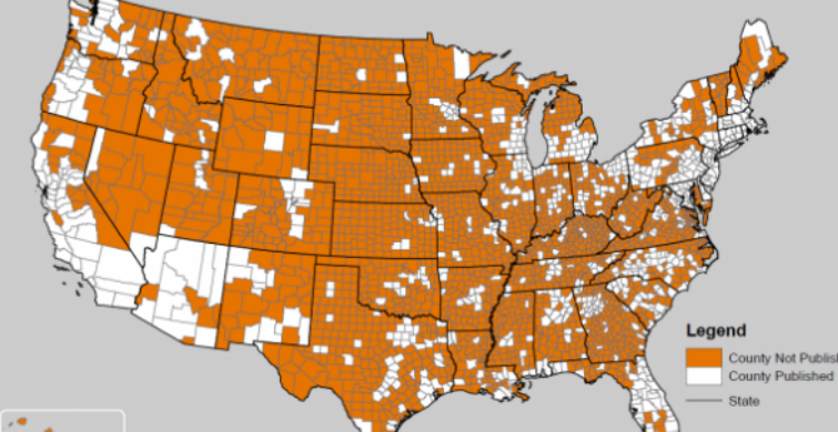
So SAIPE comes along, as a sort of “enhanced ACS”. ACS acts as a starting point, but using one year of data doesn’t provide a large enough sample size for most school districts. In the map below, the orange counties are too small to have 1-year ACS estimates:

And why is it important to use 1-year estimates rather than 3- or 5-year estimates? Here’s a chart from the Census’s presentation, showing how single-year poverty changed in Franklin County, Ohio, comparing ACS 1-year estimates to 5-year estimates:

As you can see, the smoothed-out 5-year estimate doesn’t reflect the large change that occurred during the recession.
So to come up with a more accurate and timely number, SAIPE combines a number of indicators from different sources together. It uses:
- American Community Survey (ACS):
- 1-year estimates (published and unpublished)
- 5-year estimates (school district model)
- Population estimates based on the decennial 2010 counts
- Decennial census
- Federal Tax Information
- Supplemental Nutrition Assistant Program (SNAP, formerly Food Stamp) participation records
SAIPE takes these indicators to create a regression to estimate the poverty rate for counties in a given year. This regression estimate is averaged with the ACS 1-year estimate for the same area. Sometimes the ACS data has a higher sample rate, and sometimes the regression does. Whichever has the higher sample rate has the “better” number, so that average between them is weighted towards the estimate with a higher sample rate and lower variance.
This creates a county-level estimate of total poverty. To get to school-district school-age poverty, SAIPE uses anonymous tax records from the IRS to calculate the number of tax exemptions in the county. This is divided among the school districts in the county using ACS 5-year estimates (for which an adequate sample size exists at small areas).
In short, the poverty rate for the county is calculated using the most current data, and is then calculated down to the school district using population counts from the longer-term 5-year estimates. Using the strengths of each source, SAIPE creates a school-district dataset of poverty suitable for Title I funding.
If you’re craving an even wonkier explanation, complete with equations and more diagrams, check out the PowerPoint presentation given by the Census’s Lucinda Dalzell at the STATS-DC conference: http://nces.ed.gov/whatsnew/conferences/statsdc/2014/presentations/V_C_Sonnenberg.zip
So there you have it: Data creation is just as exciting as a trip to the Crayola factory.