
Did you know… (New Color Palettes)
Welcome to our series on helpful tips for PolicyMap. With over 15,000 indicators of data and many features, we hope our series can help users better utilize PolicyMap. For a complete training, please join a free online session here: Click Here
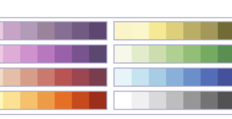
 Did you know there are now 8 different color palettes for thematic maps on PolicyMap? Subscribers and trial users now have the option to select from these new color schemes. Simply add data from the Add Data Layer tabs and in the legend you will find the option to “Change legend color”. These new colors and the 40 new color options for custom regions will now allow our users to greatly customize maps for any presentation.
PolicyMap’s default purple is still available but we’ve added some great new color palettes, which includes a new saturated purple, better blue palette, and a new rose palette (see below):
The new green palette is a great compliment to our previous olive palette:
And for those that like a more simplistic look at color, we’ve added a beautiful grey palette.
To read a full guide on all features on PolicyMap, please look at our Primer available here. If you wanted to know more about a feature or topic, send your request to info@policymap.com subject “Did you Know…”