
Five Takeaways from the 2017 ACS Data Users Conference
Every year I go to the ACS Data Users Conference, and it’s like coming home to a country where everybody speaks my language. Census tracts, summary tables, margins of error, ZCTAs… everyone talks about these things like they’re second nature. And with the 2017 conference in the books, I thought I’d share a few takeaways from this year’s gathering.
The Census Is Doing Its Best, Given Its Budget
As you may have heard, there’s been some news coming out of the Census Bureau. First, with the Bureau gearing up for the 2020 Decennial Census, funding is uncertain, and then, two days before the conference, the Census Bureau Director, John H. Thompson, unexpectedly announced his resignation.
Despite these setbacks, speakers from the Census did a good job setting an optimistic tone, discussing some of the cost-saving measures they’d be taking with the ACS, and methods they’ve been working on to increase the response rate to the survey.
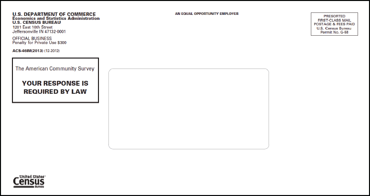 Every year, we hear about the latest in the ACS envelope – literally, the envelope the survey comes in – and this year was no different. Apparently, large text stating that recipients MUST COMPLETE SURVEY UNDER PENALTY OF LAW doesn’t actually encourage people to submit the survey. More effective has been softer text explaining how completing the survey can benefit their community. Even more effective than that is sending the survey in a pressure-sealed envelope, so it looks like a check.
When survey recipients don’t respond, there’s a process of additional mailings, phone calls, and personal visits. To reduce costs, the ACS is planning to reduce personal visits, essentially giving up. The idea being, once they don’t respond to the letters and calls, their odds of responding at all are pretty low. I can see how this might be an efficient way of reducing costs, but it has the potential to bias the data against people who for whatever reason are unlikely to respond.
Margins of Error Are a Thing
It’s really tempting to ignore ACS margins of error. We want to think the data is inexorably correct. We use this data to make decisions that impact real communities, and we don’t want to make those decisions knowing that the values we’re using have upper and lower ranges of confidence intervals.
Unfortunately, the truth is the data does come with margins of error, and in some cases, they can be substantial. (This is yet another consequence of limited funding.) So much of the talk at this conference was on how to map ACS data without ignoring margins of error.
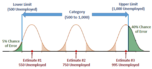
Joel Alvarez of the New York City Department of City Planning gave a talk in which he showed how on a choropleth map (where data in different geographies show up in different colors to represent their values, a la PolicyMap), the ranges you choose can affect the likelihood that the margin of error could change the color on the map. For example, PolicyMap uses quantiles by default (where the ranges are determined such that there will be an equal number of geographies of each range on the map). However, it may be that other techniques for ranges, such as natural breaks or equal intervals, create less of a chance of the margin of error affecting the map. David Wong, of George Mason University, expanded on this, explaining techniques to create ranges with the explicit purpose of minimizing geographies whose margins of error cross into another color range.
(PolicyMap does not currently show margins of error, due to technical constraints. We’re working on plans to show margins of error in the info bubbles at some point in the future.)
Words Matter
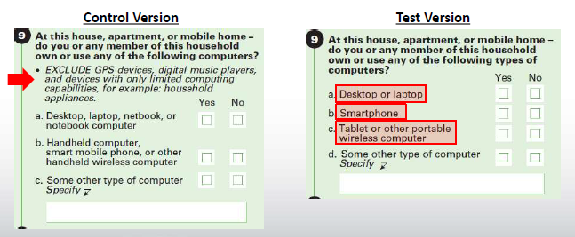
The ACS survey changes a little from year to year. Sometimes, a new question is added. Sometimes, you have to recognize that the term “Smartphone” is less unwieldy than “Handheld computer, smart mobile phone, or other handheld wireless computer.” But what’s clear after hearing a session on the 2016 ACS Content Test is, nothing gets changed without a whole lot of study.
The Content Test tests whether changes to question wording, response categories, and definitions improve the quality of the data. The process of the 2016 test started back in 2013, when various government agencies submitted requests for changes and additions to the ACS. They then do “cognitive tests”, seeing how people respond to various versions of the questions. After that, sample surveys are sent out to 70,000 people, with half getting a “control group” questionnaire, and half getting a “test group” questionnaire. The results are analyzed to see how changes in the questioning affect the data.
Changes were proposed to questions on health insurance, weeks worked, computer and internet use, commute to work, race and Hispanic origin, class of worker and industry and occupation, telephone service, retirement income, and relationships. The results of these tests are more detailed than I can go into here, but their presentation slides are available, and pretty darn interesting.
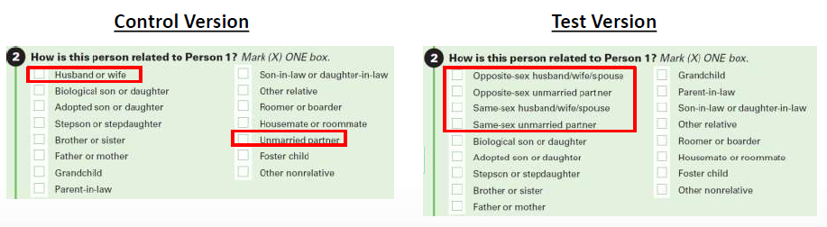
If You Want to Come Out, It Won’t Be on an ACS Survey (But If You’re Married, Mazal Tov!)
News came out recently that the Census would not be adding questions about sexual orientation to the 2020 Decennial Census (with no plans to add it to the ACS either). This seemed to be an about face, as the Census Bureau previously indicated that they were planning on adding such a question, which would be helpful in providing services and identifying discrimination against LGBT communities.
During the Q&A after the opening plenary session, an audience member asked about why the Census decided not to include this question. Decennial Census Programs Associate Director Lisa Blumerman responded that the request for this question originally came from the Department of Justice (which presumably would use the data to aid in prosecuting discrimination cases). In March of this year, the Department of Justice rescinded this request. Without a government agency requesting this data, it was removed from consideration.
But some LGBT concerns will likely be addressed in other respects. The 2016 Content Test (discussed above) contained a section aiming to improve couple household estimates by revising the relationship question to provide explicit same-sex and opposite-sex spouse/partner response categories.
People Love the ACS
If there’s one theme that emerged throughout the ACS conference, perhaps unsurprisingly, it was how important the ACS is to so many different groups. From transportation planners to business analytics, everyone kept talking about how vital the data was to what they do. At a session comparing ACS to other sources, even better-resourced state-specific sources, presenters again and again reiterated that the problems that exist with ACS (mainly around margins of error) are nothing compared with the prospect of not having the ACS at all.
In 2015, administrative data was the hot topic. Administrative data is not collected for research purposes, but can be useful to researchers. An example of administrative data would be the IRS Statistics of Income data. People don’t file their tax returns for the purpose of providing data for researchers, but the data is still useful. The ACS has a question relating to families receiving SNAP assistance; there is also data directly from the USDA, which administers the SNAP program, about the number of people receiving SNAP, so one imagines that might be a more accurate data source than a survey.
But this year, there was much less talk about administrative data. As Webb Sprague of the Washington State Department of Social and Health Services put it, agencies only collect administrative data that’s useful to the agencies. It’s very limiting. Emilia Istrate at the National Association of Counties was asked why she used ACS SNAP data instead of the USDA data, and her answer was that the ACS data was substantially easier to use.
All this is to say, as much as big data and administrative data are touted as the next big thing, ACS remains the first choice for statistical data for a lot of people.