
GreatSchools Ratings: What Do They Mean?
School performance data is important to assessing the educational opportunities in an area, but it can be challenging to work with. Thanks to No Child Left Behind, there’s a ton of this data, but it’s spread throughout every state, and there’s no federal government repository. Each state has different tests for different grades and subjects, and just finding where the data is located isn’t easy. And once you have the data, it might not be simple to interpret.
Fortunately, an organization called GreatSchools has done all this work for us, which is how we have school performance data to show you on PolicyMap. GreatSchools collects this data regularly, gives it consistent formatting, and provides a useful rating for public schools and school districts throughout the country.
PolicyMap offers the raw test score results, showing the percentage of students who are “at or above proficient” in a given test, whether it’s the 6th grade math test results in Arkansas, or the global history and geography Regents Examination in New York. These test results are available for both schools (as points) and school districts (as layer data).
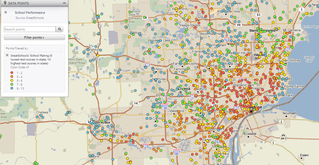
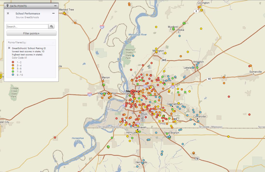
PolicyMap also has the GreatSchools ratings, which give each school and district a rating between one and ten, based on how the test scores compare with other schools in the state. The map below shows that in Memphis, as in many other cities, highly rated schools tend to be clustered in certain areas.
Of course, a one-to-ten rating simplifies a very complex assessment. What does it mean if a school is a “four”? GreatSchools took this question head on in an article on their site. Scores of one or two, or nine or ten, are pretty straightforward. A score of two clearly means students are scoring lower than average on standardized tests across all grades and subjects. A score of nine means they’re scoring higher than average.
For middling scores, GreatSchools offers a few possible explanations, and further details to look into. In some cases, a change in school leadership can cause scores to fall, or to rise, so it’s worth looking at test results in previous years and see if there’s an upward or downward trend. In some schools, standardized tests are not focused on, which can result in lowered scores, but may in itself be an asset to the school. They also talk about looking at the differences in scores between non-economically disadvantaged students and those getting free or reduced price lunches.
There’s no denying that the whole topic of rating schools based on standardized test performance can be controversial, and the debate about school choice is best left for another website. But the current trend of standardized tests has resulted in a massive trove of data, which could be useful whether you’re researching educational outcomes in a community or looking for where to send your children to school.
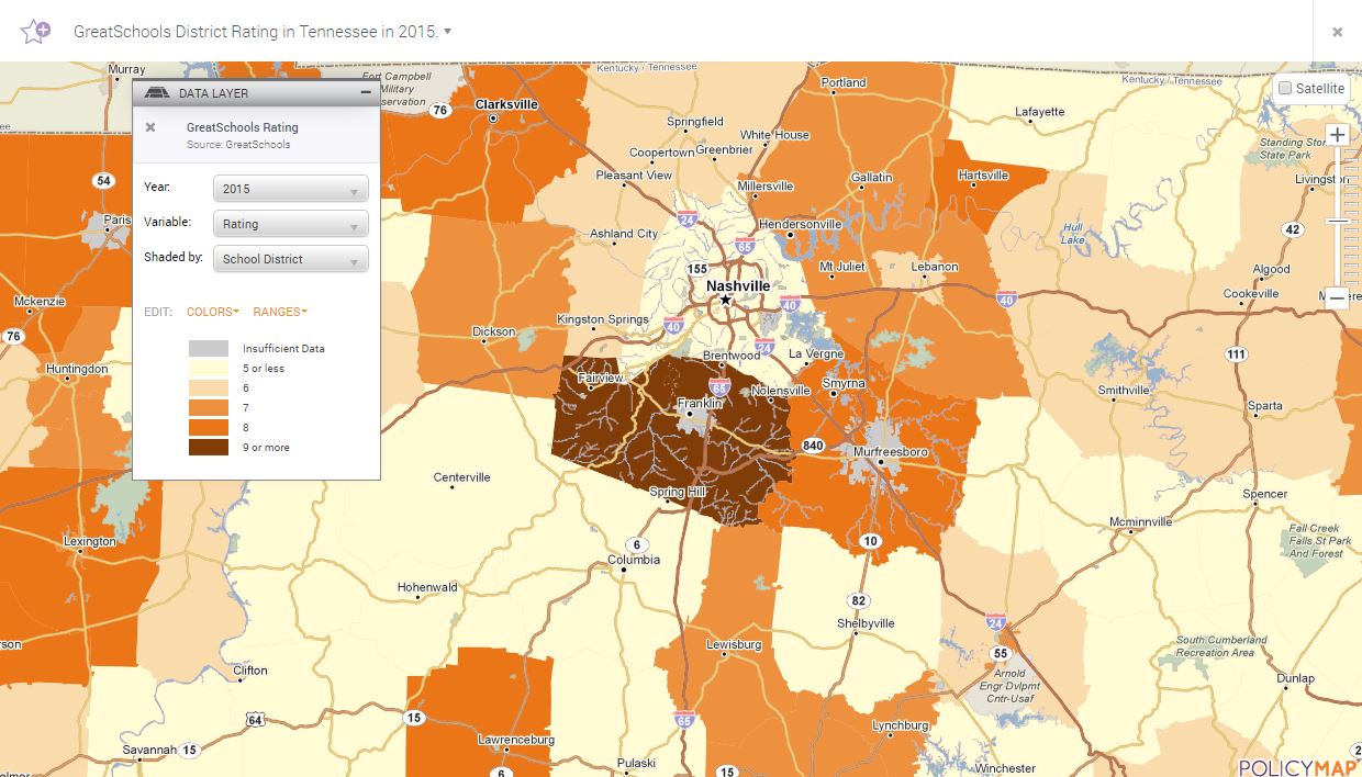
Because each state administers different tests, we separate the data out by state, so you don’t compare, say, a school district in New York to one in New Jersey. The map below shows school district ratings in Tennessee.
This data is available to PolicyMap subscribers in the “Education” data menu. The school district test scores and ratings can be found in the data layer section, under “School District Performance”. School level data, which is often more illustrative than averaged data for the school district, is in the data points section, under “School Performance”. Additional performance data, such as Graduation Rate, Student-Teacher Ratio, and Student Proficiency, is available to all PolicyMap users in the “Education” menu under “School District Statistics” and “School District Performance”.