
HOLC Historic Lending Guideline Maps on PolicyMap
Data
Home Owners’ Loan Corporation Risk Maps (1935-1940)
Source
University of Richmond, University of Maryland, Virginia Tech, and Johns Hopkins University
Find on PolicyMap
- Lending
- Historic Lending Boundaries
- Home Owners’ Loan Corporation Risk Maps (1935-1940)
- Historic Lending Boundaries
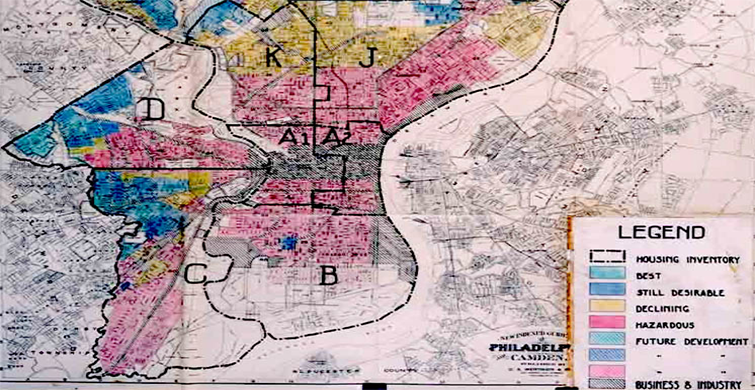
Often the most compelling explanations for the present lie in the past, so it is no surprise then that many historical records stored at the National Archives have been revelatory to say the least. A few decades ago, historian Kenneth Jackson’s discovery of the collection of neighborhood risk assessment maps developed by the Home Owners’ Loan Corporation (HOLC) during the New Deal era was one such discovery. This collection of maps, which spans over 200 cities and is often viewed as a key component of post-war American housing policy, has been digitized by a team of researchers at the Digital Scholarship Lab at University of Richmond (and a handful of other research institutions) as part of a project named Mapping Inequality: Redlining in New Deal America. We are pleased to announce that this dataset is now available on PolicyMap, and our users can overlay this polygon data with a number of other layers to explore trends in residential and economic segregation, along with a host of other areas.
The Mapping Inequality dataset on PolicyMap comprises of neighborhood risk assessment data for 148 cities across the US. The Federal Home Loan Bank Board (FHLBB), the HOLC’s parent organization, commissioned the City Survey Program in 1935 to collect data on real estate risk levels across 239 cities. As part of the exercise, each neighborhood was evaluated via a network of realtors, lenders, developers, and HOLC staff members, and ultimately assigned a rating or letter grade which signified the neighborhood’s investment prospects for lending. The rating was primarily a function of neighborhood racial and ethnic makeup, housing conditions, and access to public facilities, among other factors. Ratings assigned to neighborhoods included: “A-Best”, “B-Still Desirable”, “C-Definitely Declining”, and “D-Hazardous”. Thanks to the dedicated research team at the Mapping Inequality project, a digitized version of these boundaries are now available publicly. We at PolicyMap downloaded the boundary files for each city and then merged and dissolved them by grade level so you can see the boundary for each grade (A,B,C and D) for each city.
You can explore your city of interest using the map below.
The HOLC neighborhood risk maps have been seen by a number of researchers as evidence of institutional discrimination based on geography, a practice widely referred to as “redlining.” The effect of these ratings may have manifested itself to neighborhood residents in a number of ways, including-number of mortgages, interest rates, loan-to-value ratios, and type of lender. Even if the low grade areas shown in the HOLC maps initially didn’t have bad mortgage statistics in terms of defaults and timely payments, some argue that spatial isolation eventually made it a self-fulfilling prophecy.
The HOLC maps were part of a broader landscape of housing and lending policies during the 1930s and 1940s, and it is worth noting that there is a strong body of literature suggesting that the HOLC maps were more a consequence of existing discriminatory lending practices, as opposed to being a cause for them. Other studies have also tried to empirically show how the HOLC grades were more a function of factors such as housing condition, residential density, and housing type, as opposed to solely ethnic and racial composition. Several scholars have conducted a deeper analysis of HOLC maps for specific regions such as Philadelphia,PA, Richmond,VA, and Hartford,CT, in order to explore local factors and players involved in neighborhood classification.
These HOLC risk boundaries are far and away the most historic data we have on PolicyMap, and we are very excited about this addition. We want to extend our gratitude to the researchers at the Mapping Inequality project for doing the hard work of digitizing these historic maps and making them available publicly. We encourage users to explore their website for additional background on the project. If you’d like to read more about interesting ways to use these boundaries along with the current data and functionality available on PolicyMap, we invite you to read our second blog post on the topic here.