
HOLC Lending Boundaries: Features and Functionality

Data
Home Owners’ Loan Corporation Risk Maps (1935-1940)
Source
University of Richmond, University of Maryland, Virginia Tech, and Johns Hopkins University
Find on PolicyMap
- Lending
- Historic Lending Boundaries
- Home Owners’ Loan Corporation Risk Maps (1935-1940)
- Historic Lending Boundaries
[This blog post has been revised to reflect more recent data. HOLC polygons have been updated and an indicator layer was created in February 2022. Layer and polygon viewing options are now available to all users.]
In an earlier blog post, we introduced the Home Owners’ Loan Corporation (HOLC) Neighborhood Risk dataset that we recently added to PolicyMap. Given that this data is more historic and a little different than other PolicyMap data, some people may be wondering what this can be used for. Here, we’ll get into some of the nitty gritty about how this new addition can be used alongside the other data on PolicyMap to gain insights into an area.
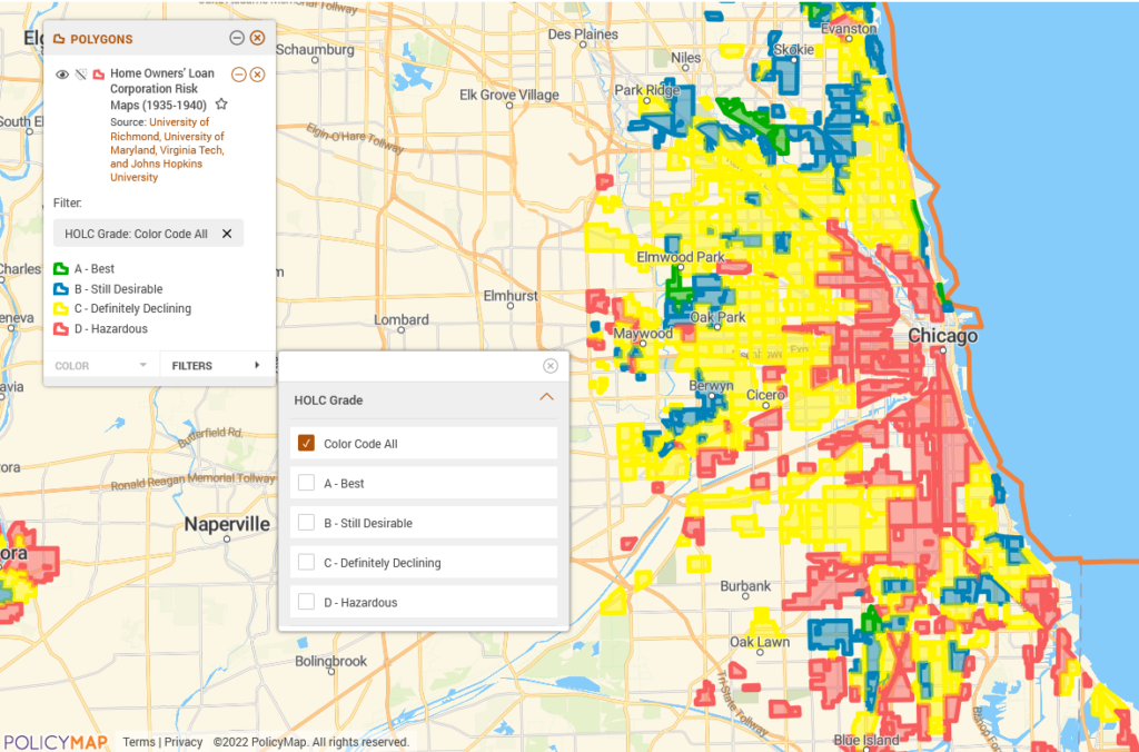
To begin with, this dataset is in polygon format, which means that the boundaries for the neighborhood risk assessment maps can take the form of any geometric shape, as opposed to being confined to traditional boundaries such as tracts, cities, or counties. It’s available for 148 cities, and each neighborhood within these cities has been assigned a grade of A, B, C, or D, depending on how it was appraised during the 1935-40 period. According to HOLC documentation from the City of Baltimore, neighborhoods with a grade of “A” were seen as “hot spots” that were relatively safe for lending, whereas those with a grade of “D” were considered to be “characterized by detrimental influences in a pronounced degree” and most risky for lending.
Note that when you first open the map, you’ll see lots of icons clustered together around cities; make sure you zoom in to see the data.
Looking at this data for an individual city on PolicyMap, you can see the different areas highlighted in different colors representing the different grades. To get information about the different grades in each city, click on the icon of the appropriate color in the city. (Each city has one icon for each of the four grades.)
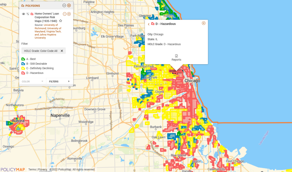
What if you want to really focus in on one of the grade levels in particular? You can do this by selecting the grade through the filter in the legend. The example below shows the ‘D-Hazardous’ graded areas in Chicago. You can add an additional grade as well, depending on which subsets you are interested in exploring.
The original HOLC maps were originally created between 1935-1940, making the digitized version far and away the most historic data we have on PolicyMap. So what is the value of adding them to PolicyMap, where the rest of our data is more than half a century more current? The HOLC maps were one of the most well-documented contributors to the landscape of housing discrimination in post-War America. Exploring these historic boundaries alongside current indicators allows for an examination of how the areas then categorized as favorable or less favorable are faring today. While we can’t assume any direct correlation between historic lending patterns and existing indicators, it is interesting to take a look at some of the HOLC ‘D’ graded areas. Overlaying the HOLC maps with current Census data in Chicago shows that some, though certainly not all, of the areas that had been categorized as “Hazardous” continue to have high poverty rates (above 30%, as compared with the city average of 22.3%). Some of the areas remain predominately Black and appear to have some of the lowest homeownership rates in the city.
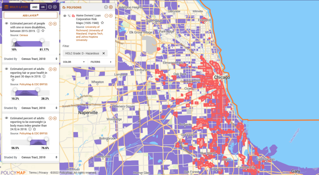
Users can also use the 3-layer maps and overlay them with the polygons to see the confluence of a number of factors and their prevalence in graded areas of interest. The map below shows health outcomes and “D-Hazardous” areas.
PolicyMap subscribers can also make use of the reports by generating them for a particular risk assessment area in a city. This can be done by clicking on a pointer within a polygon and selecting “See Report.”
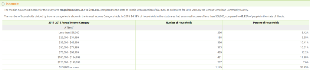
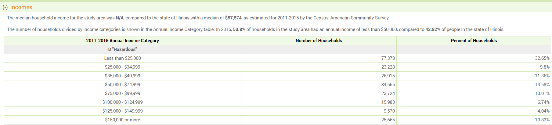
Each of the PolicyMap reports – Community Profile, Rental Housing, HMDA, and Home Sale – can provide interesting insights into trends relevant to the neighborhood risk assessments. The example below shows Community Profile snapshots for ‘A’ and ‘D’ graded areas in Cleveland, Ohio. You can see that the current household income levels vary greatly; in the “D” graded areas, 72% of households earn less than $35,000, as opposed to around only 25% of households in the “A” graded areas.
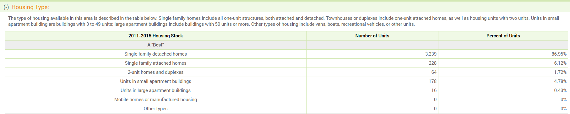
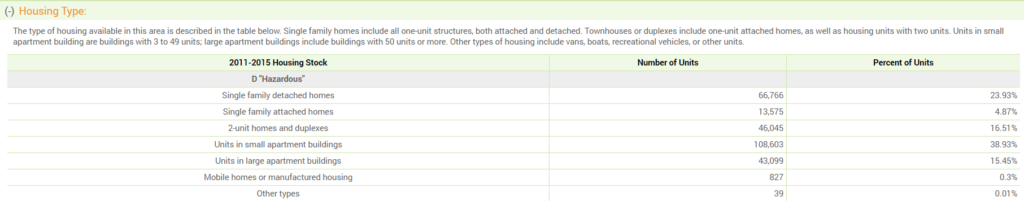
When comparing housing stock, we can see that the “D” graded areas have around 20% less single-family houses than the “A” graded areas.
Polygons. Filters. Overlay. Reports. Repeat! Clearly, we are very excited about this latest addition to PolicyMap, and we want to share the joy of being able to work with historic data on a modern mapping tool. Let us know what insights you’re able to find by looking at this data!