
Hospitals: Quality of Care Data Now Available in PolicyMap

Data
Hospitals: Quality of Care (Medicare Certified Hospitals)
Source
CMS & HRSA
Find on PolicyMap
- Health
- Hospitals
- Hospitals: Quality of Care
- Hospitals
The Patient Protection and Affordable Care Act, commonly referred to as the ACA or Obamacare, has been heralded as a game changer in expanding health coverage across the U.S. The legislation’s focus on patient protection, supplemented by a paradigm shift towards higher reporting standards in the healthcare sector, gets overlooked amidst the political din of insurance premiums, exchanges, and expanded coverage. The Centers for Medicare and Medicaid Services (CMS) spearheaded the movement towards improving quality of care through their Quality Initiative, as part of which they compile hospital level information on a portal known as Hospital Compare. PolicyMap users can now access key quality of care indicators from the Hospital Compare dataset for Medicare Certified hospitals, as shown in the map below.
The Hospital Compare portal houses a set of standardized indicators on healthcare quality including hospital characteristics and inspection information, structural measures, benchmarks on timely and effective care, mortality and readmission, complications, Medicare payments, as well as patient survey responses. This information is primarily meant for patients to make informed choices about healthcare providers, and for healthcare providers to assess and improve their own performance. CMS uses this information to penalize and reward healthcare providers as part of its linking quality to payment programs.
Numerous researchers have tried to establish the validity of patient quality perceptions vis a vis technical measures of quality care at hospitals. A few studies have used consumer survey data from CMS and found significant relations with technical measures of quality care such as incidence of hospital acquired conditions, processes of care, or complication rates.
Researchers and policymakers can use this data in PolicyMap to chart out geographic trends in healthcare quality, and to assess its relation to other indicators available in PolicyMap such as insurance coverage, poverty and education, to name a few.
Overview of the Data Available in PolicyMap
Hospital Compare data available in PolicyMap consists of indicators that fall under three broad categories – General Information Ratings, Patient Survey Ratings and Structural Measures – which are reflected in three separate tabs in the info bubble when a hospital is selected.
- General Information Ratings: Consists of an overall hospital rating based on a national comparison of seven underlying quality measures – Mortality, Safety of Care, Readmission, Patient Experience, Effectiveness of Care, Timeliness of Care, and Efficient use of Medical Imaging. The overall hospital rating is given in stars from 1 to 5, while the underlying quality measures are designated as either being below, same, or above the national average. Data for these measures is compiled through the Inpatient/Outpatient Quality Reports and other mandatory reporting programs for Medicare-certified hospitals.
- Patient Survey Ratings (HCAHPS): Consists of a set of 11 ratings assigned by consumers covering topics such as cleanliness, communication, pain management, staff responsiveness, quietness, and overall hospital experience. All of these measures are assigned a star rating from 1 to 5 with 5 being the best score a facility can receive. The 11 ratings are aggregated to calculate a summary patient rating for the hospital. Data for these measures is compiled using the Hospital Consumer Assessment of Healthcare Providers and Systems survey (HCAHPS).
- Structural Measures: Indicates whether a hospital has certain standard facilities or protocols – Ability to receive lab results electronically, ability to track lab results, tests, and referrals electronically, and the presence of various registries and checklists. Data for these measures is submitted by hospitals and their vendors through an online data entry tool
PolicyMap users can filter hospitals based on two primary ratings from the Hospital Compare dataset – the overall hospital rating and the patient survey summary rating. Both ratings are based on a 1 to 5 scale with a higher rating indicating higher quality. Users can apply these filters to examine geographic trends and variation in healthcare quality across regions.
Potential Use Cases in PolicyMap
The application of this dataset can be approached from a number of angles. Most notably, it can be used to gauge actual hospital performance with respect to consumer perceptions, and to assess disparities in healthcare quality across a number of dimensions.
A state-by-state scorecard on healthcare performance highlighted that, between lagging and leading states, there is an up to fourfold disparity in healthcare quality indicators such as timely access to care, risk for potentially preventable medical complications, lower-quality health care, and premature death. The findings from this report also noted that two key factors affecting healthcare quality experienced by patients included income levels and state of residence.
Some reports have also noted disparities in healthcare quality among racial and ethnic minority groups. These disparities are inherently linked to determinants such as insurance coverage, income, language barriers, and availability of primary source of care.
Building on these studies, we isolated two clusters from the Hospital Compare dataset based on the overall hospital ranking, and the patient survey summary rating from HCAHPS. The first cluster includes all hospitals that scored one out of five on both dimensions, while the second cluster includes all hospitals that scored five out of five on both dimension. The following table summarizes key characteristics for both clusters:
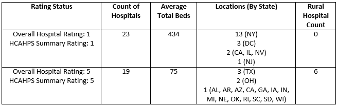
It is interesting to note that 15 of the hospitals from the cluster with low ratings are located in major urban centers, including the greater New York City area, greater Chicago area, Las Vegas, and Washington D.C. The average hospital size for low ranked hospitals is also much larger, compared to hospitals in the high ratings cluster.
Mapping these clusters over layers such as predominant race/ethnicity and poverty at the zip code (ZCTA) or county level also yields interesting results.
Predominant Race/Ethnicity
Low Ranking Cluster
High Ranking Cluster
The maps above appear to show how hospitals in the low ranking cluster tend to be in cities where the predominant race or ethnic group is a minority, while hospitals in the high ranking cluster are mostly based in white majority areas.
Poverty Rate
Low Ranking Cluster
High Ranking Cluster
The maps above show both clusters of hospitals overlaid over poverty rate, taking the national rate of 13.5% in 2015 as the benchmark for ranges. Dark red areas on the map represent zip codes above the national poverty rate. Hospitals in the low ratings cluster appear to be predominantly located in areas with poverty rates greater than the national average, while hospitals in the high ratings cluster tend to be located in areas where the poverty rate is below or equal to the national average.
These maps, which show trends that can be found in other parts of the country as well, are meant to help illustrate the possible association of health care quality with various indicators available in PolicyMap. While we do not claim a direct statistical association between health care quality across both clusters and the many variables we have overlaid them with, we do aim to demonstrate how these relationships can be explored to uncover spatial trends.
With insurance expansion currently at the helm of most political debates across the country, it is equally important that healthcare quality remains a priority for decision makers and involved stakeholders. Datasets like Hospital Compare are critical to informing these discussions, and we hope that our users will be able to extract useful insights from this latest addition to PolicyMap.