
Is COVID-19 on the rise in your area?

Data
Cases of COVID-19
Source
New York Times
Find on PolicyMap
- Health
- COVID-19
- Cases
- COVID-19
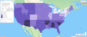
As new cases of the virus drop across the northeast, they are beginning to rise in states across the southeast and southwest. Florida, Texas, and Arizona—three states that have recently re-opened their retail and restaurant businesses–recently reported their largest one-day increase in cases yet.
Mapping the percent change in cases over the past week reveals that Arkansas (31%), Alabama (26%), and South Carolina (31%) have also experienced large increases in COVID-19 cases.
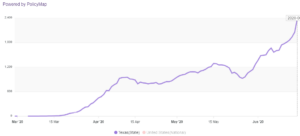
Some of these upticks are quite dramatic, as shown in trend line of the seven-day rolling average of COVID-19 cases. Texas, for example, had seen two smaller peaks followed by slight declines in mid-April and then mid-May. Starting on May 26th, however, the state saw the beginning of a rapid rise in cases that does not appear to have peaked yet.
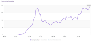
Zooming in to the county level shows that not all large population centers are experiencing exponential growth. The trend line shows that Houston (Harris County) experienced a sharp peak in cases followed by a sudden drop in mid-to late-April. After that low point, and following re-opening on May 1st, COVID-19 has been steadily increasing again.
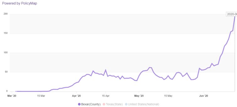
In contrast, San Antonio (Bexar County) had low increases in number of cases, with an exponential increase over the past week and a half.
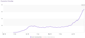
Areas less discussed in the national news, such as South Carolina, are also experiencing rapid increases in reported cases. Unlike in Texas, nearly all major population centers in this state are showing similar patterns of low plateaus followed by exponential growth.
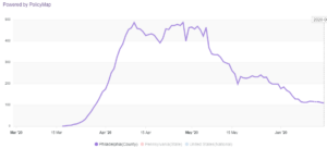
Trend line curves in former hot spots in the Northeast tell a different story. In Philadelphia, the seven-day average peaked in mid-April, and has since dropped to levels not seen since the end of March.
As state, county, and municipal governments make decisions on how to reduce community transmission of COVID-19, tracking the one-day change in cases, as well as the rolling seven-day average of reported cases in relation to policy changes can help inform COVID-19 policy decisions.