
Knowing Life Expectancy to Improve Public Health

Data
Life Expectancy
Source
CDC
Find on PolicyMap
- Health
- Vital Statistics
- Life Expectancy
- Life Expectancy at Birth
- Remaining Life Expectancy
- Probability of Death
- Life Expectancy
- Vital Statistics
New life expectancy data from the CDC provides a valuable tool for understanding neighborhood health. For the first time, standardized life expectancy data is available at the census tract (neighborhood) level across the nation. It can help make decisions that will drive investment to where it is needed most.
Life expectancy, or the average number of years a person is expected to live, can be used as an overall indicator of community health. Low life expectancies can result from high infant mortality rates, high rates of drug overdose or suicide, barriers to high quality healthcare, and other factors. When combined with other health data, this new indicator can help policymakers and practitioners target which neighborhoods are most in need of investment and inform their interventions.
Identifying Disparities
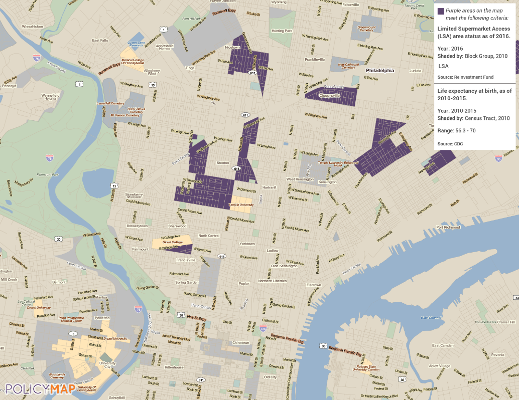
Viewing life expectancy at the neighborhood level highlights differences from one side of a city to another. In PolicyMap’s home town of Philadelphia, for example, we see more than a ten-year gap in life expectancy between the longer-lived neighborhoods of Center City and shorter-lived parts of North Philadelphia.
The life expectancy dataset in part reflects the impacts of the county’s history of racial and economic inequities on community health. The CDC’s study that produced this dataset, the United States Life Expectancy Estimation Project, or USALEEP, revealed that race and income strongly influence life expectancy. Persistent racial and economic segregation contribute to striking geographic disparities, such as the variation in life expectancy in Philadelphia neighborhoods. Nationally, these disparities reaffirm the poor health outcomes in the southern United States that we have explored in an earlier blog post.
Diving Deeper
Identifying neighborhoods with shorter life expectancies is only the first step in creating healthier neighborhoods. The next step is exploring other health data to find out what locally specific factors may be reducing average life expectancy. Certain chronic health conditions can lead to lower life expectancies, particularly when unemployment, poverty, or a dearth of nearby medical facilities introduce barriers to accessing treatment. For example, hypertension can lead to heart disease, which is the highest cause of death in the United States. Regions with high rates of hypertension tend to also have lower life expectancy.
According to the CDC, people can take steps to prevent hypertension, including eating healthy foods with lots of fruits and vegetables and being physically active. A number of interventions have been found to be effective in helping people eat better and move more.
The map below highlights some of the neighborhoods of Philadelphia with lower life expectancies that also have less access to supermarkets. People living in these areas might benefit from greater access to healthy foods. Meeting with community members and local organizations working in food access can help determine which of the suite of possible actions would be feasible, helpful, and wanted.
Life expectancy data can help begin the search for health disparities within a city, a county, or across the nation. It can be combined with additional data on health outcomes, an informed set of possible actions, and collaboration with the people living and working in affected neighborhoods to make changes that give residents an equal chance at a long, healthy life.
Other Indicators
Although life expectancy at birth is probably the most commonly-used life expectancy metric, the USALEEP study produced a wealth of other indicators as well. In addition to life expectancy at birth, remaining life expectancy for 5- or 10-year age groups are also available. These layers show how much longer a person within that age group would be expected to live.
Life expectancy at birth represents an average of the ages of death for everyone who died in that area, which means it includes those who died in infancy. In each progressively higher age group, the overall average life expectancy rises. The values shown are years remaining, so as the age group increases, years remaining start to decrease, but total life expectancy (age of death) still increases.
The CDC also published data on probability of death by age, which represents the likelihood that a person in that age group will die before reaching the next higher age group. These percentages begin climbing in older age groups, until the open-ended “Age 85 or older” age group, where they reach 100% everywhere.
About the Data
The CDC’s National Center for Health Statistics (NCHS) combined data on age-at-death from death certificates with population estimates to build “schedules of mortality” that show how many people died in a tract within each age range from 2010 to 2015. Wisconsin and Maine were excluded from the study because the researchers were unable to obtain death certificates from 2010 for these states.
In many lower population neighborhoods, there are age ranges where no one of that age died. To help fill in these gaps, the researchers developed a statistical model that used demographic, geographic, and economic variables to predict the numbers of deaths in the larger tracts. For the remaining life expectancy and probability of death datasets, the published data in each tract may be based purely on observed data pulled from the death certificates, purely on values predicted by the statistical model, or based on a combination of the two. The Data Source Flag variable shows which tracts fall into each group.
For another look at this data, here are some articles from the Washington Post on areas with high and low life expectancies.