
Map Vocabulary
PolicyMap has two basic types of maps. One has a very simple name, the other is more complicated.
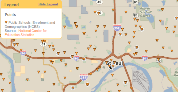
This is a point map:
Pretty simple: the map shows points representing the locations of, in this case, schools.
So what’s this?
The data here represents a geographic area, not just a single point. It’s usually an aggregation of a mass within the area (number of people, percent of families, median dollar amount, etc.), where different colors represent a range of values among all areas. There is a technical term for this: choropleth map. (You’ll notice there’s only one “L” in choropleth; it’s not chloroform.) Map nerds know exactly what a choropleth map is. The problem is, just about no one else in the world has heard of the term, and frankly, it’s not very fun to say.
On PolicyMap, we call these Data Layers. The data is neatly layered underneath the map labels. The problem with this term is you can’t actually have multiple layers of Data Layers (how would you see the multiple colors at once?). Ironically, you can layer as many points as you want onto a point map. So it could be confusing.
Around the office, we call this “thematic data” (as would appear on a thematic map). Unfortunately, that’s not correct either, since a thematic map is any map that shows data, which would include maps with points. Occasionally, you’ll hear us slip this term into conversation, but we have a swear jar we have to drop a dollar in every time we use it.
Sometimes I call this “shaded data”. But we don’t want to imply there’s anything shady about our data.
So remember: Data layers = choropleth map = thematic data (when we slip up) = shaded data. Have a better name for this? Let us know!