
Mapping Racial and Ethnic Diversity
What makes a neighborhood? What makes a community? I’m sure we’d all have various answers – they aren’t easy questions. Maybe it’s your favorite coffee shop or the local market or the park where you walk your dog but I’m guessing that many of us would answer in some way, that people make the place. We wanted to explore how people are distributed across places, and not surprisingly, since we’re spatial thinkers over here, we analyzed some data and created a few maps.
First, we decided to look into this idea of residential diversity. Following the similar methodology as the Census, we calculated an index of diversity as the likelihood that two individuals chosen at random are of different races or ethnicities. For example, an index value of 15 would suggest that given the proportions of various racial and ethnic groups in a geography, there is a 15% chance that two individuals chosen at random in that geography would be of different races or ethnicities. In a nutshell, lower index values between 0 and 20 suggest more homogeneity and higher index values above 50 suggest more heterogeneity.
Racial and ethnic diversity can be indicative of economic and behavioral patterns. For example, racially and ethnically homogeneous areas are sometimes representative of concentrated poverty or concentrated wealth. They could also be indicative of discriminatory housing policies or other related barriers.
The national map of the diversity index is pretty striking. We see that to the east and south of the Appalachian Mountains there is a belt of higher diversity values and these values decrease fairly abruptly to the west. In the Midwest and extending up through Maine, many counties have lower diversity values. Not too surprisingly, if we zoom into large cities like Los Angeles, New York or D.C., we see higher diversity values, or more heterogeneity.
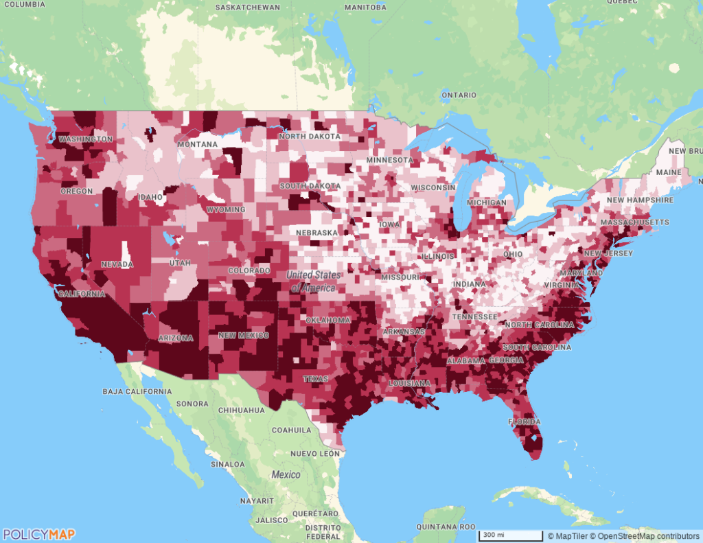
So this is pretty interesting, but the diversity index doesn’t say anything about which racial or ethnic group may be the predominant group; it only comments on the extent to which there is homogeneity or heterogeneity in an area. So we went a step further to create a second data layer which illustrates the predominant racial and ethnic group of a given geography. Each racial or ethnic category is given a different color and this color is shaded according to the percent of the population a given group represents (e.g., darker values mean that group constitutes a higher share of the total population).
Now, we can see that the Southeastern band of higher diversity largely consists of white and black individuals. Also, when zooming into a city, we start to see that racial or ethnic groups may be clustered within the city.
The data are presented at the block-group, tract and county, so go ahead and explore your neighborhood, town or region. We’d love to hear how you think these data could be useful and if there are other features you’d like to see. Contact us.