
Exploring Medicare Costs

Data
Medicare Fee-for-Service Beneficiaries
Source
CMS
Find on PolicyMap
- Health
- Health Status
- Chronic Conditions
- Health Insurance
- Medicare
- Health Status
(For an overview on the Medicare data available at PolicyMap see our previous blog post.)
With proposed decreases in funding for Medicare, exploring what contributes to higher costs can shed light on which initiatives might be helpful in reducing future costs. The Medicare fee-for-service (FSS) program offers health insurance to older Americans over the age of 65 and those with qualifying disabilities or end-stage renal disease (ESRD). Despite extensive regulations, the cost for Medicare services varies across the U.S., with the highest average per capita costs concentrating in the southeastern states. Looking at the recently updated 2016 Medicare data on PolicyMap, we can see that the western half of the US spends around two to three thousand dollars less for each beneficiary than does the eastern half.
This is a pretty striking map. It turns out that similar geographic trends have been observed since at least 1999, when a paper in the Health Care Finance Review reported on state-level variations in Medicare coverage and spending patterns. So, what explains these trends? Since Medicare has strict allowable costs and payments for procedures and services, the geographic discrepancies of per capita Medicare costs are unlikely due to institutional differences. Moreover, the average per capita costs are standardized to account for local wages or input prices and extra payments that Medicare makes to advance other program goals, such as compensating certain hospitals for the cost of training doctors. Using PolicyMap data, this post will explore whether it is likely that higher costs are associated with increased rates of disease, different use of Medicare procedures and services, and local behavioral health risks.
Chronic Conditions
Higher average per capita costs likely correspond with more medical need among beneficiaries in those areas. Having a chronic condition is one reason why a Medicare beneficiary might visit doctors more frequently or suffer complications from additional medical needs, thereby leading to increased Medicare costs. By looking at chronic conditions among this population, similar geographic patterns emerge as those related to costs. For instance, Alzheimer’s disease has a much higher prevalence among Medicare beneficiaries east of Colorado with some of the highest rates in Texas, Kansas, and Florida.
This trend is also present for beneficiaries with high blood pressure.
Numerous other chronic conditions among Medicare beneficiaries, while not concentrating in the Southern states, are frequently higher for the eastern half of the U.S. Some examples include, depression rates that are higher in Rust Belt areas and high cholesterol rates for most East Coast states.
Health Facility Use
Given the increased costs associated with treating high concentration of patients with chronic conditions, one might imagine that more extensive use of medical facilities would also be associated with higher cost areas. This prediction turns out to be true. Geographic variations in per capita Medicare costs correspond to geographic differences in Medicare facility use. Emergency Room visits for Medicare beneficiaries have higher rates per 1,000 beneficiaries in the Eastern half of the U.S., although this trend is not as strong as those for chronic conditions.
With Medicare coverage, a distinction is drawn between outpatient visits and inpatient stays. Inpatient stays are covered under Part A of Medicare and typically require a doctor’s referral and official admittance into a hospital. Many beneficiaries qualify for premium-free Part A coverage. By contrast, outpatient visits fall under Part B of Medicare coverage and include most doctor visits, outpatient care, and many preventative services. They also usually involve a premium payment from the beneficiary. While it is not always the case, inpatient use is likely to require more extensive care and Medicare typically pays a higher percentage of the costs. It is therefore likely that higher inpatient stay rates will correspond with higher average Medicare costs. For more information on the difference between Part A and B coverage visit Medicare.gov.
As predicted, higher inpatient stay rates correspond with increased Medicare per capita costs. In 2015, the eastern half of the U.S. typically had closer to 300 inpatient stays per 1,000 beneficiaries rather than the western half which had rates less than 300.
Outpatient visits, by contrast, show the reverse trend with significantly more outpatient visits by beneficiaries in the northern Midwest and Northeast. It is also possible that more frequent routine doctor visits and preventative care could reduce the need for more costly inpatient stays.
While the geographic trends in level of care provided to patients should reflect the need of those patients, investigations have shown this is not always the case. Blame for Medicare cost differences across states has often been attributed to variations in local practices, most notably hospital discharges to more intensive care facilities than are always necessary given a patient’s health risk. A 2013 Washington Post article describes the differences in costs for stroke patients discharged to a nursing home ($33,000) versus those cared for at home with health aids ($13,000). The article further discusses how the intensity of care that patients receive was not always linked to the severity of their health concerns and was associated with almost a quarter of the variation in cost.
Behavioral Risks
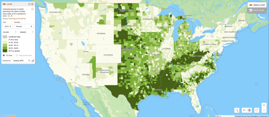
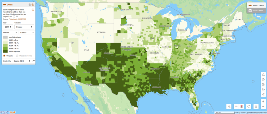
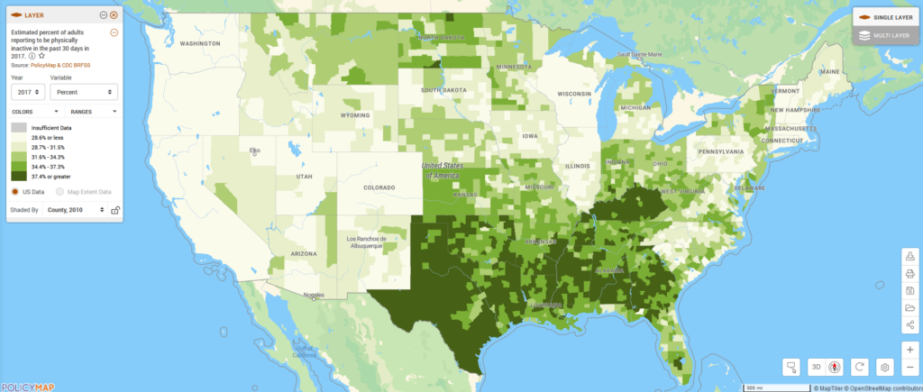
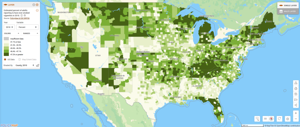
Behavioral norms also differ by place. Although Medicare beneficiaries represent a select and small portion of a population, it is possible that local trends contribute to less healthy beneficiaries that might require more services. Looking at PolicyMap’s BRFSS data on estimated obesity the highest prevalence of obesity is in the southern US, with the lowest rates in the western-most states, loosely matching the trend of higher Medicare costs. Similar geographic trends exist for limited consumption of fruit and vegetables, physical inactivity, and, to a lesser degree, current smoking. These links between lifestyle-related risks and Medicare costs were found to have a significant relationship by a research study in 2002. The authors found that smoking and obesity were statistically significant determinants of state-level variations in Medicare costs and that Medicare costs changed in response to changes in smoking and obesity rates.
Conclusions
While it appears that higher per capita Medicare costs are linked to areas with chronic conditions, increased use of emergency and other intensive care services, and higher rates of local unhealthy behaviors, the solutions to these issues are anything but simple. Nevertheless, efforts focused on promoting healthy lifestyles and further encouraging preventative measures could be effective tools in limiting the cost of Medicare in the future by reducing the overall need for medical services.
Standardizing quality of services and costs for services are also likely to help limit the geographic differences in Medicare costs. Practices put in place as part of the Affordable Care Act to encourage more uniform Medicare spending to hospitals may have helped contribute to the narrowing in the Medicare spending gap. Changes from the Affordable Care Act also started in 2011 to cover more preventative services, including annual checkups, which ultimately should result in lower per capita costs. Yet, the fact that geographic differences still exist, with the same states continuing to spend more than others, suggests that another examination of Medicare billing would likely be useful to uncover more effective programs at reducing costs.
It is important to note that focusing only on cost reduction ignores the important variations in quality of service. To learn more about the Centers for Medicare and Medicare Services’ push to improve quality of care and to see the new hospital care indicators available on PolicyMap, see this previous blog post.