
In Praise of Bar Charts
It’s gonna really shock you to hear that we’re big fans of maps here. Putting data on a map is a great way of finding spatial patterns in an area that you might not spot in a long table of numbers.
But what if I told you… sometimes bar charts can be better than maps?
At the APDU 2017 Conference a few weeks ago, Mike Crow of Crow Insight (whose logo ingeniously features a lighthouse illuminating a bar chart that it’s a component of) gave a presentation on data visualization, noting the importance of having visualizations so clear that anyone looking at them has no choice but to see a pattern. He was a big fan of bar charts, where plain and simply, the tallest or longest bar designates the biggest thing. Seems obvious, but think of how often you see charts whose data is obscured in complexity.
After his talk, I asked him what he thought about maps. Some maps show clear patterns and do their job well. But sometimes, maps can obscure data, particularly when the physical geography and human geography don’t share the same magnitude.
For instance, what’s the most populous county in Pennsylvania, according to the map, below?
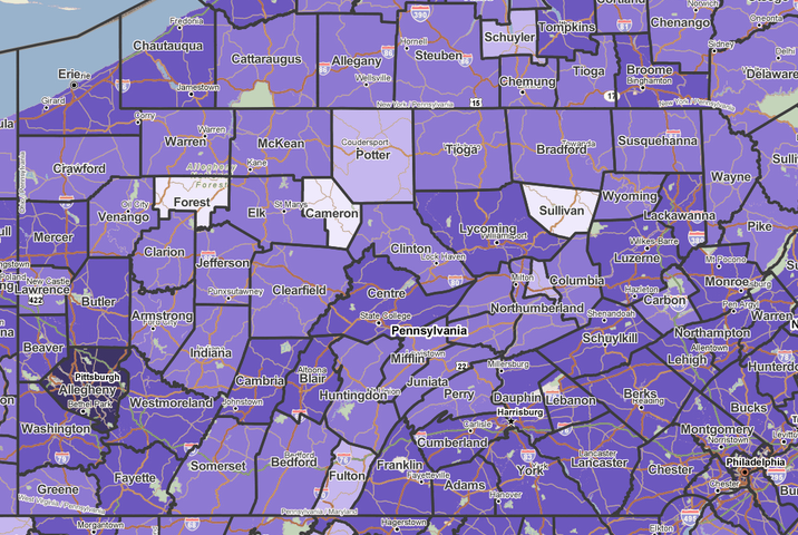
If you’re looking for the biggest of something, the first thing you’re likely to do is look for, well, the biggest something. Lycoming County is the biggest county in Pennsylvania, but it doesn’t have the most people. Allegheny County is fairly big, and has a dark shade of purple, but it’s not the most populous county either.
Now let’s look at a bar chart of the top eight counties in Pennsylvania:
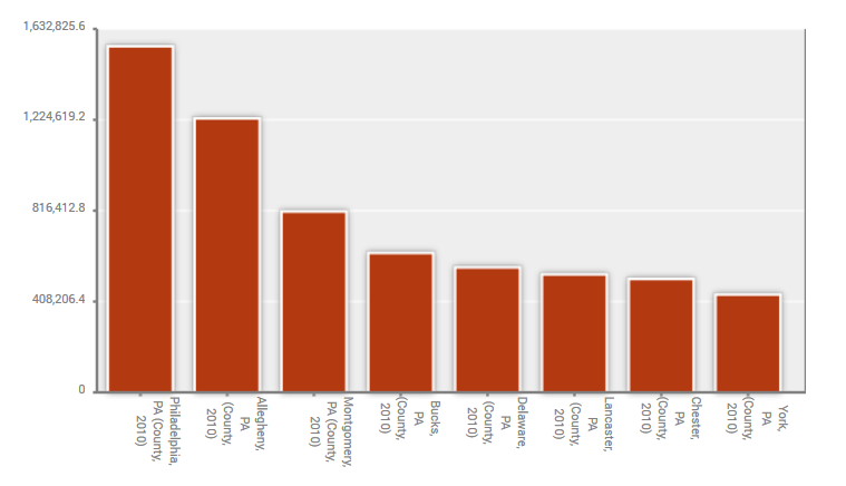
Of course, now it’s obvious.
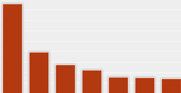
But looking at total population is a simple example. Let’s go a bit deeper and say we wanted to see the percentage of people who ride their bikes to work in the Philadelphia area. Let’s pretend we’re looking to distribute bike racks to areas that need them.
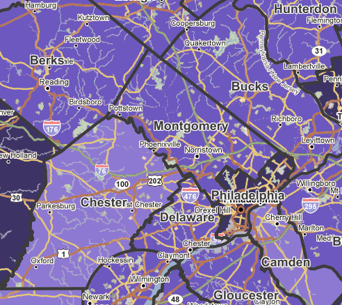
This map certainly tells me that Philadelphia has more bikers than its surrounding counties, and that Chester and Camden have a little fewer than average. But then look what happens when you look at a bar chart:
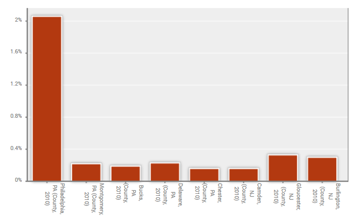
Philadelphia doesn’t just have more bike commuters, it has FAR more than any of its neighboring counties. Do we lose anything by not showing this on a map? Well, if you’re a policymaker from Philadelphia area, you know where these different counties are. And the spatial relationship isn’t what’s important in this example; it’s just a comparison of the different counties.
Which isn’t to say maps don’t have a place. If we wanted to look at bike commuters throughout just the city of Philadelphia, a map is super useful:
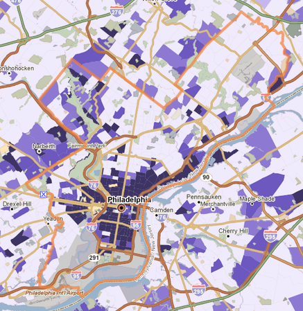
There are some obvious spatial patterns. People are more likely to be bike commuters near the city center, while there are also bike commuters in certain neighborhoods around the downtown area. Some areas farther away from the downtown core also have bike commuters, such as in the northwest of the city, which may be influenced by bike path accessibility to downtown.
Want to make a bar chart in PolicyMap? Click on “Tables” on the top of the Maps page.