
Putting 134 Colors on the Foreign-Born Map
Data
Predominant Country of Birth among the Foreign-Born Population
Source
Census ACS
Find on PolicyMap
- Demographics
- Population
- Foreign Born
- Population
We recently added a data layer showing the predominant country of birth of the foreign-born population. It gives a fascinating look at what immigrant groups populate different cities and neighborhoods. But in creating this layer, we ran into what might seem like a minor issue: With 134 different countries and regions, how do you display 134 distinct colors on a map?
Creating Colors
Color theory is an extensive subject, but for applying colors to maps, there are a few things to understand. To begin, it is useful to know the difference between hue, brightness, and saturation.

When we think of color, the first thing that comes to mind is likely a color wheel. The first element of color, called hue, refers to where that color falls on the color wheel. You can think of hue as the proportion of yellow, magenta, and cyan ink a printer would add to create that particular color.
The second element is brightness level (also called value), which you can change by adding white (called a tint) or black (called a tone). In this way, you can modify a color to vary along a brightness spectrum. This is useful because it multiplies our overall color options. Without varying a hue’s brightness we would be left with maps that require an entirely different hue for each element on the map. Furthermore, varying brightness helps create colors that are still visually distinct for people with color blindness.
The third element of a color relates to saturation, or how vivid or gray a color looks. This accomplishes an almost equivalent function of brightness, varying the color and increasing overall color options, but is harder to visually differentiate.
If you are curious to learn how PolicyMap used these three elements of color to generate the default purple color ramps, you can lean about this in a previous blog post. For some excellent resources on creating your own color ramps I recommend Lisa Charlotte Rost’s compilation of data color sources.
Applying Colors to Maps
When applying colors to maps, the main goals are to help the viewer get a sense of what kind of data is being shown and how the data changes geographically. In order to accomplish this, it helps to ensure that each color is easily distinguishable by the viewer from the other colors used on the map. Likewise, different types of data are best represented by different color patterns. (For more information on this topic click here).
There are two general types of data that are represented on a map: continuous and categorical.
Most of the maps you see on PolicyMap represent continuous data. The colors we select show the numeric differences for a single data layer, such as this map on per capita income. This kind of map is called a choropleth map. The most important part of picking appropriate colors is to make sure that the difference between the color gradients are easily distinguishable, and the relative values can be immediately inferred by the lightness of the colors.
Choropleth maps display either sequential or diverging data. To represent sequential data, such as per capita income, a gradient of a single color hue is often used that varies along a brightness spectrum, often from light to dark, with dark representing the larger values. It is also possible to use complementary hue progressions, which gradually shift from one color to a second complementary color, such as seasonal flue activity. In this case the second color helps create more easily distinguishable breaks between the colors. For most of our colors ramps, PolicyMap uses a slight hue shift to help distinguish the colors (such as from a reddish purple to a bluish purple).
Diverging colors are selected to clearly show the difference between two colors. You can think of these as the combination of two distinct hue color ramps, joined in the middle usually by a light or white color. These are typically used to show when a value changes from positive to negative, such as five year percent change over time of estimated median value of owner occupied homes.
PolicyMap shows fewer maps with categorical data, but a good example is CRA eligibility. For this kind of map, the most important visual consideration is that that the colors go well together aesthetically but are still distinct enough to represent separate categories. This is quite easy with only a handful of colors, but becomes more difficult the more colors are needed. After about six to eight colors, additional colors start to look similar. Moreover, as the number of categorical variables increases, the viewer is likely to refer to the legend more frequently. You can see this in our map of predominant languages spoken at home.
Coloring Predominant Foreign-Born Country of Birth Data
The predominant foreign-born country of birth data is categorical, meaning it needs lots of colors. The main challenge was that it included almost twice as many categories as the languages map, which had a very large number of categories itself. We needed to create a list of 134 distinct colors, varying in hue and brightness, which would still have meaning on a map.
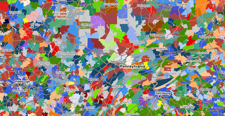
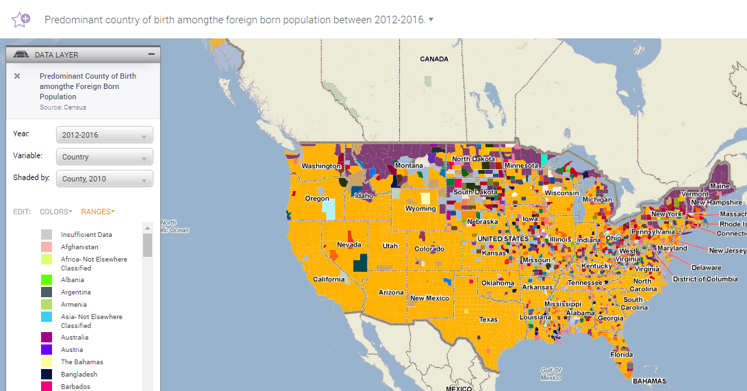
Our first strategy was to apply a series of most distinct colors to the countries that appeared most often. So Mexico, India, China, and the Philippines, would all have very different colors. Selecting a color chart of 20 easily distinguishable colors, we assigned these to the most commonly occurring countries of birth and selected more random distinct colors to the remaining 114 countries. The results for our first map looked okay at first glance:
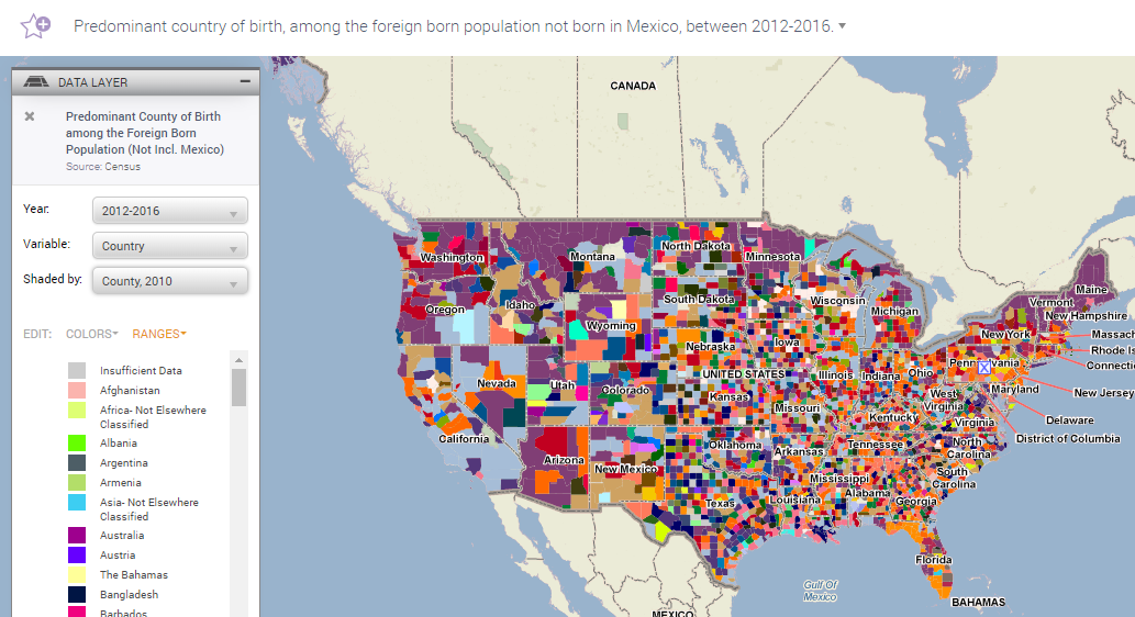
The colors also still seemed distinguishable from each other when we recalculated the predominant country of birth after removing Mexico.
However, when we tried to use the legend to identify which colors related to which country, the drawback of this map quickly became evident. For instance, looking at a light yellow the viewer would have a difficult time deciding if the country it was representing was The Bahamas or Belize . Plus, there might be other similar yellow colors farther down the legend. You would need to scroll through the entire legend, just to check.
Recognizing that we were going to need to readjust our legend, and that viewers could reasonably only distinguish between a handful of colors at any given time, we decided to focus on highlighting regional affiliations. Luckily, the countries data has an underlying hierarchy, with each country falling into a continent and sub-continent category. This time around, we decided to treat the data as if the sub-continent regions were categorical data but the individual countries themselves were more akin to contiguous data.
Using this hierarchy of data, we decided to sacrifice being able to easily distinguish between all 134 different colors at a glance, and instead focus on letting users easily identify continents and sub-continents of birth. Countries from the Americas would be shown in greens, European countries in reds and oranges, Asian countries in blues, African countries in purples, and Australian and Oceania countries in yellow. Each sub-region was then given a distinct hue grouping (for instance blue-green, yellow-green, forest green, and olive green) and individual countries within these sub-regions were assigned a brightness level of this hue based on their alphabetical order. In other words, we applied a sequential color gradient to each subcontinental grouping of countries, making sure that each hue group was distinguishable from every other continental hue group.
While some of the color gradient shifts may be too subtle to see clearly, it lets users glance at the map and easily distinguish between different continents: greens, blues, reds, purples, and yellows, representing the Americas, Asia, Europe, Africa, and Oceania. Looking at counties in California, you can see the predominance of the Asian-born population throughout much of the state. On closer inspection, users can either click on the county to find the specific country or look at the legend.
Speaking of the legend, grouping the colors by continent and subcontinent allowed us to order the legend by geographic area, making it easier to find specific countries and their neighbors.
This required a trade-off. It might not be immediately intuitive which is which when a Vietnamese neighborhood is next to Chinese neighborhood, since they’re both similar shades of blue. But the alternative was effectively random colors. At least this way, you have something to go on at first glance.
When zooming into a smaller region, it does become possible to differentiate between each country’s color when there are fewer colors present. For instance, zooming into Massachusetts, it easy to differentiate the lighter blue representing India and the darker blue indicating mainland China.
Even looking at an area as diverse as census tracts in New York City, distinguishing between countries becomes possible by zooming in, which reduces the total number of color options.
Thinking carefully about colors makes for a more useful data visualization. You can look at the data yourself on PolicyMap, going to the “Demographics” menu, and looking under “Foreign Born”.