
Quarterly Census of Employment and Wages
Last year, PolicyMap added data from the Bureau of Labor Statistics’ Quarterly Census of Employment and Wages (QCEW; affectionately pronounced here as Q-soo). When we added this last year, we provided 2000 and 2010 annual data on wages by industry. As you may recall, this aided our user base of prospective lumberjacks.
But now there’s more.
First of all, we’ve added data for 2011, as well as all years between 2000 and 2010. So if you need to know wages in the paper manufacturing industry in 2007 (before the economic crisis), you can now get that. Or if you want to see a trend line, you can see that as well. How did wages fare in the manufacturing industry in Ohio over the decade?
But wait—there’s more.
Along with average wage data, QCEW also provides employment by industry. So we can see how many people had employment jobs in Ohio over the decade. We can see this by going to the “Change Variable” toggle in the legend, and clicking on the number sign. Not quite as pretty a picture.
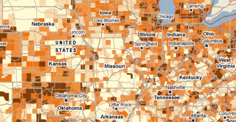
But there’s one more indicator, called “Tot$” in the legend. And this shows the total wages, for all workers, in a given industry. So if ten people were paid $50,000 a year in a given industry, it would show $500,000 of total wages. It can be used to show the total economic activity in an area. It’s sort of a combination of both of the other indicators- if there are lots of jobs, but all with low wages, or a few high wage jobs, that will be reflected here. So we saw that over the last decade, in Ohio, manufacturing jobs went down, but wages went up. What effect does that have on the total wages?
As you can see, it’s a mixed picture.
All QCEW data can be found in the Jobs & Economy tab, in the submenus under the “Jobs & Wages – Industry Concentrations” section. In those submenus, the QCEW data is under the “Wages” header (even though there is employment data in addition to the wage data; “Wages” distinguishes it from the County Business Pattern data above).