
Using Historical Data to Inform Future Fair Housing Policy

Data
Home Owners’ Loan Corporation Risk Maps
Source
Digital Scholarship Lab at University of Richmond
Find on PolicyMap
- Lending
- Historical Lending Boundaries
- Home Owners’ Loan Corporation Risk Maps
- Historical Lending Boundaries
[This blog post has been revised to reflect more recent data. HOLC polygons have been updated and an indicator layer was created in February 2022. Layer and polygon viewing options are now available to all users.]
In the 1930s, the federal Home Owners’Loan Corporation (HOLC) drafted maps of major urban areas throughout the United States. In these maps, appraisers and mortgage lenders graded residential areas dependent on their assumed lending risk and creditworthiness—from “A- (Best)” to “D- (Hazardous)”. Upon receipt of a poor “D” evaluation, largely non-white neighborhoods were “redlined” by lenders, denying homeowners there the same access to capital, wealth building, and lending opportunity afforded to other (largely white) residents
Residential lending boundaries drawn over 80 years ago widened racial wealth gaps, solidified unfair housing and lending patterns, and have perpetuated racial segregation that persists to this day. These divisions have driven disparities related to health, quality of life, and education access throughout our communities.
PolicyMap includes these HOLC “redlining” maps in our data offerings to encourage public understanding of the effects of discriminatory housing policy, as well as to support the implementation of future fair housing practices in local communities. Below, visualize how graded HOLC overlays on PolicyMap correspond to concentrations of predominant race and ethnicity in Atlanta census tracts, as of 2013-2017.
Ongoing Impacts of Historical HOLC Designations: Home Values
In Atlanta, a city where the median home value is estimated at just below $300,000 ($290,400) between 2015-2019, the concentration of higher-valued homes in the northeast, shown in dark blue, and lower-valued homes toward the south and southwest, shown in the lightest blue, stands out on a map.
These current maps of median home value contain reminders of the historical HOLC boundaries, drafted between 1935 and 1940. In the map below, the estimated median value of an owner-occupied home is overlaid with HOLC Risk Maps graded “A” for “Best”–those neighborhoods deemed to be at the lowest lending risk.
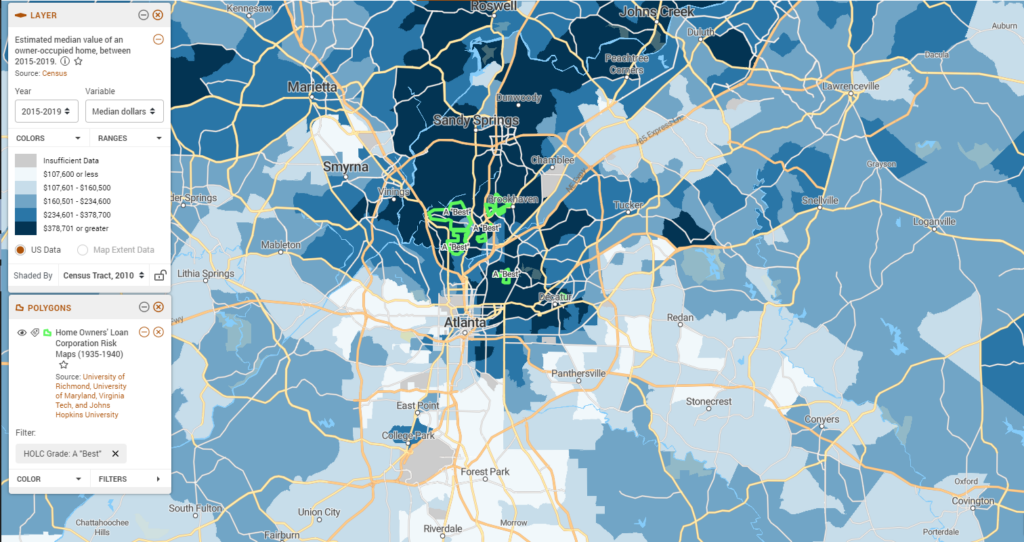
These “A” graded boundaries now abut or contain census tracts which in the period between 2015-2019 had median home values ranging from $438,400 to $1,472,700. Just across town, we can see the same home value data, but with HOLC risk geographies historically labeled “D” for “Hazardous” or “Highest Risk” outlined in red.
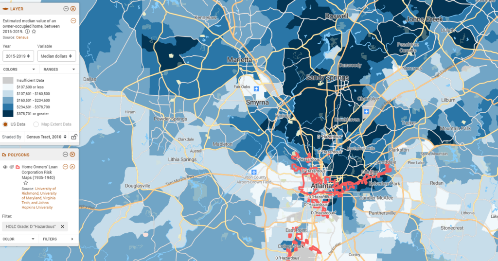
Census tracts contained in these historical boundaries had median home values ranging from $66,100 to $260,700 during the period between 2015-2019.
When exploring data from the previous five-year ACS period (comparing 2010-2014 and 2015-2019 data), median home values in Atlanta have seen a growth of 41.66% overall—a boon to local value and homeowner wealth in the city. That wealth, however, has not been equally distributed. In the same geographies historically labeled as “D-Hazardous”, over half of census tracts saw a decline in median home values over the past five-year period. During the same comparison period, in geographies bounded by “A-Best” HOLC designations, not one census tract experienced a decline in the median value of an owner-occupied home.
Ongoing Impacts of Historical HOLC Designations: Environment and Infrastructure
Throughout the U.S., discriminatory housing policies not only eroded opportunities for building generational wealth and access to homeownership which exists to this day, a growing body of research shows it also impacted modern health equity, education access, and quality of life opportunities for residents of these segregated neighborhoods.
Historic lending practices simultaneously denied opportunity to potential homeowners and impacted future earning potential to many Americans. As such, many of the areas labeled in the HOLC maps as “D-Hazardous” have higher poverty levels than neighboring areas without those designations. Quality of life detriments and environmental health challenges are more often found in these communities, too. Below, Brownfield sites are quite prevalent in the south-western neighborhoods of Atlanta that have higher poverty rates.
High-speed internet is inaccessible to households through these neighborhoods in Atlanta. In census tracts to the southwest, designated as “D-Hazardous” neighborhoods, up to 46% of households indicate they do not have access to high-speed internet. In northeastern “A” tracts, on the other hand, the highest share of the population without high-speed internet access in the household is limited to 16% (15.96%) as of 2015-2019.
While federal fair housing protections have been recently reintroduced, fair housing advocates suggest more is needed to ameliorate the numerous effects of historic unfair lending practices on today’s Americans. Various impacts caused by redlining can influence financial insecurity, environmental hazards, and a lack of services infrastructure in historically segregated neighborhoods. Addressing inequities in fair housing and lending requires a broad approach and understanding of these myriad ways in which historic lending guidelines and segregation continues to harm our communities.
Explore additional health, quality of life, and lending data in PolicyMap to further highlight the converging economic, health, and environmental needs that have unfolded in the wake of decades-long systemic and structural racism in lending practices.