
Viral or no, PolicyMap does Epidemiology at Johns Hopkins Summer Institute
When we hear about a new viral map making the rounds, we probably aren’t expecting to see influenza cases by state. The most-“liked” maps in this day and age are those that use readily available data to tell us something fun and innocently meaningful about ourselves and our differences as a country. Often, the maps that win the popularity contest are based on what we share on social media in the first place, such as our relative preferences for professional sports teams, or whether we’d rather talk about beer or church. In other cases, administrative datasets can be mined for viral purposes, such as relative popularity of baby names or even the ranked statistic where each state fares the worst. Ben Blatt’s recent article for Slate explains some of the issues with these maps, which are valuable for entertainment purposes but usually shouldn’t be taken too seriously. Blatt does a great job explaining what us data nerds know already – when it comes to mapping, a clever presentation can obscure important details and shortcomings in methodology. This is why we at PolicyMap prefer to serve the data to you straight, rather than like this:

This week I am in Baltimore, taking a course in Social Epidemiology at the Johns Hopkins Bloomberg School of Public Health. The course focuses on the causal relationships that exist among non-communicable diseases and social conditions. In social epidemiology, the focus is on mitigating or eliminating conditions in the population as a whole, such as income inequality, racism, or car-oriented urban design; these strategies will have a positive effect on health outcomes for the entire population. Data and maps are essential to this way of studying public health, especially since differences in these socioeconomic and structural conditions often manifest at the regional or neighborhood level. Variations among states can be associated with policies, differences in population characteristics, or both.
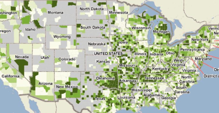
While you may not see any “viral maps” on PolicyMap, you can see some neat epidemiological maps, such as the rate of mortality from coronary heart disease, the leading cause of death in the United States:
Perhaps even more importantly, PolicyMap data can help us navigate the structural elements in our society that reinforce inequality in health outcomes. For instance, reliance on an automobile for transportation limits our physical activity, which is known to lead to higher obesity rates and cardiovascular disease. In most American states, over 85% of the population drives to work.
Now, that’s something to share on social media! Will you help our no-nonsense maps of the obesity epidemic go viral?