
2011 home sale data now available on PolicyMap!
Update (06/09/2021): PolicyMap now has home sale data from Moody’s Analytics. Read more here.
While the story of the home sale market has been grim for the last several years, we are beginning to hear reports calling for cautious optimism and slow but steady growth. The New York Times recently described what analysts are calling “the beginnings of a recovery.” Michelle Meyer, an economist at the Bank of America Merrill Lynch optimistically foresees gradual improvements in home values, with average home prices regaining the peak of the 2006 market by 2022.
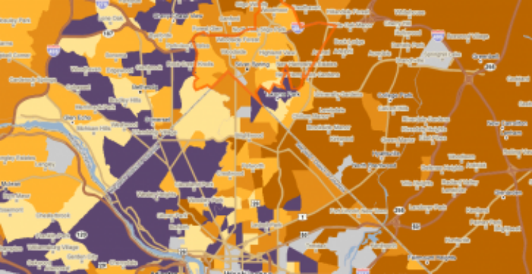
 However, the housing market is anything but consistent across the country. In fact, one of the most striking features here is its unevenness. The map below shows the percent change in the median sales price of a residential home since the 2006 nationwide peak. As you can see, while the general trends are overall negative, some areas have actually seen increases in prices. The areas in orange indicate where the price has gone down, with darker orange indicating greater relative drops in prices. The areas in purple indicate that median sales prices have actually increased in the area since the 2006 peak. Feel free to pan and zoom the interactive map below to get a better sense of the trends in your area.
PolicyMap’s home sale data is from Boxwood Means, Inc., a reseller of CoreLogic’s residential and commercial real estate data. The data is available at the ZIP code, city, tract and block group geographies exclusively to our standard and premium subscribers. Interested in learning more? Why not try out a monthly standard subscription to PolicyMap?