
The Changing Face of Religion in the U.S.
Last Tuesday’s election has inspired conversation on a number of topics, one of which is the changing face of religion in the United States. A recent NPR article reported that “Obama won 95 percent of black Protestants, three-quarters of Hispanic Catholics, 7 out of 10 Jewish voters and 70 percent of religiously unaffiliated voters.” A recent study by the Pew Forum on Religion & Public Life found that Protestants are no longer the majority in the U.S. and that the unaffiliated are the fastest-growing religious group in the country. So how have religious preferences been changing in the U.S.? Fortunately, people interested in up-to-date data on America’s religious preferences can turn to PolicyMap. ( For a detailed look at religious affiliation by age, city, and race click here.)
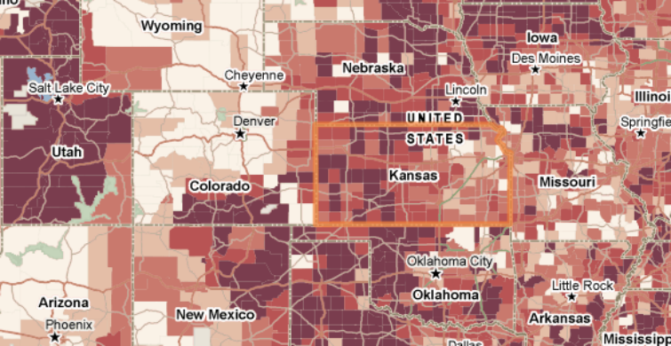
Located at the bottom of the Demographics tab under “Religion”, PolicyMap users can now find the results of the 2010 Religious Congregations and Membership Study. Conducted by the Association of Statisticians of American Religious Bodies (ASARB), the most recent iteration of this decennial study included 236 religious groups who together reported more than 150 million adherents, representing close to 50% of the U.S. population. Below is a map showing the rate of adherence to all denominations and religious groups as of 2010:
Inherent to this type of study is the question of who is considered an “adherent” and how various religious bodies may measure this differently. Rather than counting “members”, a category including all individuals with full membership status, this study reports “adherents”, which counts “all members, including full members, their children and the estimated number of other participants who are not considered member.” This broader category includes the “baptized”, “those not confirmed,” “those regularly attending services,” etc. However, because “adherents” can be defined more loosely, these estimates can vary among religious groups and even differ within a specific religious group over time. For example, as discussed in the Salt Lake Tribune, comparing numbers for the Church of Latter-Day Saints from 2000 to 2010 has its challenges. Despite these challenges, we at Policymap calculated percent change for religious groups and individual denominations when possible (based on the recommendations of the survey’s staff). For example, below is a map showing the percent change of adherence to Catholic denominations from 2000 to 2010:
It is also important to note that the methodology for conducting the study was different in 2010 than in 2000, with the 2010 study being more inclusive and comprehensive on the whole. For example, the 2010 study included historically African American churches, while the 2000 study largely had not done so. For more information on the study and its limitations, click here.